


Tor.com is pleased to offer the first part of Tim Hamilton’s graphic novel adaptation of Ray Bradbury’s Fahrenheit 451. Including a new foreword by Bradbury himself, the graphic adaptation of Fahrenheit 451 is a striking work of art that expertly captures the now-classic story of Guy Montag’s awakening to the dangers of censorship. Fahrenheit 451 remains a very relevant book today, and this graphic adaptation is sure to introduce this seminal work to new readers.
Buy the Book

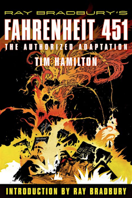
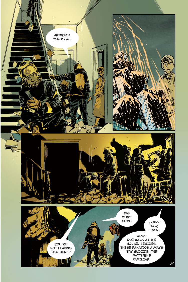
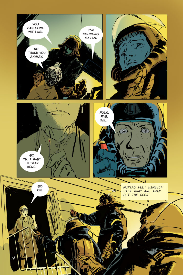
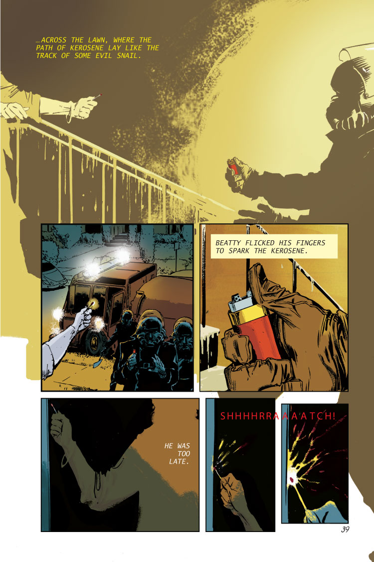
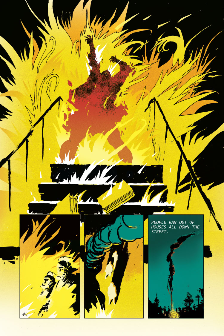
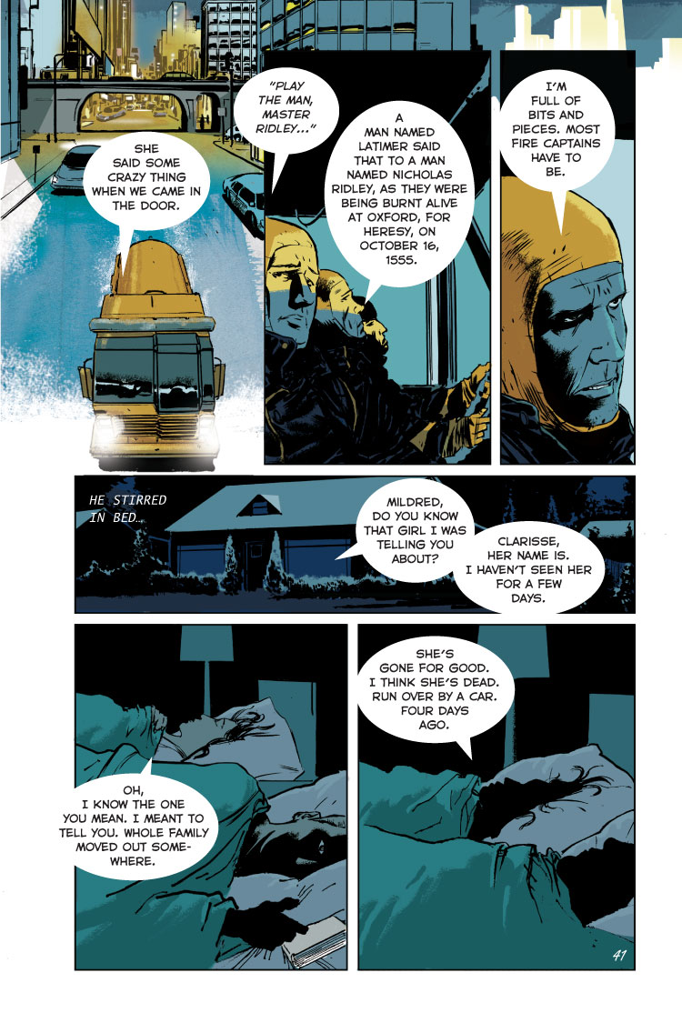
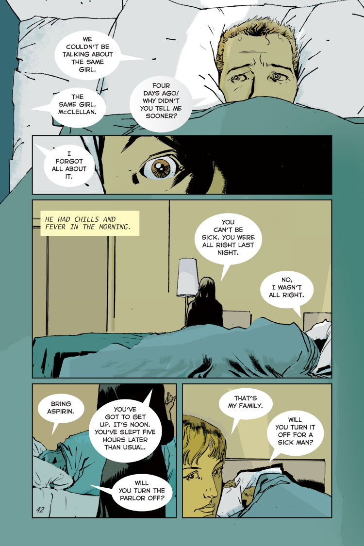
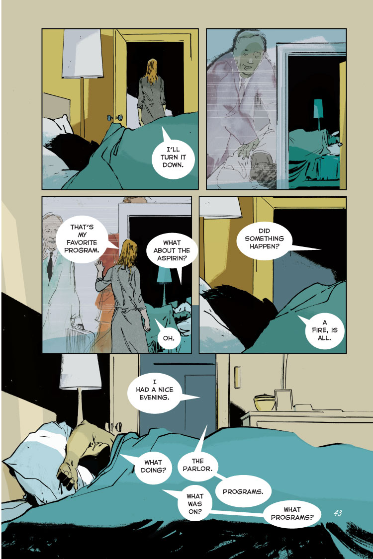
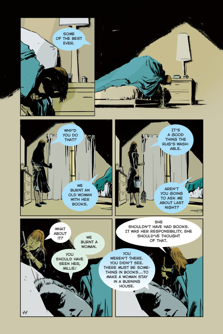
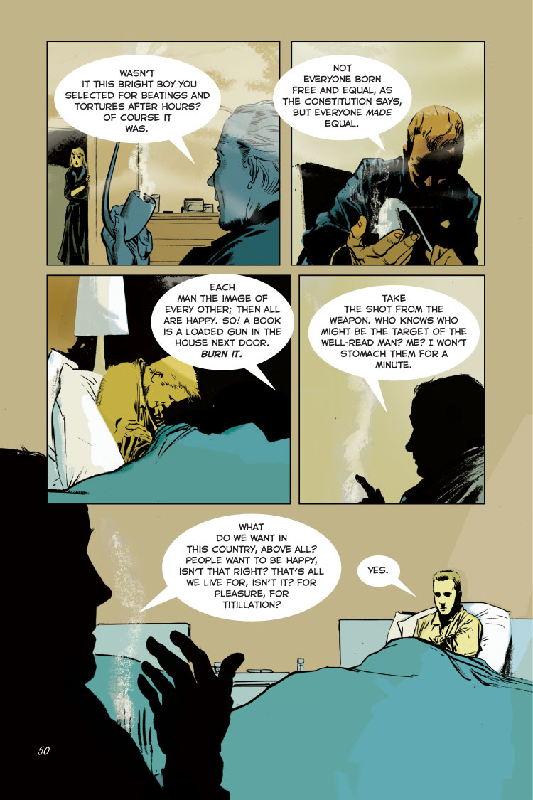
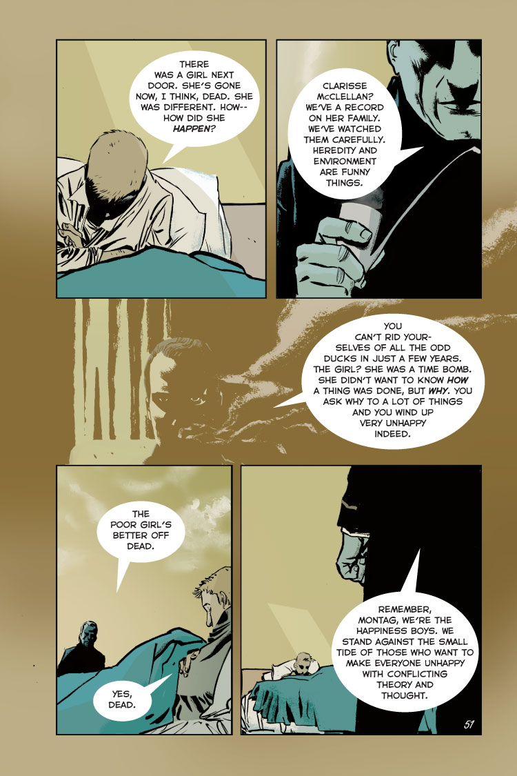
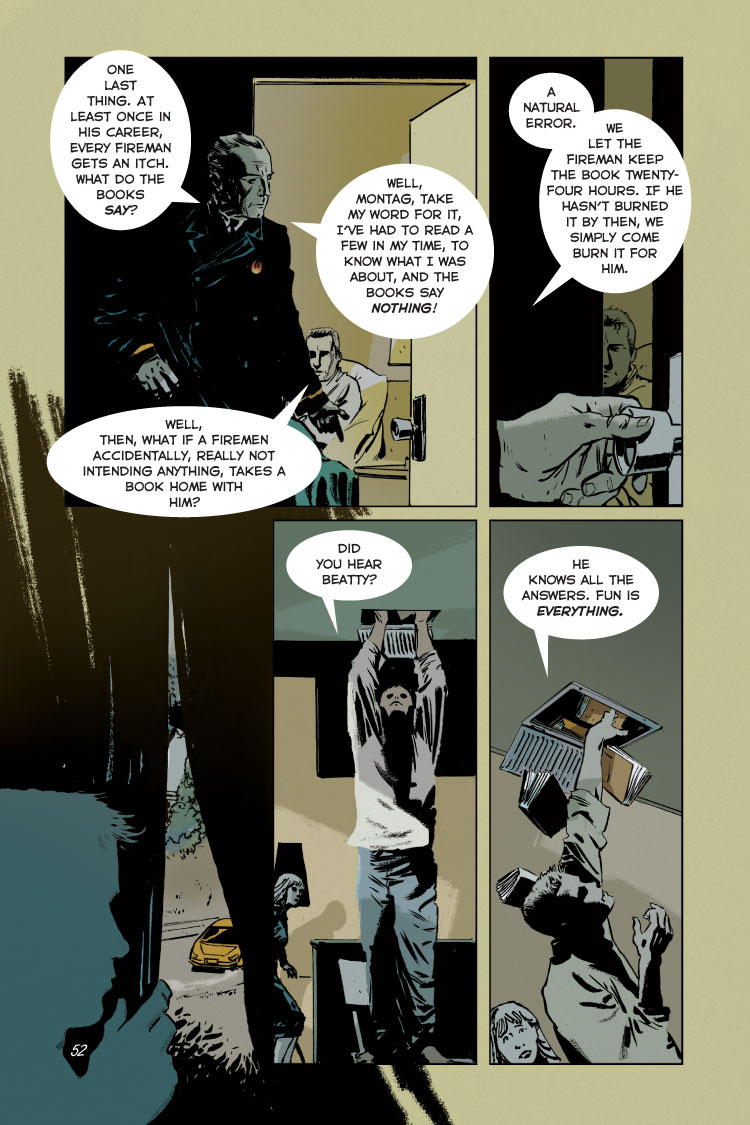
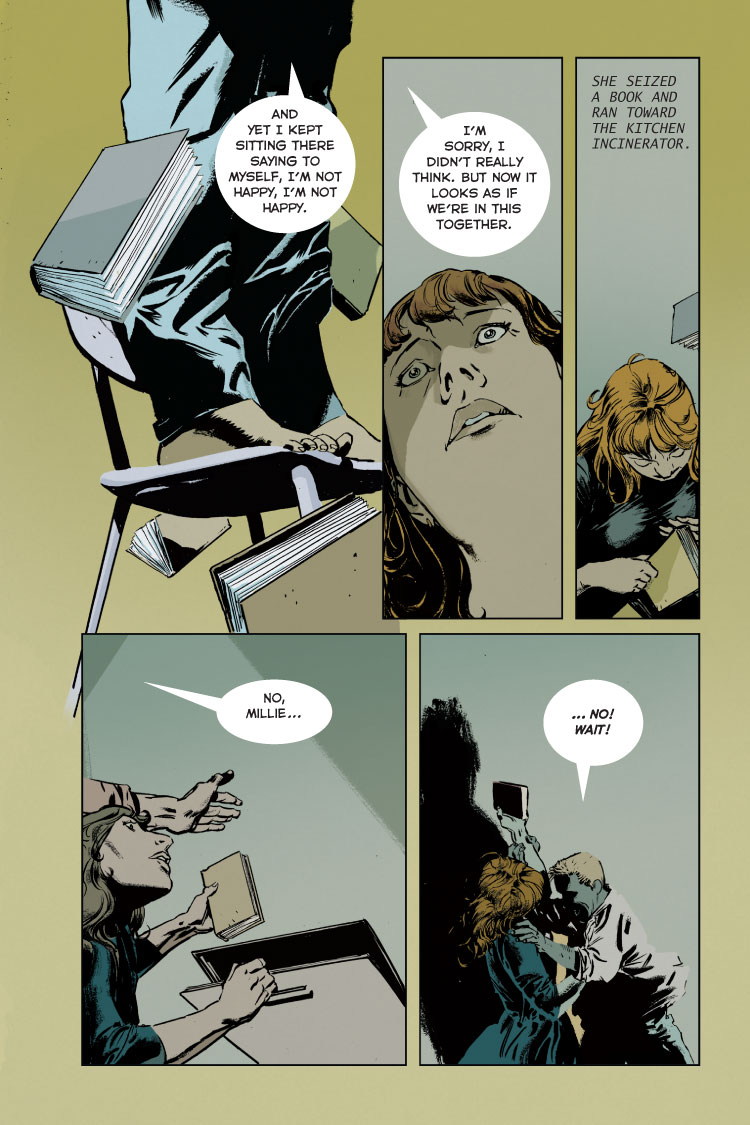
Fahrenheit 451: The Graphic Novel
Enjoy the read!
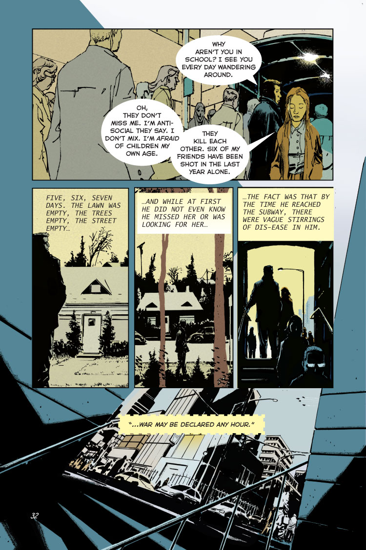
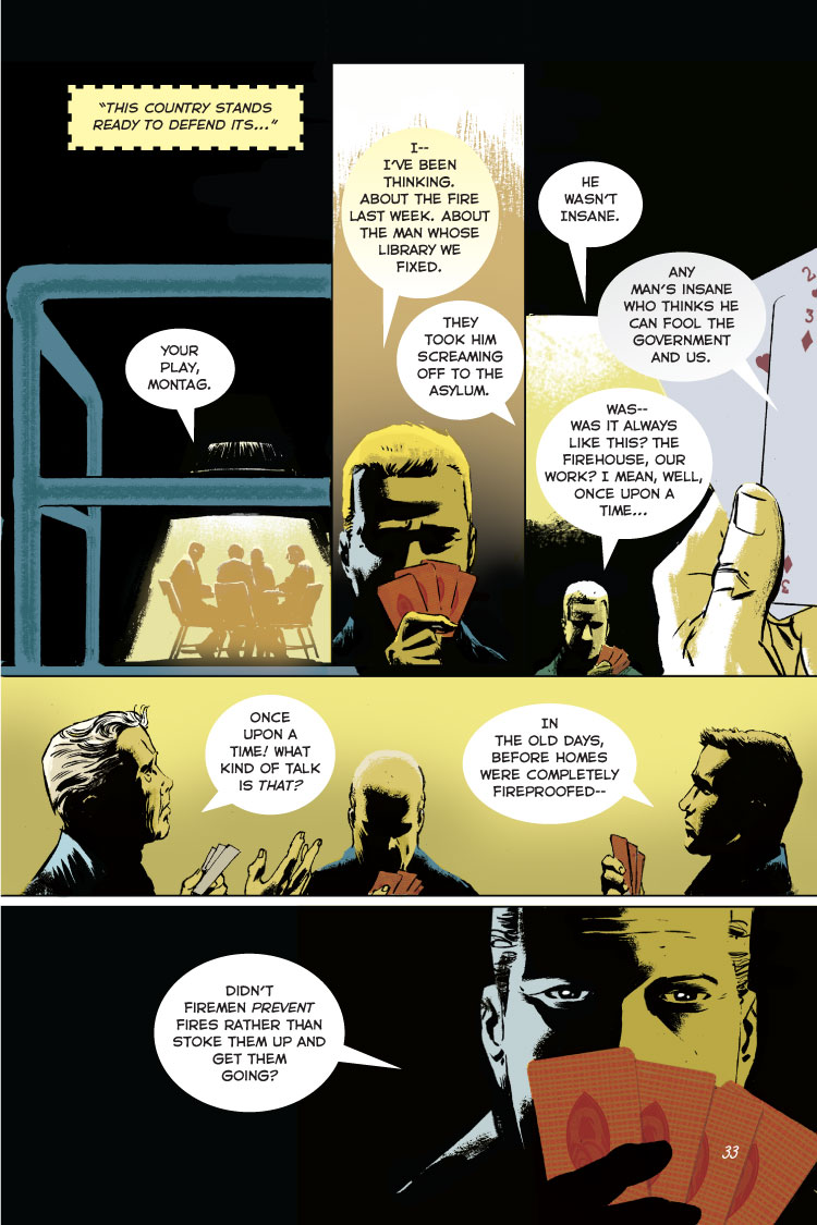

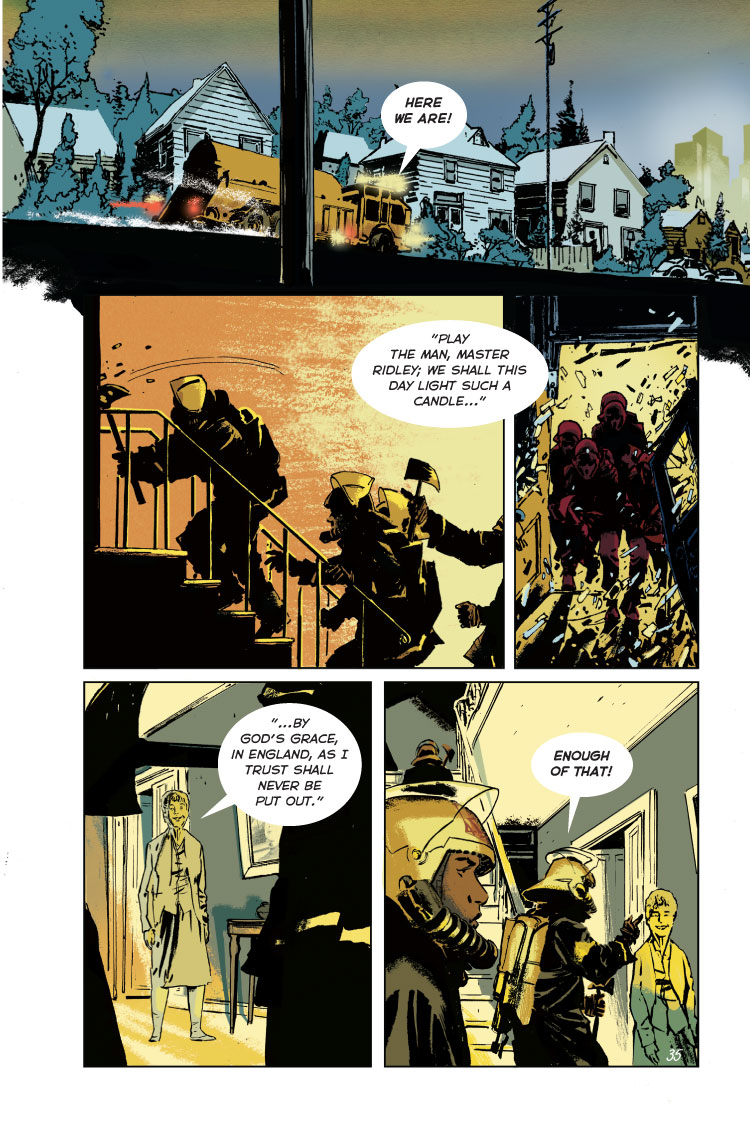
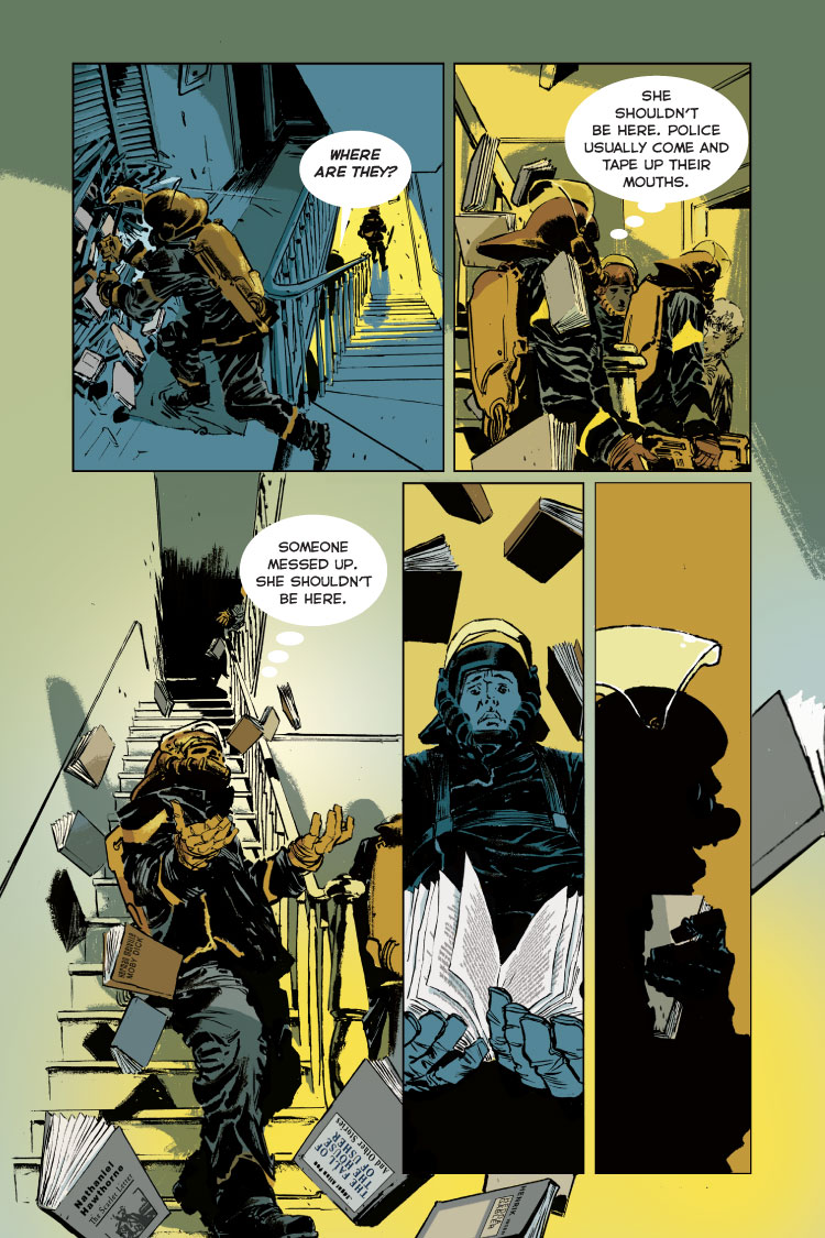

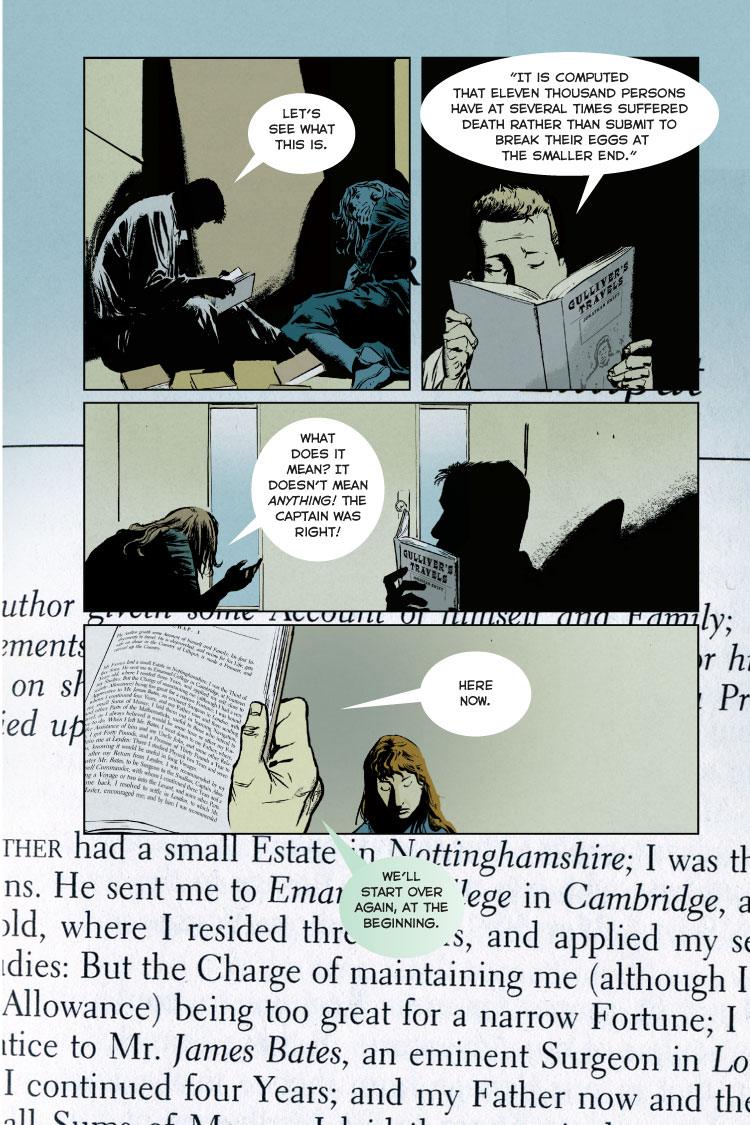
1. This Graphic novel further devolves my understanding of the text by creating a larger image in my mind. It expands my imagination seeing graphics in the text.
2. It barley took my vision of the text away. When I first started to read the novel, I made up in my mind what all the characters, serenity, and more on what they’d look like. The graphics took away from my imagination and what I thought everything would look like.
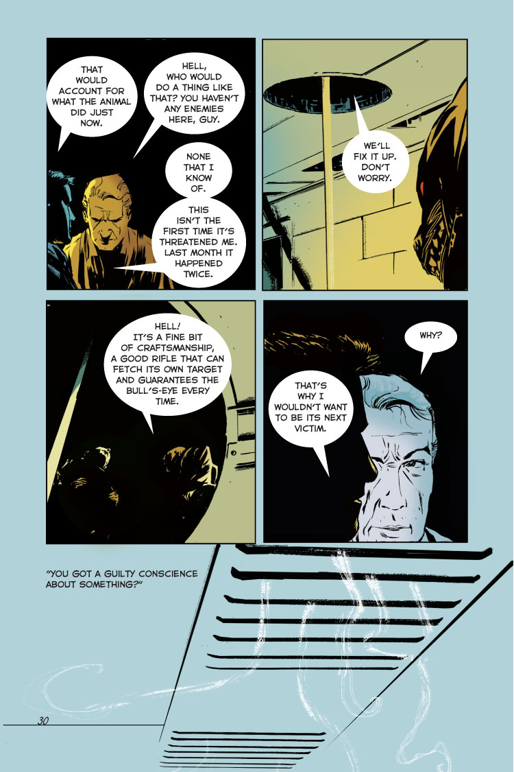
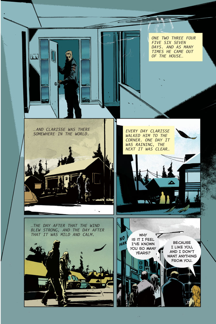
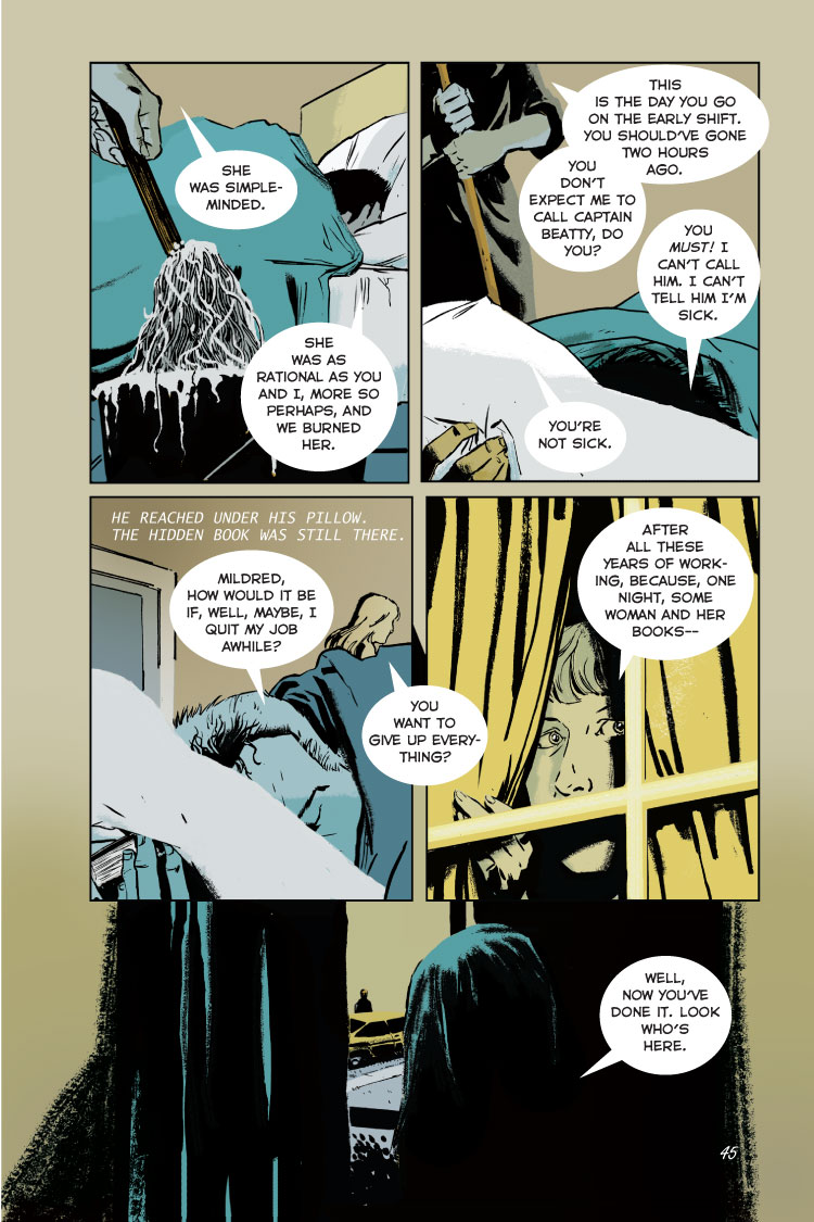
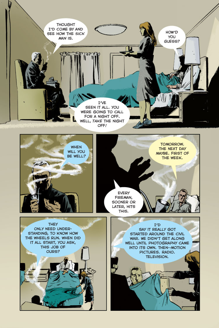
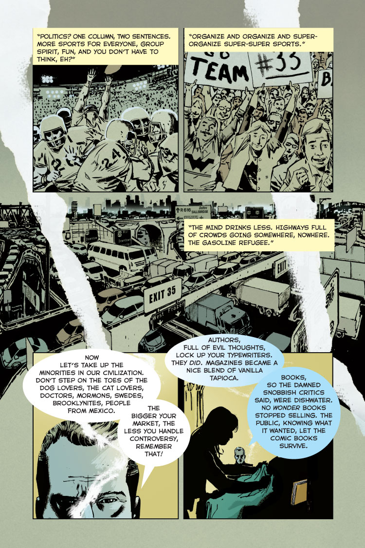
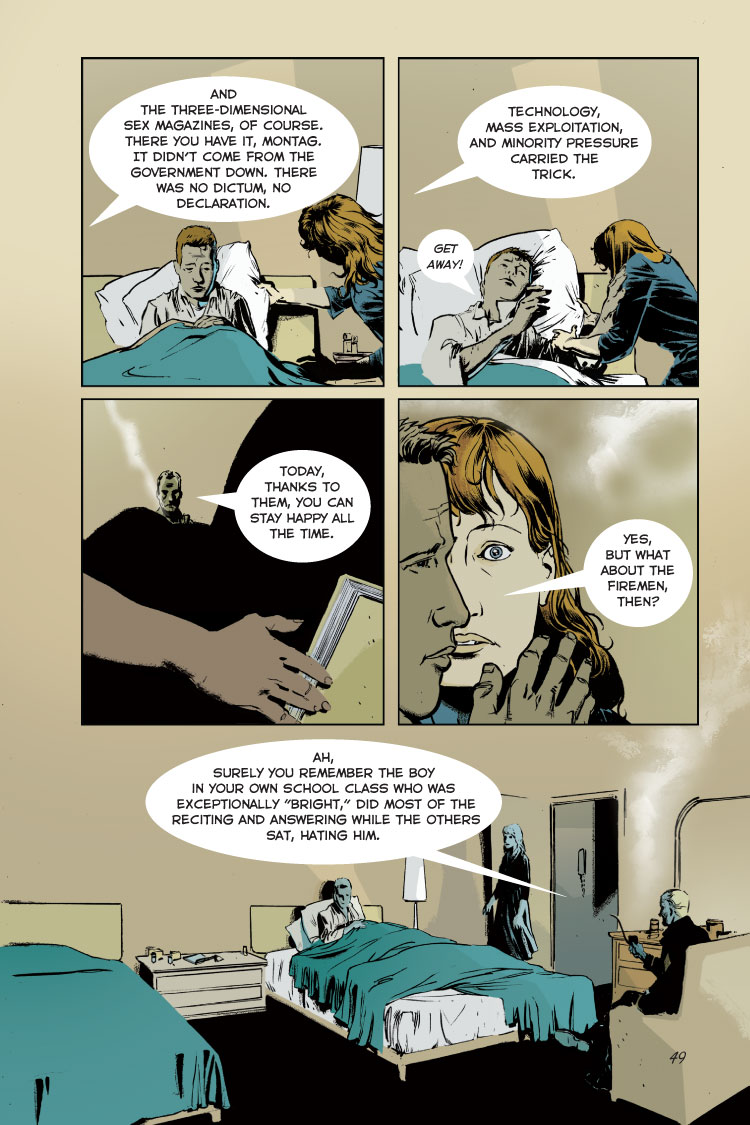
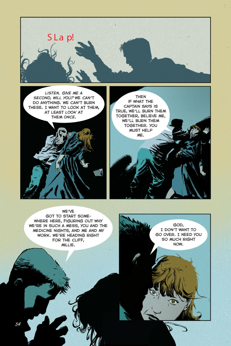
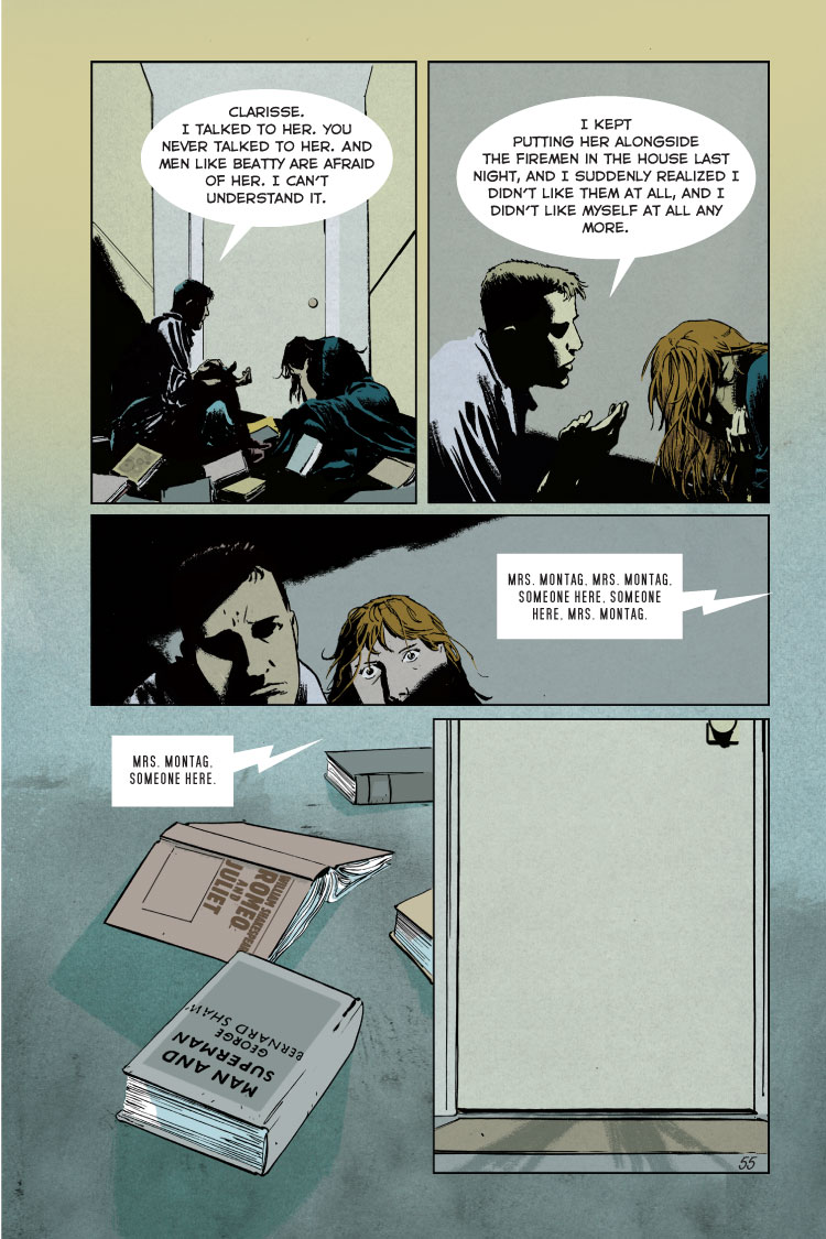
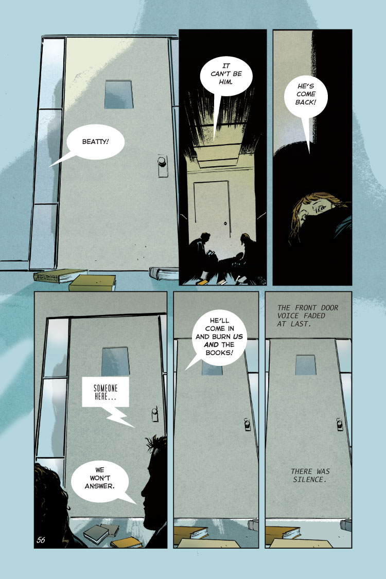
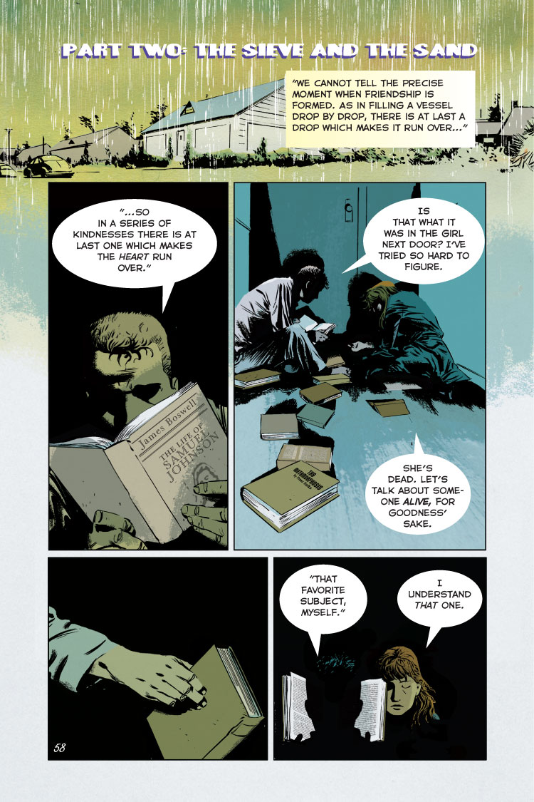
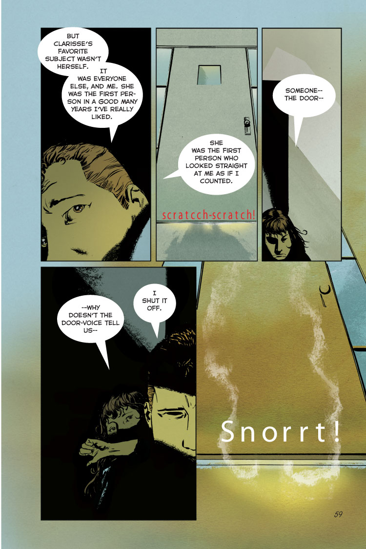
3. The graphic novel seems to use a very gold, white, black, and teal color scheme. I think the artist, Tim Hamilton used these colors to show that the world these charters live in is not colorful nor bright. He used these colors to show that in their world, everything is plane and boring. No vibrant colors, everything is the same and nothing changes.
The illustrations are nothing like to what I had envisioned while I was reading the novel with my English class. It took my eyes off the text. There is really no point in having text at all. The pictures shows it all, really.