


The Path of Daggers, volume eight in Robert Jordan’s The Wheel of Time, will be available in ebook form May 18th. In celebration of Jordan’s work, we have commissioned fourteen artists to interpret one of the Wheel of Time books in their own style. (Previous editions can be seen here. The first seven ebooks can be purchased here.)
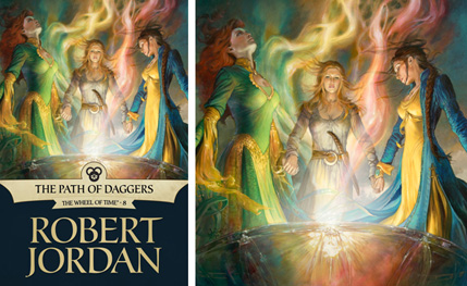
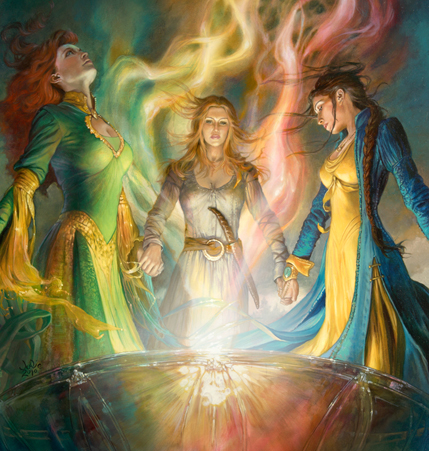
 Julie Bell was on my artist wish-list for this ebook cover project right from the start. There are few artists as comfortable with figure drawing as Julie. The only question was, which book and which scene? Fairly early on, Megan Messinger had described the “Bowl of Winds” as a pivotal point in the book that focus on the strength of character and ability the women in the Wheel of Time possess. Since Julie has a hard-earned gift for painting strong women that are every bit as powerful as they are beautiful, it seemed a natural fit.
Still, some hard decisions had to be made. The scene includes thirteen women working together. If we did a long shot, we could include all thirteen, but then we loose the ability to engage with specific characters. When you add in the thumbnail-size that ebook covers are often first seen at, I thought it best to focus on a few of the key characters: Elayne, Aviendha, and Nynaeve.
The scene fell together pretty quickly after that. I have to say a special thanks to our Leigh Butler who called me in a mild panic after the sketches were approved: it seems that the clothing in the scene was described in the book before this one. Not something I ever would have caught. And further proof that the more people we let into the process, the better it is for the project.
 In the end, Julie created strong and individual characters, each one looking as competent in their own right as the next, clearly working together for a greater power.
This is not surprising to anyone that knows Julie and her work: she is one of the most disciplined and grounded artists I have met. She and her family—husband Boris Vallejo and sons Tony and David Palumbo—live a life fully dedicated to art. Not in a flamboyant or trivial way, but with an intense focus on craft and hard work, tempered by a true delight in bringing fantastic images to life.
 Those of you familiar with her fantasy illustration should check out what I call “the three Julies.” Beyond her commissioned work, Julie creates personal paintings that push her stylistic range. And then there’s Julie the wildlife painter. Yes, I’m a sucker for animal paintings in general, but she has an incredible ability to idealize a subject matter while maintaining its visceral heart.
It was an honor to have her involved with this project. When the painting was done, we spent a day visiting Julie. Hear what she had to say about The Path of Daggers and her career in general:
To keep up with all of our Wheel of Time posts, including information on the ebook releases, check out our Wheel of Time Index.
Special thanks to Megan Messinger for video editing.
For the full-sized cover image, check out Dragonmount’s The Path of Daggers feature.
For more information on Julie Bell please visit her Tor.com gallery, website, blog, and her health and fitness blog.
That’s a gorgeous image. I have to say it’s not how I see Elayne in my mind’s eye, and it is odd, although totally accurate, to see Aviendha grace her first cover in wetlander garments. Still, gorgeous.
Plus, two Nynaeve covers in a row! Yay for my favorite character!
As always, an honor to help!
Yeah new cover
Lovely artwork, but I’m pretty sure that Elayne is too short, and Nyn is too tall.
Mis-critic
Now I’m doubting myself: which is Elayne and which is Aviendha? I assumed the left-hand figure was Avi due to her height, and pegged the center as Elayne, but now I’m remembering that I tend to picture Elayne as a blonde despite the 10000 references to her “red-gold curls.”
It is a wonderful painting.
Question though…My first thought was that it was Avienda, Elayne and Nyn, in that order. That belt knife makes me thing I have Avi and Elayne in the wrong order but then the hair color is switched…isn’t it?
Either way an excellent piece.
Elayne-Aviendha-Nyneave.
E- Green dress, red hair
A- Blonde hair, brown WO dress, knife
N- Yellow dress, dark hair, BRAID, plus is that Lan’s ring I see?
I do love this cover. But why no step-by-step this time? :(
This looks amazing. Nynaeve looks awesome.
So the one in the middle is Aviendha? Her dress seems see-through… Not that I’m complaining. I thought/pictured El as blond (her mother being red-haired) and Avi a red head.
Oh yes, before I forget, the cover is very impressive.
What aaziz said — though I had to think about it too.
I love the cover, simply for a great portrait of the three women. I do have two problems though. First, shouldn’t Avi be by far the tallest of the three? Perspective may account for that, I suppose, but still she looks pretty short here.
Second, the threads of Saidar in the illustration look chaotic and random, like smoke. I think they’re described in the book as an incredibly intricate lace, so I think they should be a lot more structured, regular, and symmetric.
Still, I’m happy to write that off as an artistic inconvenience. The people are the important thing, and I think Bell gets the personalities exactly right.
It seemed obvious to me who was who, but after the questioning comments I had to step back and reconsider. Nope, obvious. The imperious stance and raised chin? Not Aviendha. The one who looks like she’s been thinking about jumping off a cliff? The one with a heavy belt knife she’s been showing off to the Sea Folk? That’s Aviendha. And that’s not a Wise One’s dress she’s wearing, it’s one she acquired in Ebou Dar. I would have expected Elayne’s hair to be a bit less red, Aviendha’s a bit more, but lighting/shadowing is probably responsible for that.
I agree that Nynaeve is shorter than Elayne, quite a bit shorter than Aviendha, and again, perspective angle can be blamed for the appearance that Elayne is much larger than Aviendha.
I like that a ring is strung from Nynaeve’s neck, though it should be MUCH larger and heavier. She can nearly fit both thumbs through it, and it’s a signet ring.
I see the heavy jeweled bracelet on Nynaeve’s right hand, and it appears there are tiny chains coming from it toward her fingers. Not how I pictured it, but excellent work to include her angreal.
Certainly no quibble about the necklines for either Elayne or Nynaeve. Elayne has always pushed the envelope on that score, and Nynaeve is now showing off in yellow/blue for Lan. Aviendha, I think, would not present cleavage.
Last nit. The Bowl is described as flattened or shallow, more like an oversized dish. This bowl, while gorgeous, is a bowl.
And lest anyone think otherwise, I love this artwork. It’s beautiful, represents a major scene of the book, and captures the power of the moment quite thoroughly.
Very well done, Julie. And Irene. And Leigh.
A beautiful cover if you ask me, and the characters look exactly as I’ve depicted them in my mind.
Dresses, size, and hair colour are also correct.
(Elayne has always been described as tall and she is tall in this cover, and how could anyone who has read the books miss that Elayne’s hair is described as sun-red? Aviendha’s hair is described as having a red tint however, but making her hair red too would have made the cover confusing.)
A – reddish hair
E – sunburst curls
N – dark hair in a braid
Haha, it’s fitting that we are arguing about hair and dresses in a Jordan book ;)
Seeing the image in the RSS feed, my instant reaction was, “Phoenix is in The Wheel of Time? Oh, and that’s Kitty Pryde over on the right….”
@14: Oh wow. Elayne is totally in Jean’s “rising from the lake” pose. And with the red hair and green-and-gold… What a wild coincidence. Or is it possible that John Bryne influenced Julie Bell?
David,
I was just now going to post that. Well, Elayne — and specifically her dress — being very reminiscent to classic-era Phoenix (as here). I found this, I’m afraid, rather jarring. I’m sure it’s utterly unintentional, but even just changing one of the tones — make the yellow a red or a blue or a white — would immediately deal with that. I suppose the colors may be described in the text…
Don’t really see Kitty, but Phoenix, oh yes.
It’s a nice painting otherwise. Particularly like Aviendha, for some reason, and Nynaeve’s gown.
Avienda is a red head, Elayne a blond (red/gold would be strawberry blonde) and Min a brunette. I did think Avi was one with belt knife but hair wrong for them….
@16: Shadowcat had a shiny sleek blue and gold ninja costume, with bulky blue sleeves and yellow running down the middle, in the 90s. The braid makes this image quintessentially Nynaeve, so I didn’t see it until David pointed it out, but I think that’s what he’s referring to.
At least Elayne’s dress wasn’t red-and-gold. ;)
And we’ve certainly veered into a very different nerd-dom, haven’t we?
The only thing throwing me off is that Nyn is too tall.
Here’s a quote concerning Elaynes hair:
“Nynaeve was one of them, and he believed he saw Elayne’s red-gold hair.” (TSR, Cha 53)
Although how red that is could be discussed forever, so lets settle with that it looks way much better having three women with distinctive different haircolor on the cover…
Hair-Gate! What did Julie know about their hair color, and when did she know it? Inquiring minds want to know! On the QT, and very …hush hush!
Another hit! Yeah, to what Free said, but overall very appealing.
Thanks to Tor and to Ms. Bell.
love the cover!
especially love Nynaeve and Elayne.
aviendha is nothing like i picture her (tho well drawn here)
but im glad im not the only one who thought elayne looks like jean grey the phoenix lol
i had no trouble recognizing who was who. the belt knife (re: short sword in any other culture) is clearly avi. tho i didnt notice the hair color til it was pointed out here.
great work! love it.
Subwoofer is going to be disappointed the artist didn’t use his “bowl of the winds,” but somehow I think he won’t be too disappointed… LOL
Well, Aviendha up there is very close to how I imagined Elayne. And Elayne up there is almost exactly how I pictured Aviendha.
At least Moiraine was sufficiently off from what I imagined her as not to confuse me.
Nynaeve looks a bit tall. Even though she already just barely reaches to Elayne’s nose at this point. The one in the middle is probably Aviendha with that belt knife, and she looks short, but she should also be about a foot back from the other two. Good rendition though. Consider that at this angle Elayne’s hair would have shadows in it, so it’s redder than it’s light. Aviendha’s would be directly behind the light, so it looks lighter.
Fantastic It really captures that part when they use the Bowl!
I though Avi was on the left at first, but if you do look at the picture closely, you can see the red tint in Avi’s hair.
I am very happy to see Julie Bell was “Chosen” to be one of the artists; she and Boris have been favorites for a long time.
By which I also mean, she looks too young!
The girls look good here, but I think Aviendha does not have enough experience in the “wetlands” to realize what will happen to that fabric if it gets wet.
I don’t think that Avi is in the middle for the simple reason that an Aiel wouldn’t wear white. That’s the colour of the gai’shain.
MostlyAnthony @30:
It is Aviendha in the center, and she’s not wearing white. In the Bowl of the Winds scene she is wearing a silver-gray wetlander dress.
For some reason I never pictuered them holding hands in these circles. Do they?
I think Nynaeve looks spot on. But the hair seems a bit off for Elayne and Aviendha – or a least I picture them way different in my head. I remember that dress for Elayne from the book though.
I like it, it does capture that scene:)
tempest™
My first thought was why isn’t Elayne’s hair curly?
Then I read the comments and realized that the one in the middle wasn’t supposed to be Elayne.
I went back and looked again. The one with the knife is probably supposed to be Aviendha, but her hair is definately the wrong color. It should be red! Also MostlyAnthony@30 is right, she wouldn’t be wearing white.
Elayne would be the one wearing the keyhole Ebou Dari dress, but her hair should be curly and gold, with only a slight hint of red.
Everyone above is correct about the heights as well, but that could be explained away by perspective.
Come on, all it takes is a quick Google to find the characters physical description.
I think it captures the scene quite well. It tells of the ecstasy that the girls are feeling as that much power is used. The colors coming from the Bowl bring the Wind to life.
Exellent work with the scene, and another great artist pick for Irene. Julie is a greatly talented artist.
Yeah the hair is a little confusing cause I always pictured Avi as a redhead, but Elayne’s face looks right on, Nynaeve looks perfect (I really don’t remember her being described as very short, just Moraine, and perspective yada yada what they said.)
Not how I picture Avi, but I generally imagine her in Aiel garb, despite the multiple references to her starting to enjoy Wetlander dresses.
Awesome art and scene though, nitpicks aside.
It has a really dynamic feel. I like the movement which is a quality not all artists can capture. Tor has done a great job seeking out very talented people and the people have done a fantastic job in illustrating such recognizable scenes from a much beloved (and debated) series.
For me I had a difficult time pronoucing th names. Imagining what the people look like doubly so. I just go with it at this point since it is “interpretive” not difinitive.
I always imagined Nynaeve as being a bit more of a sturdy girl, pretty but not thin, which is my bias as I have known very attractive, strong women who were not a size 6 and I kinda used them for my vision of Nynaeve.
Also discribing her favoring “thick woolens and stout shoes” did not help. Even though she is at other times described as “a slip of a girl.”
The art is great. Hooray new art!
I looked at the full size image on Dragonmount and noticed that Elayne does have some curl to her hair. The dresses are very well done. I feel like maybe my last comment was a little too harsh, it is just frustrating when it’s difficult to even recognize the characters at first glance and after reading everyone elses comments, I knew that I was not the only one having that difficulty.
Not for nothing, I think these new renditions are light years better than the original book cover art. To be clear, I am not hating on Sweets (I think that’s the name lol) imaginings of what looked like what in Randland, but at the time, who would’ve thought that this would turn into such an epic, highly worthy of beautiful and evocative art drawings? And in my book, if you are gonna come to the table with some WOT art, you better come packin… perhaps one has to be a fan to properly portray something like this. Idk. Most certainly, one must appreciate the absolute Awesomeness going on in so many parts of this series.
I love all of the new stuff, am totally hating that it is on the Ebooks and not on my bedroom walls, and can’t wait to see more great art for WOT. Kudos.
Re: Aiel in white- isn’t the Wise One uniform a white algode blouse with a dark skirt?
I remember Nynaeve described while wearing a borrowed dress, and the implication I got was that she was more constricted up top. I think she was described as less tall than average, but not a li’l bit like Moiraine.
LOL
Elayne looks like Phoenix! That’s AWESOME!!!
And that’s the best rendition of Nynaeve I’ve seen. When are the posters/calendars out so I can be more of a nerd at work?
Great job!!!
As always, any time particular characters are pictured, we all find things that don’t look the way we pictured them. Still, the fact that most of us could tell within a few seconds who everyone was says a lot. My few nitpicks have mostly been covered, though I’d add that Aviendha’s hair is too long. Regarding their heights, I just remind myself that the ground was uneven, so maybe Aviendha is standing in a low spot. :)
Thank you so much for all the kind words!!! Just to settle up with all of you, it’s like this:
Elayne on the left, Aviendha center, Nynaeve on the right. It’s true that because we’re seeing it a bit from below and Aviendha is farther away in the circle, she looks a little less tall. And all of the hair colors are being influenced by the rainbow colored light which is just beginning to form an intricate braid at this point in the illustration.
Any references to Phoenix are subconscious and unintentional, but I agree that the idea is AWESOME!!! Wish I had thought of that!
Best wishes to all of you,
Julie Bell
I love this! Sure, the heights and hair colour and whatnot are a bit confusing, but I guess the context and explanation make sense of it.
I am just loving the fact that there are now covers that do justice to the wonderful books rather than the fairly static ‘nothing’ covers we’ve mostly seen.
Going to go through and save all of these for my desktop now :)
And I would LOVE a calendar or posters made up of these.
Hey Julie! Thanks for stopping by.
It’s funny…Before these covers are revealed I’m so caught up in how they are going to be perceived it’s hard to see them with an open mind. Once released, I finally get to experience them with a fresh eye. Great job, Julie! It feels good to let all the prep go and soak them in along with everyone else.
Beautiful! And I’ll accept the explanation (from the artist, no less!) that the hair color is being affected by what’s going on around them! I remember some quibbles about Nynaeve’s hair and Lan’s zombie-like coloring in the ebook picture for ACoS. To me, it was completely in keeping with how the light filtering through river water would alter their appearances.
@sps49
As per TPoD:
“…and Aviendha found herself responding with pleasure to comments on how well her gray silk riding dress looked on her…”
And while we’re on the subject of their clothes…
“Elayne wore garments as inappropriate as Nynaeve’s, a gold-embroidered Ebou Dari riding dress of green silk, suitably high-necked but with an oval opening that bared the inner slopes of her breasts.”…
And Nynaeve’s dress is described two different ways in the same paragraph. Once as a blue riding dress, and then as a tight-fitting blue coat over a yellow riding dress. Obviously, the painting goes with the second description… :D
Really, really gorgeous work!! Thank you, Julie!
Julie@42:
Great picture, Julie, but I think most readers would have found it truer to the actual character descriptions if you had painted the belt knife on the girl on the left. I dare say, without the belt knife most WoT readers taking a first look at the picture would have said Elayne in the middle and Aviendha on the left (as I did). Nynaeve was immediately recognizable, though.
Alisonwonderlan@46 as well as everyone else.
To me, it was immediatly recognizable that it was Elayne, Aviendha and Nynaeve.
Re: hair color. I took a look at both red-gold hair and reddish hair (Elayne and Aviendha). Given the lighting from the Bowl, the color of their hair is spot on.
Wetlandernw@41: Aviendha’s hair was just short of her shoulders at the beginning of TFOH. There are about six months between that and this scene. Depending on a variety of factors, that is about three inches of growth. Aviendha is about 20 years old, so it could grow faster. What is depicted is well within the relm of possibility.
Julie@42: Love the new cover. One of the many reasons that I like the series is because Robert Jordan took the time to explain the clothing of his world. I really think that that came through in your cover. Really great job!!!
EDIT: Now that I look at it, something just struck me. They’re supposed to be channeling, right? Where is the glow?
mainphramephreak @@@@@ 47, Oh, Julie put the glow in – but it’s only visible to other women who can channel.
I like Thumbelinablues’ reason better than mine :-)
…which is: it was talked about (I think Jason Denzel mentioned it to me) but between the braids of light, hair, and flowing dresses — adding another element might push us into something a bit messier than we wanted. So…we cheated that a little bit for the sake of clarity.
Referencing Irene @51: Yeah, it’s the kind of thing where, if it was a movie, it would be so cool to include all those kinds of things (channel glow, etc.). But, since it’s a still image, clarity sometimes wins over details.
Boobies!
@53- seconded.
For the image itself, it is awesome. I liked my idea better but for the concept that was given, it was carried out well. My nitpick on this is that if there is a circle of women channeling, like I pictured- they would have the bowl on top of the hill and be spaced around it at a distance. This close and you have room for only maybe half a dozen, not the 13. To fit 13 into this spacing, they’d have to camp out in each others’ small clothes.
And Ny is a midget.
Woof™.
Wow! Phoenix, Frost and Pryde in an amazing pic!
Oops. Wrong genre.
Hey Guys,
New Spring! I haven’t really addressed this yet. Any favorite scenes?
(I know some have been suggested in earlier threads – I’ll dig those up as well.)
Ms. Bell might have just put them in bodybuilder bikinis and been done with it, and I, in all my WoT ignorance, might have enjoyed it just as well (though I’m rather keen on that riding outfit…). But, I know, it’s really for the fans, and the details matter. Aren’t I lucky to not know the difference? Go, team TOR! Another fine work, and an entertaining post (and I ain’t even watched the vid, yet. saved the best for last).
mainphramephreak @47 – All I can say is, you must be using a different ruler than I am. You’re quite right that three inches in 6 months would be easily “within the realm of possibility.” However, from “just short of her shoulders” to where it is in this picture is 6-8 inches, and it’s been less than five months. Sorry, I have super-fast-growing hair, and I get about an inch a month. It’s not really “well within the realm of possibility.” More like “remotely possible but extremely unlikely” that it could grow that fast.
I’m not picking on Julie at all; I think she’s done a fine job. It’s just those tiny things that I notice, do the math, and find that it would be more realistic to have her hair a few inches shorter. Who cares, really?
thumbelinablues @49 – Kudos!!! Excellent reasoning. :)
I see I’m late to the party…
That is a very beautiful bit of artwork there! (Hair color or relative height notwithstanding. But no one ever said I was an art critic.)
Great job Julie and Irene, and you too Leigh! :)
Bzzz™.
Irene @56-
Moiraine dumping the pond on Lan is memorable, but might be tough to put on a cover.
The birth of Rand on Dragonmount? not depicted, but hey….
Lan and Bukama riding into Canluum would have some varied people, but Lan and Moiraine should both be on the cover.
Which means the balcony scene with Merean.
Great cover, regardless of nitpicking over height and hair color…
Irene@56:
Moiraine bonding Lan.
The fight with Merean on the balcony.
Moiraine’s test for AS, fighting trollocs or death’s head spiders.
Gitara’s foretelling — because that’s what started it all, and I’d like to see Siuan on a cover.
Fighting bandits on the road to Chachin
Oh, Julie put the glow in – but it’s only visible to other women who can channel.
But then the flows of the Power coming from the Bowl should be invisible to non-channelers too.
Julie Bell did the cover for my book INDIGO SPRINGS, and I love it! It’s got one of those powerful women you mention, and nobody who’s seen it has failed to be impressed. It is amazing work!
This is one of the best covers yet. Slight discrepancies aside, the three women are depicted so strongly. I get a sense of their joy at embracing saidar and a bit of the urgency of the act.
Love the colors and the artwork. Thank you Julie for an incredible job. Thank you Tor, again, for doing this project.
Irene@56: favorite scene from New Spring? Moiraine bonding Lan. Absolutely!
56 Irene
My vote would be the scene of Gitara’s foretelling, immediately after it occurred. Show the grim acknowledgement and tightly wound terror in Tamra’s eyes as she looks at Moiraine and Suian. The true value of this image would come only if the artist is successful in complementing the absolute shock of the event with intelligence and an inner core of strength for both Moiraine and Suian.
If they can’t do that, then just bond Lan.
@56 Irene
I think the scene with Moiraine being dumped into the pond would be the most dramatic scene, as it can show two Malkieiri with a damsel just entering or emerging from the water. Dynamic and full of information and almost cinematic in a still . . .
@Irene: Moiraine serenely doing a ballroom dance while Trollocs burst into flame around her. MOA.
@Irene: The Foretelling of the Dragon’s birth and subsequent death of the Keeper who Foretold it cause it was just that powerful a Foretelling.
Referencing Alyx Dellamonica @63: I’m really thrilled to know that you liked the painting for the cover of Indigo Springs! It’s a special piece for me and it makes me very happy to know that it hit the spot.
suian and moiraine swearing the oaths, accepting their shawls, or being admittied into the blue ajah quarters (tho i understand these could possibly have a lot of sisters on the cover)
moiraine bonding lan
any scene with suian, moiraine, and elaida, because the dynamics of these three women have a lot of impact on the tower
Moiraine on the boat leaving tar valon with the tower in the background as she starts her journey/mission/quest thingy
@Irene The Aiel saluting Lan, show Lan from behind and the Aiel gathered in the foreground.
minor nitpick: avi should be tanner/darker since she is ms desert warrior?
other that THANK GOD for these covers, and yes i am hating on DKS(boycotting until new printed covers come out). this is a very nice cover which shows something relevant. Good job julie bell.
@@@@@ Tor: how about a landscape scene? the bowl of winds scene could have been a great chance for orbital shot to see randland + web pattern via saidin/saidar. just a thought.
Yes! I love the sceen where Lan throws Moiraine into the pond. When I think New Spring, I think that pond. It shows just how young Moiraine used to be.
Another sceen that sticks out in my mind is when Siuan and Moiraine were going through their seramony to become Aes Sedai. Siuan and Moiraine near the ter’angreal for accepted, all the sitters and two more Aes Sedai from each ajah standing together, shawled, and with another draped across an arm. To me, it’s a representation of where it all began for the pair. A sign of how tightly they bound themselves to the quest for the dragon. And later, the price they paid for it.
No trouble telling Elayne from Aviendha, Elayne is the one with her chin up in the air. ;^)
Love the cover, thank you Ms. Bell.
I am going on record to protest putting the bonding scene on the New Spring cover.
To me, the Aes Sedai use Warders without providing complete disclosure before the bonding. Sure, the Warder gets some benefits that make them a better servant to the Aes Sedai. But who voluntarily enters a relationship that is so unequal? How strong is the control the channeler has over the Warder? How many want out when the reality hits? What happens when they are too old to be useful to their still youthful Aes Sedai?
Note this is aside from Alanna’s “crime” that other Tower initiates considered themselves. Also note the predatory connotation that others appear to hold- Perrin being warned against Alanna, the view of new Aes Sedai trolling for Warder candidates (including by Lan, early on).
I am sure many will disagree with me; hopefully no one will try to justify it with “but in culture X, men do stuff to women”.
The Foretelling could work for a cover. It is a good visual, Lan is featured on a cover already, and giving Siuan one would be nice, but New Spring is mostly about how Lan and Moiraine began.
The foretelling of Rands birth as Gitara is falling down on Moiraine with Suian and Tamra looking on in shock would be the perfect scene.
Irene @56
I’d have to say the image in my mind from New Spring is that of Moiraine facing off against the Dark sister (her name escapes me at the moment) both of them glowing with the One Power, with the hostage(s) between them, Lan and what’shisname fighting in the background. All of that might be a little busy, but that’s the scene I imagine in my mind when I think of the book.
First… for New Spring: I agree with Samadai, sps49 and others that the Foretelling would be absolutely awesome.
Second… sps49… I’ll post something later on the Open thread regarding your anti-Bonding position. :D
And I quote er… me quoting…
Bags of Awesome. We were talking about book covers- this is it for this one IMHO. The three girls whooping butt. Bar none.
This one is nice, but perhaps a Mulligan?
Woof™.
I’d have to say the bonding scene for New Spring. I mean when Moiraine bonds Lan. With lan kneeling with his sword across his hands.
It doesn’t give away anything. We already know what is going to end up happening (I don’t think New Spring should be a new starting book for Wheel of Time) And It’s a pretty awesome scene.
The scene that should be painted is the fortelling. This is The point of the book. Its the start. Tamra, Gitara, Siuan, & Moiraine together in the room, when Gitara stands up, arms ridged at her side, looking over Moiraine’ head and telling everyone that the dragon has been reborn.
Other thoughts
If you want action, could do Lan fighting the seven swordsmen by himself.
Could do Moiraine reaching over the balcony trying to save the teenage Malkieri girl at the finale scene.
Stunning work, absolutely gorgeous. I have been rereading the series on my kindle, and each new cover makes me more and more depressed that the device doesn’t display color :(
er… it was six swordsmen…
Bonding scene is a good idea.
Or we could do the Lan tossing Moiraine in the drink
Or we could do Moiraine channeling a torrent of water on Lan.
Or we could do Moiraine entering the final test to become Aes Sedai. The women on the floor in weaving in union. The oval ter’angreal doing it’s thing. Any maybe Moiraine- pre-naked about to enter the thing. It has all the hocus pocus imagery that everyone is looking for.
Woof™.
A very nice cover indeed, and it caters to its audience.
“In the end, Julie created strong and individual characters, each one looking as competent in their own right as the next, clearly working together for a greater power.”
-Damn Right!
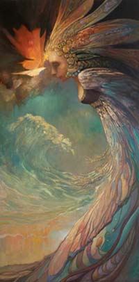
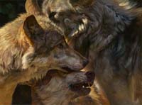
I particularly enjoyed the other examples of Julie’s work: the Wolves which are so beautifully detailed, and that nebulous elemental-like being.
Does anyone know why Amazon has pulled this from it’s Kindle store? It’s not available in the US.
Thanks for all the notes, guys. My panel of experts..errr…Jason, Leigh, Megan, and I are talking them over. Of course, Harriet has the real say. ;-) But keep the ideas flowing if you got em.
@87: PATH wont be out until the 18th. At that point it should be available at Amazon, Sony, Ibooks, etc.
Thanks for the response. It just seemed weird that the Kindle store shows all the other future releases but PATH is missing (just one week out from launch). I’m sure it’s just being updated with the new artwork, etc.
Looking forward to the 18th.
Thanks.
Arrgh… “lose”, not “loose”.
Would have been interesting to have included Caire in the picture, to see Julie’s take on a Sea Folk outfit. Granted she is a minor character, important for the BoW scene and not much afterward.
tharker89:
There is definitely something weird with Path of Daggers kindle edition on amazon.com
In the past, the Kindle editions of this series have been available for pre-order about a week before release (or more). As of May 15, 3 days before release, there is no pre-order for Path of Daggers. But as you say, all of the other books (Winter’s Heart, Crossroads, Knife, etc.) can be pre-ordered for Kindle.
Also, there is a non-US kindle version of Path of Daggers available for pre-order.
I think somebody at amazon screwed up somewhere. Hopefully it gets fixed by the 18th. Maybe someone from Tor should contact amazon about it.
I called Amazon, and they say that Tor did not give them the go ahead to accept pre-orders for the kindle version of “The Path of Daggers”. Odd.
I guess we will see tomorrow whether The Path of Daggers is available in a kindle edition. I give it a 50% chance that it will be available on the 18th, depending on whether the lack of pre-orders is just that, or whether it is because there was a computer error with getting the kindle version of the text to Amazon.
Not being able to pre-order definitely makes me antsy. I sure hope they figure out this problem soon. Otherwise I’m going to have to whip out some international proxy / VPN action and get it that way. Restricting things based on IP is so LAME.
I just checked with our Ebook peeps. they say there is an issue with the pre-order that they are trying to work out but, that should not effect tomorrows “on sale” date.
Apologies for the hassle.
It’s up on the Kindle store now. Showing the 18th for delivery. I can preorder it 3 hours before it’s sold. Better jump on that. :)
Thanks to everyone in helping get this straightened out.
Hey, nice work on the cover arts lately… really, really great artworks!
May i suggest again, villains in the next e-book covers? i mean, at least one villain would be nice. =)
Planeswalker,
I’m afraid the next one wont be a villain…But that’s been on my mind as well. I just wish I had more books to play with!
Doesn’t Book 2 have Lanfear in the distance?
(Just kidding; I appreciate your point, Planeswalker. Maybe we’ll get Semirhage for Book 11 or 12?)
Another great ebook cover, and definitely one of the most striking. It’s been a while since reading tPoD, but this scene conveys a lot of emotion, and it’s great seeing three main characters together, two of which we’ve yet to see.
And while the bowl is more elaborate than I’d imagine it to be, I find nitpicking at points like that, as well as each of the characters’ perspective heights and attire and so on, to be exactly that; nitpicking. I pray that these ebook covers soon replace the current paperback covers that are in print. I’d be hard pressed not to buy the entire series again if that were to happen.
I think it is the worst cover in the new series. The artist has given a cheap and lazy rendition when you compare this to her other works which are so rich and vibrant that you are pulled into the snapshot of the worlds they depict. This is shoddy. The painting itself is not fully finished. The colours resemble a childrens’ palette and the perspective is terrible. Apart from the poorly structured and coloured attempt, the scene is badly constructed. Lan’s ring is too small, the weaves look like smoke, the bowl is nothing like how it was described in the book – its a complete copy of the real-life bowl used in the studio and how you guys think this is good is beyond me. Look at the art work submitted for the other books and really compare this tawdry effort. I am sure you will agree that the book and especially this important scene deserved more.
Wait a minute – where are the Windfinders? It was the Windfinders that struck the bargain to use the Bowl of the Winds and it was their leader that took control of the circle that activated it.
This is soooooooo wrong.
And while Jordan describes Elayne as having red-gold curls on many pages he emphasises her golden curls. The bowl was a dish that had clouds and blue skies that progressively darkened and no where is pinks yellows and greens – what have those colours to do with changing global weather?
This is the worst commission for a book cover I have ever seen. Julie Bell should be ashamed of herself and as for Tor.com – they ought to ask for their money back and have a new artist furnish the cover art.