


Crossroads of Twilight, volume ten in Robert Jordan’s The Wheel of Time, will be available in ebook form on July 20th. In celebration of Jordan’s work, we have commissioned fourteen artists to interpret one of the Wheel of Time books in their own style. (Previous editions can be seen here. The first seven ebooks can be purchased here.)
For this installment, we turn to one of my personal favorite artists, Greg Ruth. (I would brag that I own a few of his drawings, but my mom keeps stealing them.) Greg combines sumi-e’s elegant style and expressive line with a modern narrative sensibility. His work spans all genres and applications—book covers, picture books, comics, advertising, even video animation. It was a pleasure to finally work with him.
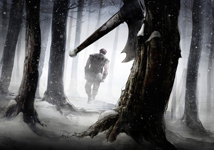
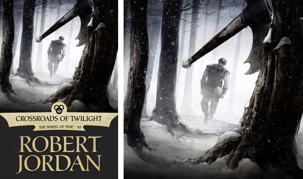
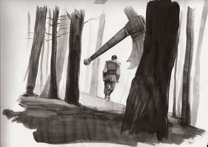
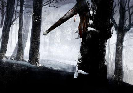
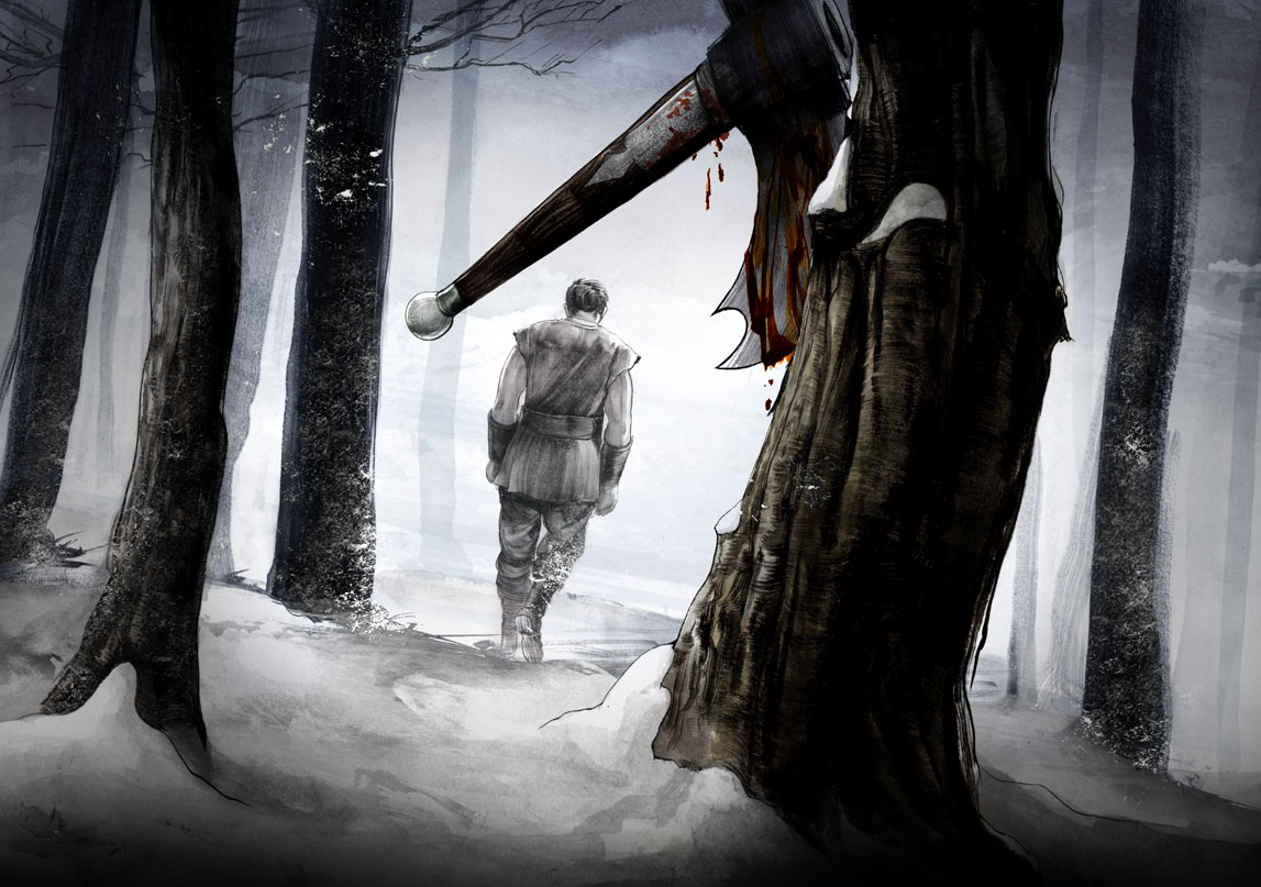
With Crossroads, we wanted to show Perrin at his breaking point. After engaging in a despicable act he, in a fit of justifiable rage, finally chooses to throw away his axe of war. The trick was getting the moment right. Attempts to show the action came across a bit cartoony. Instead, we decided to depict the minutes just after. The point was to show what Perrin, in this character-defining moment, was leaving behind.
Striking the right emotional chord through mood and atmosphere would be no easy task. According to artist Greg Ruth, “There’s a time in winter here in New England where it’s early in the woods and the canopy of trees keeps the snow from getting too high on the ground, but it’s cold as hell and so deathly quiet. I loved the idea of trying as best as I could to convey that silence and chill as a kind of indictment on the bloody events that precede this scene. If the idea was to get the moment after the action, then the world surrounding the figure and the axe had to convey the emotion as much or more than anything else. Capturing that particular lighting was tough.”
The story of Wheel of Time is a fabric of profoundly difficult and personal decisions. In the end, Greg Ruth created a moment when a giant hero with the weight of the world on his shoulders is at his own private crossroads.
Here you can follow us through a number of decisions we made throughout the process:
From Greg Ruth:
“These are of course the various sketches… I was basically trying to hit the three major poles of how to approach the cover—the emotional, the actionable, and the narrative versions, mostly on the premise that action tends to want context to give its intent purpose. Or at least that’s how I thought of it.
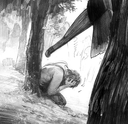
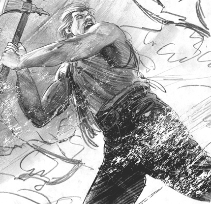
“This is the final approved sketch where we nailed down the overall piece, though still needing to get the axe right, as you can see…
Detail:
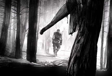
“This is the underpainting of the final—basically blocking it all out and getting it placed. The pose of figure was, to put it mildly, awful. While the axe was now correct, the tree and landscape was not so much.
“This is one of the process pieces after realizing I wanted to make the figure separate, both because the initial attempts seemed below par, and also in anticipation of changes. The foreground tree was redrawn several times. The tree, while of course merely a tree, was more than that in this case. Getting the right kind of look to it without detracting from the focus on the axe and the figure was difficult and took several iterations and tree drawings to get it closer to the mark. In this case having already decided to apply the figure separately, I attached the landscape alone for a time to better get that particular note down more clearly. I also thought the darkness of the foreground was too much and wanted to add more snow and chill to everything. This is also when I started experimenting with the idea of snow drifting down all around to convey the idea of tears falling.
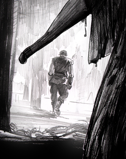
“And finally, we have the near-to-last version, with better snow but still some major problems with the figure’s emotional delivery and pose, the trees and the sense of snow and cold air that needed to be worked on. The forefront tree is better here, and adding a bit of warm color to it popped it out from the background nicely, but it wasn’t quite rooted enough.
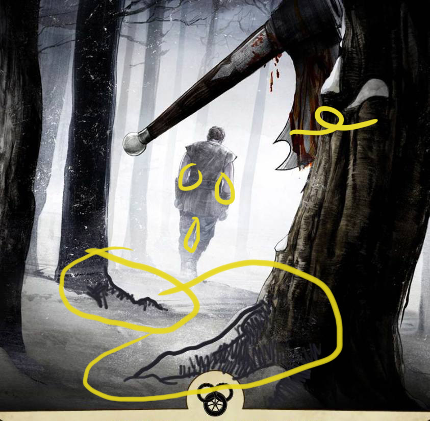
“Also, the blood was removed from the axe, not so much for making it all the more family friendly, but because it seemed more of a horror notion than one of fantasy. The idea is to keep the attention on the emotional violence and aftermath of the act rather than on the grubby realities of the physical act itself. It’s easy to lose sight of that working on a piece so intensely, and this is when you need a fine bit of art direction to come in and remind you to stay on course.”
From Irene:
“At this point, I wanted to make a few tweaks; I thought the sketch had a little more “step” in his step, so we just needed to open up the negative space between his arms and legs to help us define his silhouette. I also thought that extending the roots would give us a little more depth of field. And wanted to get rid of the blood; it seemed to be taking away from the narrative we wanted to express.”
To keep up with all of our Wheel of Time posts, including information on the ebook releases, check out our Wheel of Time Index.
Dragonmount feature on Crossroads of Twilight ebook cover.
To see more of Greg Ruth’s illustrations and children’s books, please visit his website.
Previous Tor.com interview with Greg Ruth.
Great art, my wife just actually finished reading this scene and said this captures the intensity really well. Here comes another request to have these all published in a book or as posters.
Wow… that’s amazing. I gasped when I pulled up the image.
I’m intrigued by the choice to rotate the image away from vertical just a bit. At first I didn’t like it, but I admire the way it leaves a sense of disquiet and violence behind in an otherwise calm scene. It’s as if the tree was still vibrating from the impact. Very powerful.
Congrats to Greg for a wonderful image that works both as an illustration for the book and as art in its own right. Well done!
Beautiful. I think it captures the deliberateness of Perrin, the pain and sorrow. The light, trees, snow, the slightly tilted head. It’s very emotional.
I love reading the artists’ thoughts on how he approaches the artwork. Getting a visual depiction of words and emotions is so difficult and elusive, plus he had a cadre of fanatic fans to deal with. Very well done!
Did I mention, it was beautiful?
Excellent cover once again! There is so much expression in Perrin’s shoulders. It is terrific to see how each cover evolves, and it almost goes without saying how much better these covers are than the original hard cover ones.
I like this a lot. Not one of the flashier covers, but it grows on me by the minute. I also liked seeing the rejected drafts; I appreciate that the artist considered “action shots” and rejected them in favor of the closing shot of Perrin walking away. For me, that’s what the scene is really about: not the act of torture, but the choice that follows.
Thanks to everyone involved for putting this together. I really look forward to these.
Excellent scene, depicting the struggle of Perrins choices.
Wow, again! I love these covers. As Tek said earlier, so much sadness and pain in a man’s shoulders.
Thanks for the peak inside the mind of the artist and a look at the process as well.
Mis-moved
After having just listened to this scene on the audiobook, I must say that this is exactly how I pictured it! You got it right in my book. The emotional intensity, the choice to walk away from the axe — you couldn’t have done a better job!
Great stuff! Thanks again for providing the conceptual commentary as well.
I do like the image, and it does convey Perrin’s state very well. I would have kept some of the blood (not all, it was a little heavy). After all, the scene that forced this choice was particularly bloody.
Looking forward to having the eBook!
One of my favorite scenes, and the depiction is stunning. Thanks to both Greg and Irene for the details on the process. I am always amazed at the work that goes into these covers.
Thanks, guys!
Greg is amazing. A highlight of my week is seeing his “52 weeks project” come into my email. A drawing a week all year, with equally interesting commentary.
——-
Next on my plate are some great sequences for KoD and TGS.
Then, I need to some really fun scenes for the young-adult editions. Suggestions _always_ welcome!
WOw- thanks for the kind words everyone. It comes as a tremendous relief that we came close to meeting the high expectations of the loyal fan base of this series of books in this image- It was especially important to all of us- especially everyone at TOR that we honor that devotion, and brings big smiles all around to think we did so. It’s nothing short of an honor to contribute to this series and to be in such company as those other wonderful artists who’ve contributed to it so far.
Let me also say how rare and awesome it is that Irene posts so much of the process work up online like this. Just reading the previous posts is such an education in all of our insane ways of working- it’s a great peek into the individual studios.
And yes- if anyone would like to be a part of the 52 Weeks drawing series, please feel free to drop me a note and I’ll put you on the list. (greg@gregthings.com) We’re down to the last twelve drawings of the series, so it;s a great time to come aboard and keep me honest each and every monday!
Thanks again everyone-
Beautiful cover! I love the stark color palette, the slight off-center tilt.
I’ll reiterate what I’ve been saying for months- please, please, please release these images as posters, a calendar…something! :)
The best of the bunch (I would say “by far”, but they’ve all been pretty great).
I know that they’re being intentionally released as low-resolution images, but is there any chance these will come out in a resolution suitable for desktop wallpapers?
For KoD… perhaps Mat & Tuon’s “wedding” or Egwene in novice white scrubbing floors. Perhaps Nynaeve sending Lan through the gateway, or OOOOOOOHHHHHHH Taim sitting in audience of the Reds would be a ridiculously cool snapshot.
ZOMG, shivers! I love it!
I will also join in on the keening for Wallpaper-sized images!
I would also really really appreciate high-resolution versions of all these amazing new covers. I really want to use them as screen savers for my kindle!
Seriously, “Wow” was the first word I thought when I saw the cover. I am on my phone and the image is that great even in small format.
At first I did not know this was the new ebook cover for the wheel of time series. I just wanted to read the book it represented.
Truly a great cover.
Wow. Awesome job on this cover, Greg. You captured the emotion perfectly. Love the expression of the shoulders too. And that quiet of the winter radiates from the image so well.
Love this cover.
Not a flashy, colorful cover, but it captures the scene well.
The axe doesn’t look right to me (the description sounds much like a Lochaber axe to me), but that is a minor quibble.
There is nothing better, in my opinion, than a picture that gives you the story of its subject without saying a word.
I bet I could show this to someone who’s never heard of the Wheel of Time, and they would be able to divine the emotional gist of the moment without knowing a thing about Perrin. Grief, stark, cold, abandonment, regret, irrevocable, choice, guilt…
Damn good stuff.
Greg-
Stand up job. you’ve abley captured the most dramatic moment in a book that lacked major climactic moments. I would have left one drop of blood on the axe, but otherwise, this is great.
A big “what they said” to the commenters so far, especially Leigh and rosetintworld @6. The choice of scene over the other possibilities is exactly right — the walking away is the essence of what Perrin is doing here, and the image of him departing a rejected weapon, from almost the weapon’s point of view, is chilling and really tells the tale. Fantastically well done.
I suspect we will be seeing more echoes and consequences of this moment in ToM than we have so far, with Perrin (presumably) closer to center stage but in post-rescuing-the-wife status. I know, I know: RAFO.
S
These covers are far better artwork than the original. I feel I must dissent a little on the overall body of work, though. For us fans, we know each of these scenes by heart and can tell what they are saying. To the unenlightened, I don’t think they give a good representation of the series. I assume the point is to sell books to new readers of the series as well as us. The only cover so far that accomplishes that is LOC imho. The rest would not make me say, “Hey, I gotta read that!” I’ve gotten four new people reading the series just by showing them the video of the LOC cover.That being said, they are all visually stunning and the scenes they depict are done in great detail.
I must admit I didn’t get this one at first. The color of the axehead was too close to the tree color and I realized it was Perrin and the axe only after starting the description. Personally, I liked the concept of the first discarded sketch in theme. The final did not hit me emotionally like it did with most of you. (I usually do need a bigger clue-by-four.) I think a hint of blood on the blade would have conveyed a little more info about his struggle to outsiders and the color would have been in stark contrast to the dark trees/axe and white snow.
I don’t want to come off like I’m hating, because I like all the new covers. I echo the call for a collection or calendar with the new images.
I like! I like!
(I will read the artcle in a little while.)
This is perfect; infinitely better than the misleading “Something actually happens involving Mat” cover of the original. This is the one standout scene in an unfortunate low point in the series, but this cover alone (finally, a Perrin cover) instantly redeems much of its shortcomings.
Even at a glance, the cover perfectly fits the theme of the book’s title (again, something the print cover failed to do).
I wanted to see the big version, but DM is down. :-(
I haven’t gone back to re-look at the previous covers in the series, but I think this is the best of the bunch so far. It’s perfect.
(For hardcore fans it really works well because it depicts a very momentous scene, captures it perfectly, yet doesn’t put a face on Perrin. Can’t complain that his facial features if you can’t see his face. :)
Absolutely lovely.
The eBooks look good; but if you live outside the US, you won’t be able to buy it.
I really hate geographical restrictions on eBook purchases. Nothing like shooting yourself in the foot.
Dragonmount is back up!
Here is a link to the full size version:
http://www.dragonmount.com/News/?p=1335
editted to ask: How do you embed a link??
Jenn, here you go. And linked above:
Dragonmount link
Greg,
Thank you.
I have appreciated and enjoyed every one of the eBook covers so far, from Rand atop the Spray’s mast, to the saidain-wrought destruction of Dumai’s Wells, to Lan pulling Nynaeve out of the river. By a very large margin, however, this is my favorite so far. This most decent of young men is beaten down by evil, by duty, by his own ta’veren nature, and by burdens both mundane and arcane. The sense of simultaneous resolve (leaving the axe behind) and resignation are clear in his posture.
Beautiful work.
Irene, yet another home-run. Mark me down for one of those calendars or wallpaper sets that absolutely must be produced of these covers.
JennB,
Click on the link atop the comment box, like this:
Comment (bbCode allowed):
And you’ll get the tutorial for coding links or text formats.
Amazing job Greg, one of my favorite scenes and you captured everything i loved about it.
Yes, I agree with all. Beautiful and sad all the way.
Congrats Irene! Masterful job on selecting e-book covers. Really really great! :)
Once again, wonderful job! For me, it speaks not only to Perrin, but to the idea of crossroads more generally. The path between the trees, with Perrin in the background, conveying the idea of journeying making hard choices.
Fabulous.
When I first thought about the CoT cover, this was the scene I had in mind. Oddly I imagined almost exactly this picture but with Perrin the foreground and the axe behind. Fascinating to see how changing it round adjusts the emotional impact.
LJ.
Another great cover. Making these e-books covers into posters or a way to make them backdrops on desktops would be awesome.
Mat & Tuon’s wedding scene for KOD cover and Egwene from Fount of Power chapter from TGS for the win!
Just amazing. Beautifully done and as others have stated catches the intensity and emotion of the scene perfectly.
I agree the angle gives some additional humanity to the scene. And I like the decision to remove the blood from the axe.
Thank you both (Irene and Greg) for sharing your work.
I must join in and say that this cover is absolutely awesome! The first time I saw it was on the smaller screen of my phone, and even then it just caused me to say wow.
Count me as an eager supporter of getting these covers in a poster or calender format. They have been an amazing edition to the WOT fandom.
Great art! All of the ebook covers are gorgeous. As much as I like this cover, though, I must say I really don’t care much for Perrin. I just think he’s one of the least interesting main characters in the series.
Re: Brad21088, well yeah of course he isn’t interesting cuz all he thinks about is Faile every other sentence.
Very nice, can’t honestly say my favorite, and I’ll have disagree and say I liked the blood – he did just torture someone. But, still, very nice. Perrin’s not currently my favorite character, but for the first 4 books he was. Here’s hoping he’s about to get his awesomeness back.
Also, I would like some posters please. :)
Also forgot to say thanks for picking my favorite scene in the book!
I rather suspect that it’s already in work, but if it were not, I’d suggest for the KoD cover not the wedding scene between Mat and Tuon, but from A Stave and a Razor, where Mat presents the horse to Tuon. A view with Tuon examining the horse while turning an impressed and appreciative eye toward Mat, and Selucia with arms crossed staring at him, wondering if he really believes this trick will work on her Mistress.
Or, you could use that most significant scene from the next chapter, A Cold Medallion:
Didn’t make the breeches tight enough.
In LOC we are “treated” to more of Rand than I care to see. Ever. We seem to have broken from tradition here as it looks like Perrin’s pants actually fit him.
Yay.
Mind you, we know what we know. For John Q on the street, the art is quite somber. Works as that is what you are after, but we miss the butt whoop that went on in the book too.
Woof™.
This has been one of my favorite covers. I’m glad not to be able to see Perrin’s face, he is one of the characters for whom I have a definite vision. I’m also quite struck by the eloquence of the set of his shoulders as he is walking away…
Glad to see most of the blood removed; there are hints of it on the tree which is much more subtle. Overall the artist did a fantastic job of capturing the chill of the winter forest. Great job!
Another great cover. I’ll add mine to the other requests to release the e-book covers as posters or (better) a calendar.
Cover suggestions for the YA editions:
EotW 1: Rand throws the soup kettle at a trolloc
EotW 2: the Green Man in front of the Eye
tGH 1: Ba’alzamon shows the three ta’veren to the darkfriends (why are there no covers for the bad guys?)
tGH 2: the Horn Heros appear
First off, absolutely love this cover (oh, there you are Perrin, I wondered where you’d got to) and most of the previous ones.
Secondly, and slightly embarrassedly, I turn to a little self promotion. As part of my recent Graphic Design degree I decided to have a stab at the Wheel of Time, as i love it so much. You can see what i came up with here on my blog, let me know what you think on there if you would, cheers.
Wolfbrother Out
Thanks everyone for the great cover and article.
As for the KoD cover, the books all blur together for me and I can’t think of a particular scene, but from the suggestions so far, I would vote for John Sloan’s idea of Taim and the Reds. I don’t even remember what happened in that scene, but it sounds promising.
Whenever I read Mat in his fancy duds, I picture a flamenco dancer and hear a fast-strumming Spanish guitar. Ole.
Hmm…cover ideas…for the Youth editions, you could do the Amyrlin’s visit to Fal Dara, or “Five shall ride forth” for the second half of book 2. Get some pomp scenes and all three ta’veren together.
Love the cover–to echo what others have already said, it captures the scene perfectly and is my first choice for any scene from this book.
Wasn’t going to post anything, as other’s have already made the same points I would, however I just need to post the comment my youngest son said after he saw this picture. Mind you, he’s 8 and hasn’t yet read the books and is not yet familiar with Perrin. (He knows who Rand is, but that’s only because his older brother bears that name.)
His comment:
“You know what I think would make this picture better? Wolves in the background. For some reason I think of wolves when I look at this.”
Dunno why, but that gave me chills and had to share it.
Yipes! That may be my favorite comment yet! Love what kids see in things that we don’t. Thanks Bchurch!
An excellent cover. I won’t bother to parrot what others have said, but it really does capture the moment.
For KoD I’d suggest the scene of Tuon watching Mat squatting and plotting his strategy on the map with Master Roidelle. Perhaps the moment when she motions at Edorion to step aside. I’ve always thought that this scene from the POV of Tuon was pivotal in so many ways.
Does this remind anyone else of the famous Spidey panel from Amazing Spiderman #50?