


In the 1930s, readers at a typical newsstand could choose between two basic levels of magazines: those known in the industry as “glossies”—printed on glossy coated paper that permitted crisp text and refined images—and “pulps”—printed on rough, low quality paper made from cheap wood pulp.
A glossy magazine would set the reader back 25¢ (not an insignificant price for entertainment in the midst of the Great Depression), but for a dime, a reader interested in adventure, mystery, fantasy, horror, or science fiction could go home clutching a digest-size pulp magazine full of stories and illustrations.
Though pulp magazines had glossy covers—the better to lure your dime with lurid, sensational cover art—the interior black and white illustrations were much simpler than interior illustrations in glossies because of low page rates for artists and the limitations of reproduction on the cheap paper.
That changed noticeably in December of 1935, when Weird Tales first published the work of an strikingly different new illustrator named Virgil Finlay.
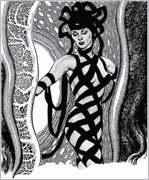
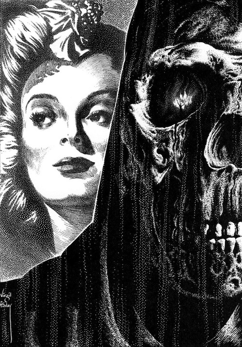
Finlay’s depictions of fantasy and horror subjects, drawn in a unique style and much greater detail than was common in the pulps, made him immediately popular with readers.
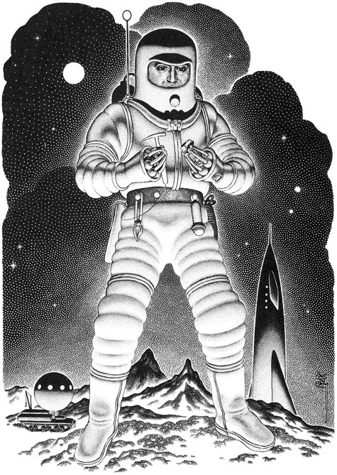
He produced wild and fantastic images of monsters, aliens, demons, robots, spacemen, spaceships, bizarre experiments, psychological horror, fantastic landscapes, and… women. Lots of beautiful women—enigmatic, endangered, entreating, entrancing, sometimes menacing, and often suggestively dressed to appeal to the pulp magazines’ largely male audience.
All of these subjects were rendered in a eye-popping drawing style that can still stun the uninitiated. Among others, H. P. Lovecraft became a fan, and wrote a poem about one of Finlay’s illustrations. The pulp reading public made Finlay one of the most popular and in-demand artists in the field.
In a career spanning 35 years, Virgil Finlay produced over 2,500 illustrations. This is particularly remarkable when you consider his working methods.
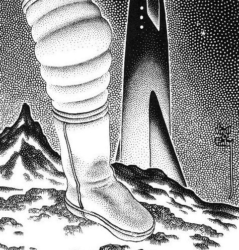
Instead of the typical pen and ink or carbon pencil drawings produced by most pulp illustrators, Finlay used a unique technique combining scratchboard—in which a clay-covered board is coated with black ink and the artist scratches away white lines from the black using a sharp blade—with intricate pen cross-hatching and an astonishingly painstaking method of creating tones called stipple.
Contrasted with hatching, or crossed lines, stippling is a time-consuming process in which tones are created with hundreds of tiny individual dots, carefully placed and dripped off the end of an ultra-fine dip pen, one dot at time.

Finlay was able to combine these techniques to produce amazingly detailed and textured images in a way that came across even on the cheap paper in the pulps. He was unsurprisingly late on deadlines, but the fans loved him, so the publishers made allowances. What is harder to understand is the level of dedication to his art that, given the rates for interior pulp illustration, allowed him to invest so much time and effort for so little financial return.
Those who have seen his original art are often similarly amazed that the majority of it was drawn, not at one and a half to twice the printed size, as was common, but at the size it was printed!
Finlay also worked in color, and produced a number of covers, but it’s the black and white images that stay with you. He kept working through the early 1960s, despite the sharp decline in the popularity of pulp magazines, finding work for astrology magazines.
Unfortunately, Finlay’s life and career were cut short by illness before the revival of interest in his work in the 1970s, when some of his images were collected and reprinted in a series of collections. These were printed on glossy paper, showing his drawings to be even more eye-popping than in the original pulps.
Another series of collections, which drew to some extent from those in the 1970s and added additional images, were published in the early 1990s. These are out of print, but can often be found at reasonable prices through used book sources.
There are also a few sources for viewing examples of his work online, notably on Monster Brains and The Golden Age. (The latter is a search link, and includes articles not specifically about Finlay. Keep clicking through the “Older Posts” link at the bottom of the page.) You can also find some Finlay on Tumblr and by doing some searching online.
Virgil Finlay’s unique approach to drawing, coupled with one of the most fervently strange and free ranging imaginations in the history of fantasy, horror and science fiction illustration, produced a legacy of stunning black and white illustrations quite unlike anything else.
Charley Parker is the author of the visual arts blog Lines and Colors and the creator of the interactive webcomic, Argon Zark!
Whoa. Those are stunning.
“to appeal to the pulp magazines’ largely male audience.”
Does anyone know if that’s true or just a stereotype? There were a large number of pulps that were aimed at a more female audience — romance genres, etc. I’m wondering if people generally think of the pulps as only being the more famous SF, Detective, and Horror titles.
Finlay didn’t have to get by just on pulp rates. He also drew for some of the glossies and was occasionally on a magazine staff, which meant a salary. Usually not for very long, given his deadline problems. He also did book illustrations for major publishers. For example, A. Merritt’s Ship of Ishtar.
@2 In context, that phrase is clearly referring to the pulp magazines Finlay was working for, which were SF/F and horror.
I would guess that, at the time Finlay was illustrating pulp SF magazines, that if the readership wasn’t largely male, the editors thought it was largely male, and pitched their wares accordingly. Although I also seem to remember John Campbell querying the Analog readership (or perhaps that happened when it was still called Astounding) and printing statistics about the answers those readers gave, and it was a largely male, largely college degreed, and largely professional engineer readership.
I don’t recall whether Finlay illustrated Analog stories–if my recollection serves me correctly, it was in the pages of Galaxy where I first encountered his work, back in the early 60s. And the detail he put into those pictures just blew me away. They appealed not only as works of art, but examples of incredibly dedicated craftsmanship. I am lucky enough to own a couple of those anthologies of his work, and they are among the favorites of my books of artwork.
Underwood Books, the publisher of the annual Spectrum Best in Contemporary Fantastic Art series and the beautiful Frazetta collections, may still publish a Finlay collection, tentative title Future Past: Worlds That Never Were. Amazon (.com and .ca) still has a listing for it. It looks like it would be a gorgeous (and expensive) book. Perhaps Underwood will devote the resources to publishing the book if enough people contact them and express their interest in adding it to their collections.
A quick note to Virgil Finlay fans, THE COLLECTORS’ BOOK OF VIRGIL FINLAY was released late last year by American Fantasy Press. Over 100 B&W illustrations and 48 pages of color. Check out our website: americanfantasypress.com.