


When it comes to book covers, sales departments have often had more clout than the poor beleaguered author. Covers are designed to catch the eye and spur sales; any resemblance to what is actually in the book may be coincidental. I think the publishing world (well, the reputable publishing world) has been getting somewhat better at producing covers that are handsome rather than garish and that do justice to the contents of the book. But in decades past… publishers plastered some really, really deceptive covers on their output. They had a notion of what would attract a stereotypical SF reader and that’s what they told the artist to paint. If old-time covers are any guide, SF fans were perceived as liking space ships, grim-faced men with guns, and naked women (as documented in the song “There’s a Bimbo on the Cover of My Book,” sung to the tune of “She’ll Be Coming ‘Round the Mountain”). With the exception of the readers of Berkley SF, who, judging by all the Richard Powers covers, were seen as attracted mainly by blobs and lava lamps.1
It would be easy (like shooting fish in a barrel) to offer examples of hilariously inappropriate cover art from the days of my youth. I could eke a compelling essay out of the covers that forced me to explain (yet again) to my teachers that no, I had not brought pornography to school.
I’ve decided to take the high road: Here are five covers that delivered exactly what they promised (even if that might seem unlikely…).
And because I like to spread praise around, this essay is not going to be “Five Covers by Michael Whelan.” It could be, because it’s clear he reads the books for which he creates covers, but it isn’t.
Inherit the Stars by James P. Hogan, 1977, cover by Darrell K. Sweet
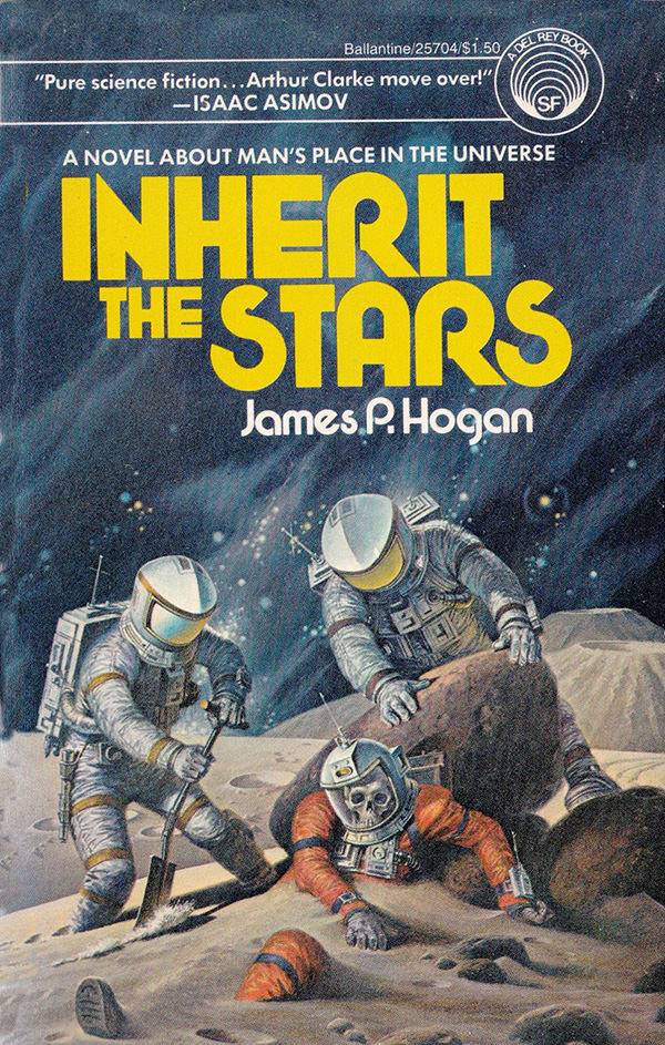
I’ve never been a great fan of the works of the late Mr. Sweet, but this cover did exactly that it was supposed to do: convince me to take the book off the shelf and hand the proprietor a buck fifty. Not only that, the cover didn’t lie to me. Sweet did take a few very minor liberties (in the book, the corpse is found in a cave, not out in the open), but otherwise the cover promises exactly what the novel delivers: a long-dead guy on the Moon and the story of how he got there.
Protector by Larry Niven, 1973, cover by Dean Ellis
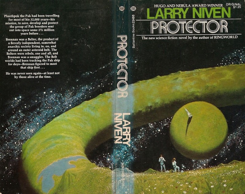
Dean Ellis’ cover depicts something that orbital mechanics fans might dismiss as nonsensical: a torus-shaped world with a smaller, more conventional worldlet in the middle. This peculiar setting is drawn straight out of the novel, which concerns a recluse living in an odd setting enabled by super-advanced technology—it’s one of two striking settings to be found in the novel. Ellis chose the setting that wouldn’t later feature on Rick Sternbach’s cover for the mid-1970s edition of Neutron Star.
The Doppelgänger Gambit by Leigh Killough, 1979, cover by Michael Herring

Herring’s cover captures two key elements of this gripping 21st-century police procedural. The first: the two police officers don’t get along. The second: clothing fashions in this future are somehow even more hideous than real-world 1970s fashions. The cover is true to the work. Detective Janna Brill thinks Maxwell takes unconscionable risks2, and these are the clothes described in the novel. (Though I suspect the cops in the novel used holsters.)
Lamarchos by Jo Clayton, 1978, cover by Michael Whelan

As previously mentioned, Whelan clearly reads the books for which he paints covers. Readers who purchased this Diadem novel bought it secure in their faith that at some point series, protagonist Aleytys would get medieval on an offending space craft. Indeed, the scene in question occurs towards the end of the novel. There’s just one puzzler: what the heck is Aleytys crouching on?
Forerunner Foray (Warlock series, third book) by Andre Norton, 1973, cover by Charles Mikolaycak

Readers might think that Mikolaycak’s striking cover for Norton’s third Warlock novel is a collection of generic images intended to alert readers to the fact that this is an SF novel. But most of the elements on the cover—the woman, the stone, the man with the migraine, and the six-limbed toucan—can, in fact, be found in the book.
So, there you have it: five striking 1970s covers for which the artist read the book. No doubt you have your own favorites—feel free to mention them in comments.
In the words of Wikipedia editor TexasAndroid, prolific book reviewer and perennial Darwin Award nominee James Davis Nicoll is of “questionable notability.” His work has appeared in Publishers Weekly and Romantic Times as well as on his own websites, James Nicoll Reviews and Young People Read Old SFF (where he is assisted by editor Karen Lofstrom and web person Adrienne L. Travis). He was a finalist for the 2019 Best Fan Writer Hugo Award, and is surprisingly flammable.
[1]I realize I’ve left out one school of 1970s cover art: assemble random elements half an hour before deadline.
[2]Brill is a methodical plodder, but she ends up with fewer bullet holes.
There are some covers out there that *still* seem to adhere to the ‘random elements assembled half an hour before deadline’ school of graphic design. Except now those elements can include MS WordArt, so I’m not sure but that the 70s have us beat.
Someone please photoshop that Doppleganger cover into the ‘two women scream at cat’ meme.
Damn, how I love the artistic style of 60s/70s sci-fi and fantasy cover arts! They made the books and the stories themselves look and sound even better. I mean, Anne McCaffrey herself claimed Michael Whelan’s beautiful cover arts helped sell her books.
Given the story of Inherit the Stars, the dead man’s spacesuit should not have been so similar to his discoverers’. But that’s a minor point.
I’d also query where the flesh went from the skull, with no atmosphere for microbes to survive in whilst breaking it down, but again, that’s a minor quibble.
When people mention terrible book covers, I’m always reminded of the US cover of Saturn’s Children by Charles Stross. It’s a good example of authors not being given any control or input over their book covers.
The UK cover features a spaceship (the book contains spaceships, so it’s an ok cover):
Whereas the US version, well, I’ll just let you look at it…
I’ve also never been a fan of Darrell Sweet. He’s an odd case. His covers always apply to the book — enough so that you can believe he read the thing before starting to paint — they’re well composed, and they have pretty good palettes. Unfortunately, his human figures always look like they’ve spent 70 years in the desert sun without a hat or sunscreen. Jack Chalker was a big fan of his work, though.
I think all of my 70s Berkeley books have random SF art by Paul Lehr. They have nothing to do with the book and occasionally border on the abstract.
@5 phuzz –
I believe that the US cover had Stross’s (perhaps grudging) approval – Saturn’s Children was a riff on Heinlein’s Friday, and the cover reflect this (although it’s not by Michael Whelan).
Could be wrong on this but I seem to recall it coming up on one or another forum that Charlie Stross contributed to.
Most covers for science fiction or fantasy books these days don’t compare favourably at all
with covers that were common in the sixties and seventies. Those old covers grabbed my attention
and I picked up the books to see if I wanted to buy it or not. Most now… I don’t pick them up.
I remember the oddball abstract art covers of Richard M. Powers. I think these fall into the “blobs and lava lamps” territory:
I like the cover of S.M. Stirling’s “Island in the Sea of Time”.
I keep forgetting about “Good Show Sir!”, the not exclusively British perpetual blog of bad book covers.
One of my only problems with earlier novel covers is that they look like they’ve been out of the sun too long.
Every year at Congregate (sf con in High Point NC), the Baen staff have a book promo event, and one of the most interesting topics is a slideshow of their covers from their first conception to their final form.
“…protagonist Aleytys would get medieval on an offending space craft…”
I know it’s a quibble, but that’s not Aleytys (who has fiery red hair) on the cover. I reread this a year or so ago when it came out in ebook format (if only they’d do new ebook versions of the whole series, instead of stopping at #5) and I think that’s an ill-intentioned Lamarchosan priestess/wisewoman type who is Aleytys’s main antagonist. Or maybe it’s the young Lamarchosan woman who was travelling with Aletys. If I remember right, the Lamarchosans are described as having olive skin and dark hair, quite unlike Aleytys.
@5&7, WRT Saturn’s Children, Charlie has recently written (don’t remember if it was on his blog or twitter) about his dislike of the US cover. The UK cover features, iirc, an airship over Venus, with oxygen gasbags because it’s less dense than the Venusian atmosphere.
“There’s just one puzzler: what the heck is Aleytys crouching on?”
A One-eyed One-horned Flying Purple People Eater is my guess.
I too, back in the ’80s and ’90s, was never a fan of Darrell K. Sweet’s art. I hung around in a science fiction specialty bookstore, so I saw a fair amount of it. (Although I have it on good authority that it did in fact sell books.) More recently I went to the 2013 Worldcon in San Antonio, which had an extensive retrospective of his work, and it gave me a much greater appreciation. He had a strong control of his craft: I may disagree with some of the choices he made at times, but it’s clear to me they were choices he made consciously. The exhibition included some non-genre nature paintings that I liked a great deal.
@DemetriosX:
Except for the ones that look like they’ve just stepped away from 70 years at the banquet table — did he never learn to draw mesomorphs, even from life? (I’ve met one of his models, who is not nearly as wide as drawn.)
I’ve always thought that the SF author with the worst luck in covers is Lois McMaster Bujold.
See, look at the cover for Captain Vorpatril’s Alliance:
What is even going on here and what does it have to do with the book!? But to be fair I don’t usually get along with older-fashioned SFF covers
Haha I was going to bring up Whelan in the comments only to have Mr. Nicholls head me off at the pass.
To me, Darrell Sweet *is* SF and fantasy. His style isn’t hang-it-on-the-wall in the way that Boris Vallejo, Michael Whelan or Frank Frazetta might be, but I have entire shelves of Sweet illustrated books and only selected books by the others.
Now that I think of it, I love me some Bonestell but I have no memory of whether any of his space scenes are representative of the stories.
This list would not be complete without the Hungarian cover of I, Robot on which the robot points to itself:
@18: While the cover for CVA might easily be mistaken as a setup for soft-core pornography, at least the characters *are* in the book.
It even tries to get across that Rish is a dancer.
These factors put it well above a lot of other covers from Baen, in my books — Baen covers certainly have a unique style but, uh, I don’t think it’s a good one.
Of the covers I have personally seen on Bujold’s stuff, I think my favourite one is from one of the prints of the Young Miles omnibus:
The joker playing card, with Miles’ two personas top and bottom, gets across the central concept of the stories with an elegant economy.
I haven’t read Inherit the Stars, but from this post, the plot seems quite reminiscent of Ross Rocklynne’s 1941 story, “Time Wants a Skeleton”.
A lot of Darryl Sweet’s covers didn’t do much for me. Seemed overdone and fussy.
Then, a few years before his death, he was a GoH at a local convention, and I got to see some of his originals, as opposed to what was printed on bookcovers and dustjackets.
The canvases for the original paintings were huge, much bigger than one usually sees at convention art shows. And at that size, those “overdone” details didn’t seem overdone at all. They made the painting pop, they seemed natural and appropriate and impressive. I stared at those paintings, marveling at the difference seeing them at full size made in my perception and appreciation.
The difference between the full-size works and their appearance on books was like the difference between a book cover and one of those tiny “People Also Bought…” thumbnails seen in Amazon listings.
For the worst Bujold covers, you need to go to the translations:
Somewhere around Bujold’s third or fourth Hugo, back when Usenet wasn’t a hive of spam and villainy, I asked just how many Hugos it took to get a Whelan cover. Alas, I only remember that she answered me (!) but not what she said.
AggieCon had the original of Frank Kelly Freas’ “Green Hills of Earth” on display back when I went to school there. Book sized it’s merely nice; in person it really hits you with “spaceman looking at the world he will never return to”
In 1970s UK, it wasn’t science fiction if it didn’t have a Chris Foss spaceship on the cover.
22: Time Wants a Skeleton is the one with time travel and a corpse? There’s no time travel in the Hogan. Instead they have 50,000 year old human body on the Moon. Clearly human, clearly wearing a space suit of advanced design, absolutely no evidence of a civilization on Earth at the time able to put a human on the Moon in a suit like that. So how did he get there?
Hogan plays pretty much fair with the reader: new evidence turns up, some seemingly contradictory, but there’s nothing like “oh, this particular civilization made everything out of allotropic ice and all their stuff melted,” or “inexplicably, this alien race from the core of the galaxy has a body plan exactly like the tetrapods, even though in this setting no other world has produced animals with the same body plans as Earth.”
As much as it pains authors, although you can’t judge a book by its cover, you can sell one that way. One of my favorite authors had a great cover for his first novel. It several elements of the story, albeit artistically arranged and sexualized a bit. And it had a good title. These attracted me to it. I read it, loved it.
His second book had a vaguer title, with a cover featuring some kind of future-soldier in black, holding a baby (something which didn’t exist in the tale but there were future soldiers and there were very important children, so, I guess?). I might have passed that book by if I hadn’t read his first novel and loved it enough to read his next, no matter what was on the cover.
Compare:
That’s a Youll cover for Emerald Eyes?
Moran got a cover from one of the iconic 1980s artists for The Long Run:

Personally I conditioned myself early to ignore the cover and not put too much faith in the blurb either.
@24, as somebody over on he Vorkosigan re-read posted that cover is unkind but it does capture Mile’s personality when he is in ‘bystanders running for cover’ mode.
A day late and a {dollar | pound | euro} short, but here’s a second vote for Good Show Sir, which proves on a daily basis that lack of talent knows no depths and need not be a hindrance to remuneration. Interestingly, one of the covers in the original post above made it into their gallery recently; I leave it as an exercise for the reader to find which one.
@24 Gareth Wilson
I’m sitting here giggling at what has to be the most outstanding shit-eating grin in the known universe :D
Bujold has gotten the short end of the cover art stick for years. My favorite was on one of the omnibus editions. With Miles, Elli, and Taura looking at a heads up display. I think it was by Stephen Hickman, an artist whose work caused me to pick up countless books over the years. Maybe even more than Kelly Freas, another of my particular favorites.
Just because of the focus on Darrell Sweet in the article and comments, I want to speak up on his behalf. I liked Darrell Sweet’s covers. They were eye-catching, interesting, and usually had to do with the book itself. For me, they were a positive factor in picking books off shelves.
The only downside to Sweet, in my mind, is that he wasn’t the guy who did the cover for Nazareth’s No Mean City. I really wanted Darrell Sweet the artist to be the secret identity of Darrell Sweet the drummer.
Kedamono (9): Thanks for sharing that.
a-j (26): The webcomic Vexxarr at one point involves a clash of three interstellar empires, named for Foss and two of his peers. I didn’t get it at first, not being British.
NomadUK (31): Thanks for the link!
My favorite cover artist has always been Kelly Freas. His career straddled the 70s but I always found his art tended to be good representation of the story they served as the cover for. One of my favorites is the cover for this short story collection from 1977, which brilliantly captures the title story.
I cannot recall: is that Alan Dean Foster sitting at the table?
Anyone else having issues with comments double posting?
mdauben@36: That’s a Michael Whelan, not a Frank Kelly Freas. In fact I’m fairly sure that the human man is a self-portrait of Whelan himself.
I’ll put in another vote for D.K. Sweet. The covers of the Heinlein juveniles in particular were a big part of my SF experience.
I discovered Barbara Hambly with The Time of the Dark. I bought it partly for the cover, which had a scowling robed wizard, with staff and sword, sitting in an apartment kitchen at night, holding a Budweiser and a bag of chips. And that precise scene, in all details, occurred in the book. I was terribly impressed.
On the exact opposite edge, I still have some paperbacks from, I think, the 70’s, with cover illustrations of ugly jagged messes, often involving what might be figures if you squint, but completely symmetrical.
For me there are two sets of iconic Heinlein covers: the original art from the hardcovers, and the incredibly wretched covers Ace slapped on them.
mdauben@36: As stated by David_Goldfarb @39, that is indeed a Michael Whelan. I was fortunate enough to pick up a (really quite faded) signed and numbered* print of this very cover. For $10, including the rather nice frame it was in. By sheer coincidence I lucked into a copy of the book itself, signed by the author in a second-hand bookstore for ~$8.
(Sure it’s faded, but still gorgeous, and for less than the price of the frame!)
(*) Numbered 450/1000, and the signature quite clearly says ‘Michael Whelan’.
@42 For me there are three sets of Heinlein covers. The original hardcover art, which I remember because my elementary school and JHS libraries had those editions.
Then there are the Ace covers . . . though, the only cover I clearly remember is that for “Space Cadet,” because that’s the only actual Ace copy I have.
And then there are the Del Rey covers from the mid-to-late 70s, which are the covers on the editions that I finally bought to have a copy at home because I was finally working an after-school job and had a little spending money. :-) Those for the most part are actually somewhat faithful to the content. Certainly the cover of “Citizen of the Galaxy” fits the story. It’s a Darrell Sweet product, and in any case far more evocative than the utterly prosaic cover for the Scribner’s original.
EDIT: Actually, come to think of it, IMHO the thing that made the art for the Scribner’s editions good was *not* the covers–it was the intertextual art. It’s been ages since I’ve seen one in the flesh, but those editions had bits of art mixed in with the text. Re “Space Cadet,” the Ace paperback edition reproduces just one of those pieces of art at the front of the book, but IIRC the hardcover original had illustrations scattered throughout the book. I remember those from other books, too. Those I miss!
I believe the interior art on the Scribner Heinleins was by Clifford Geary.
Frank Kelly Freas was my favorite beyond all others. His covers were usually colorful and frequently exuded a certain degree of whimsy.