


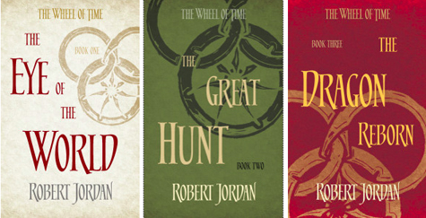
Orbit Books revealed a full set of covers for the UK editions of Robert Jordan and Brandon Sanderson’s The Wheel of Time. Like their previous editions, the new covers use the iconic snake wheels as their only visual element but, this time, take on the hand-crafted feel of a woodcut on handmade paper. The new covers will come out in the UK in September. You can view the whole set on their blog.
I like them. :)
I like them too, but I won’t be buying the books again just for the covers. As one commenter suggetsed on Orbit’s website, it will be cool if these covers are available as posters.
Orbit basically ruined the collection for me with the introduction of the new covers starting with the release of Bk. 10. So I have 1-9 with the classic covers that represent snippets from the story and the rest with that pathetic attempt at trying to imitate the LOTR covers which had just been updated at the time.
Meh. I prefer the old snake-wheel-on-black design.
For epic fantasy, I prefer the fully illustrated covers. Give me Michael Whelan or Todd Lockwood every time. These, however, don’t rise to the same level of finish. The type is very disjointed, with uneven spacing (even for the effect the designer was shooting for), an there is an unfortunatle level of predictability with how the clip art is treated from cover to cover. They look cheap. How can Tor go from great covers like A Darker Shade of Magic to this?
No. Just no. If I didn’t know anything about these books I wouldn’t pick it up based on these covers. They have a very amateurish look to them. The titles are extremely disjointed (as stated by Coffemate above) and very unpleasant to look at, especially as a designer. I wish I could have worked on these!
I like the coloring, I like the drawings, but dang I hate the font they used.
I like them. Classy. Love the font. Reminds me of the Sword and the Stone font from the animated Disney film.
I definitely prefer the beautifully illustrated covers that depict scenes from the story. It makes you feel so much more connected while you’re reading then being able to go back and look at those covers.
These covers are so uncreative, the original covers or the ebook versions of the covers are much better.