


Science fiction artist Richard Powers is among the Society of Illustrators’ newest Hall of Fame inductees, along with Beatrix Potter, Peter de Seve, Marshall Arisman, Guy Billout, Rolf Armstrong, and William Glackens. Since 1958, the Society of Illustrators has elected to its Hall of Fame artists recognized for their “distinguished achievement in the art of illustration.”
Richard Powers was a hugely influential science fiction illustrator throughout the 1950s and ’60s. Vincent di Fate wrote, in his art survey book Infinite Worlds:
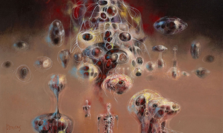
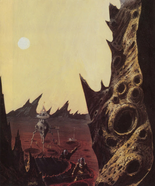
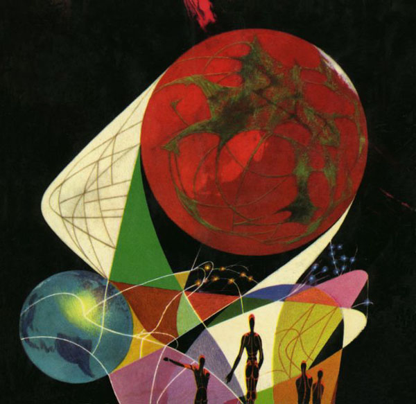
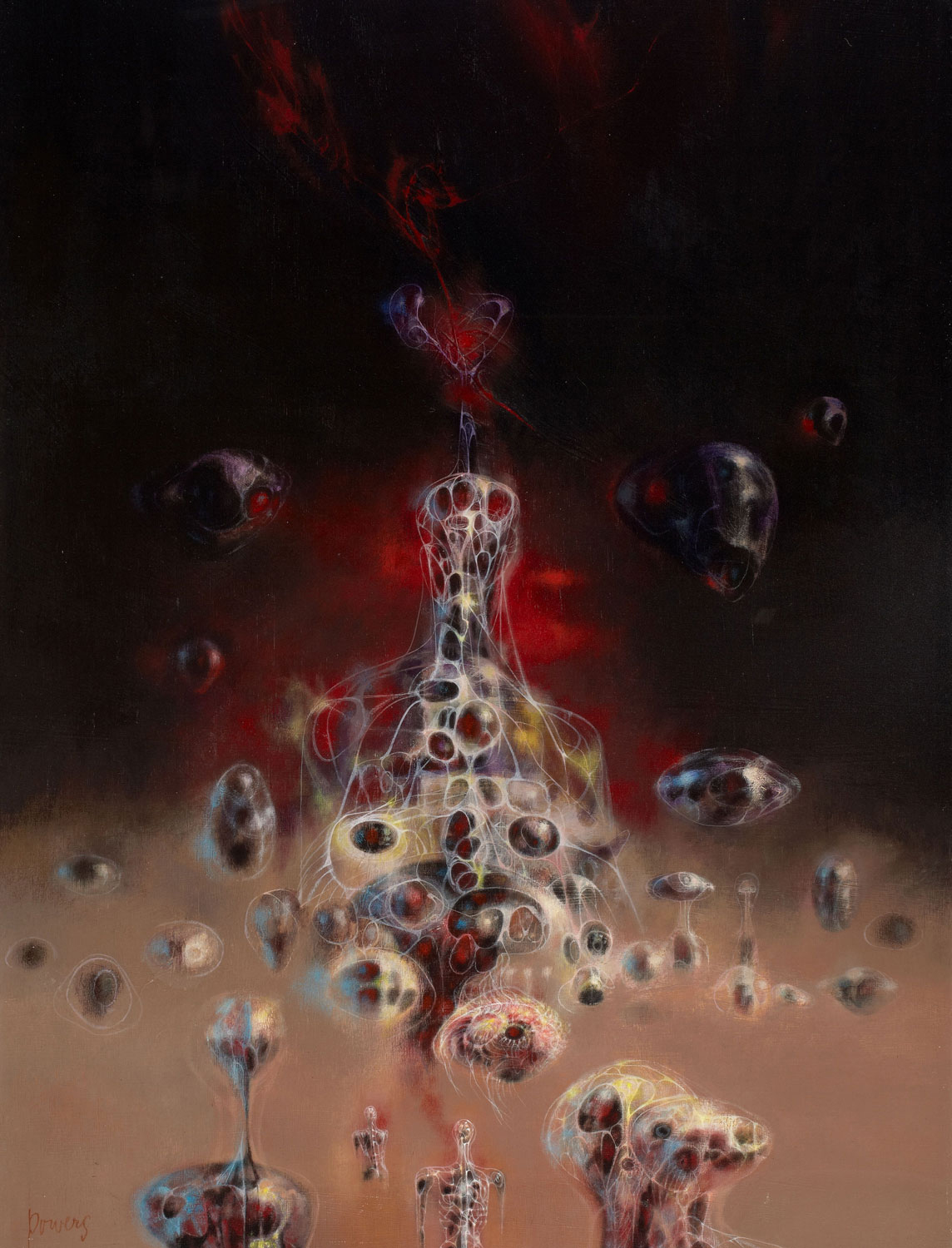
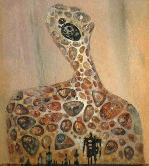
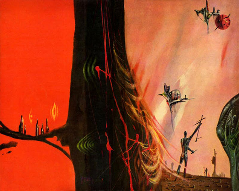
When they first appeared on since fiction paperbacks in the 1950s, Richard Powers’s surreal and largely abstract images were usual to see in the field of commercial art. The stir they created launched him on the path to becoming one of the most successful and imitated illustrators in SF, placing him in the company of J. Allen St. John, Frank R. Paul, and Chelsey Bonestell as a prime mover of the field.
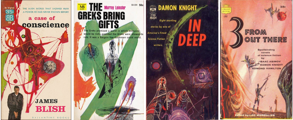
Powers was dedicated to a fine art career alongside of his commercial work—the influences of modern art were clear throughout his illustration. While trends switched towards more literal and rendered illustration in the ’80s to ’90s, Powers is still beloved today. This year’s World Fantasy Convention mounted a special exhibit of nearly 90 Powers paintings and collages. Here are a few:
I’m always glad to see illustrators get more attention.
I remember Powers’ book covers from the 60s. They were fantastically evocative, and truly gave me a feeling of the strange and alien. I got the di Fate book as soon as I knew of it. Powers is an underappreciated talent and a major 20th Century artist.
I am not keen on the abstract style of art, but have to admit that Mr. Powers was a master of it, and his work made for very evocative covers. And having started reading SF in the 1960s, I associate his work with some of my favorite novels.
Mr. Powers was the illustrator for science fiction when I was first learning to read it and so his unmistakable style has stayed with me for decades. Even when the cover artwork started to shift in the mid-1970s to the more “gritty” realism of Chris Foss and others, their workaday starships still retained the geometric color patterns and rounded shapes of Powers’s abstract chromatics.