


 The launch of any new fantasy series can be stressful. You are making a lot of decisions up front that will, hopefully, stay with you for years to come. In the case of Ken Scholes‘ The Psalms of Isaak series, the pressure was enhanced by how much everyone who came near the books fell in love with them. With the first book, Lamentation, we wanted to start off fairly bold. We also had to set a stage that was, unlike most English language fantasy novels, not necessarily set in an European medieval backdrop—they are fantasy novels set in the future with a mix of quasi-European, Middle Eastern, and Asian aesthetics. Knowing that I needed an artist that was equally proficient with multiple figure compositions and sweeping landscapes, I immediately went to Hamilton King Award-winning Greg Manchess.
About Lamentation, Ken said “I was blown away when I saw Greg’s cover for Lamentation and I just had to track the guy down and tell him how amazing I thought it was. It ended up that Greg lived just a stone’s throw away and we arranged to meet in a bar in downtown Portland. It’s pretty rare for cover artists and authors to mingle. Those relationships can get problematic, I’m told. But there was a resonance—Greg’s got this easygoing nature and his enthusiasm for capturing just the right image to draw the eye towards the book is contagious. And we both love what we do and our work goes nicely together. ”
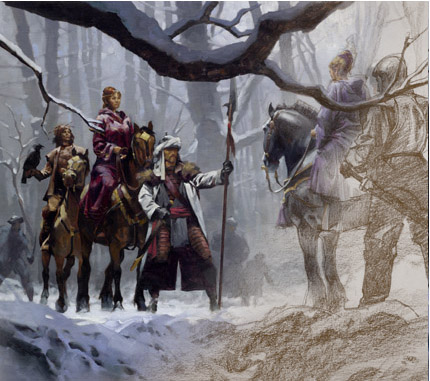
Since Lamentation had an all male sequence on it, we felt it was important for Canticle, book 2, to show off the strong female characters of the series. The editor suggested this “counsel” scene. Below the break see the various thumbnails, embarrassing reference shots, and further thoughts that went into creating this cover.
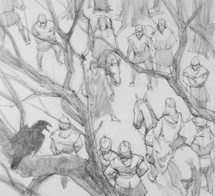
Greg Manchess: This was the first sketch coming off the board. This scene was ripe for the setup, but the busyness of it canceled it for being effective on this particular cover.
Irene Gallo: I love this sketch. It would have been my favorite but I knew my boss would think it was overly crowded for a cover painting. And in fact, the first thing he said when I showed him some of these sketches was, “Not that one, too crowded.” Someday we’ll use something like this, but not this time.
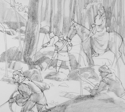
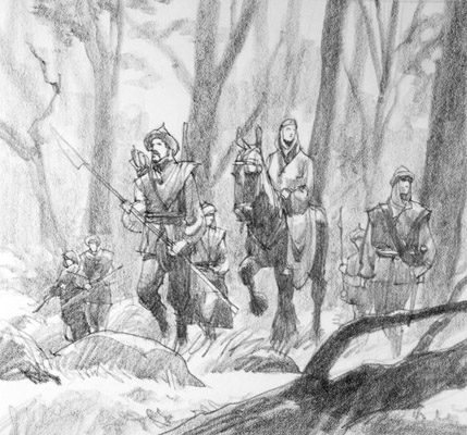
Greg: This was a favorite sketch for me. A main character, Lady Tam, is being led through dangerous territory, her Gypsy Scouts at the ready. This was close to working well, but we kept going back to the final sketch below. I’ll use this one again soon, too, I’m sure.
Irene: I liked this a lot as well…and now, looking back at it, I’d love to see it painted. But the other scene (the approved one below) felt like an important moment in the book—it gave the story a sense of weight, the meeting of two important people.
Greg: This is actually the above situation but from a different point of view and with a more relaxed but alert attitude by the guard. Here I’m beginning to feel the foggy background trees in my mind…an overcast day. But it’s a tricky thing getting that across in a loose sketch. Right about here is when I had some dinner with Ken and we started to hash details out. I wanted to get his take on the scene and what I was trying to present. Well, I had a lot wrong. But Ken was gracious enough to help me work it out for the better. I also realized that we were supposed to be showing a snowy scene.
Irene: This is a fine sketch but, for something that tells the same story as the drawing above, I thought the one above has a more interesting rhythm to it.
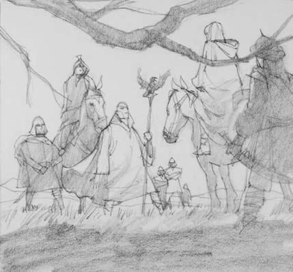
Irene: This was the sketch we kept gravitating toward. It felt like an important moment. While a staid image, it still had a sense of mystical “secret counsel” about it. As a side note: I love the cartooning in this drawing.
Greg: I usually don’t like picking a literal scene, I feel that the reader would rather get an idea, a flavor, of the book rather than a visual retelling of a particular part. But the composition worked so well, we kept coming back to it to work it out so that it made sense.
Ken Scholes: Greg called up and we talked a bit about the scene he had in mind and we met one rainy Monday night at the Rock Creek Tavern with our laptops and his sketches. We talked for a few hours, pulling details from the book on what people were wearing in the way of weapons, armor, clothing.
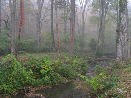
Irene: A vacation shot that Greg used to explain the background values might look like.
Greg: I take shots of forests and settings that I find particularly moody or intriguing when I’m out & about, and later on I can imagine scenes into them and have a solid setting for a piece.
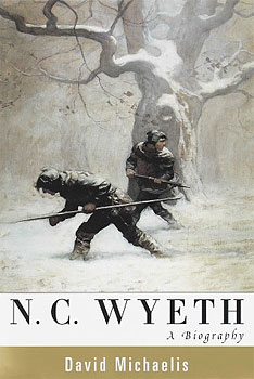
Irene: Our scene was set in winter time, that, and the values in the above photo, made me think of this N. C. Wyeth painting. This became another point of reference while working on the cover.
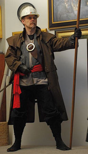
Irene: After the sketch is approved, the artist does a photo shot to get the characters just right. I love seeing these. Besides comic relief, they show just how much hand-made, string and sealing wax, imagination goes into paintings. (Thanks to Greg for being brave and letting this go public.)
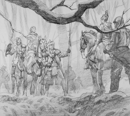
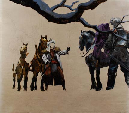
Irene: The more refined pencil drawing. He’ll use this to project onto the canvas and start painting from. At this point the only change I asked for was to move the branch away from the foremost character’s neck. Having the branch cut through the neck creates an uncomfortable tangency that draws attention away from the main action.
Greg: So…I had my general composition, lighting, weather, and color scheme. The point of view is from someone possibly eyeing the scene from a concealed position in the snow. I was ready to draw a refined sketch, and in doing so, work out what everyone was wearing and doing. The branch became a problem that I hadn’t noticed, because I wanted some interference within the frame. Something I like about the randomness of photography. As I drew, I worked out color schemes, value shifts, atmosphere. I could start to feel the cold air of the scene and worked in that the main horse’s breath could be seen. I also had to work out how to add color to the snow so that it didn’t become too monochromatic. But I wanted the bold color against that cool snow. So the cools get some warms in them, and the warms get some cools into them. This spreads the color out and makes the piece live.
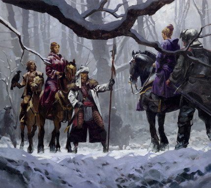
Greg: I had tree reference, snow reference, horse, clothing, weapons. I also made up costumes, weapons, horses, snow, trees. It’s a mix of everything, but the end result takes precedence, not the reference. I planned the color of the horses carefully, as well as the characters. The Gypsy Scout in front is wearing a bit of winter camo with his long white coat, like the mountain troops wear today.
The main characters had to be regal, but not overly so. We should be looking at the main character and keep the opposite character a little mysterious by not seeing her entire face. A hint of her guard is plenty, while we should see our main character protected and supported. The trees add mood to the situation and a little foreboding.
A thoroughly fun painting for me. But I do wish I had added some more breath to the right hand horse, the scout, and the bay on the left. Next time.
Ken Scholes: I was, once more, blown away. He’s somehow able to capture that sense of “otherworldly” biblical-type epic that I’m trying to write into the series. I’m glad Tor brought him on board for these covers. I think they catch the eye nicely and compel folks to pick up the book and give it a closer look.
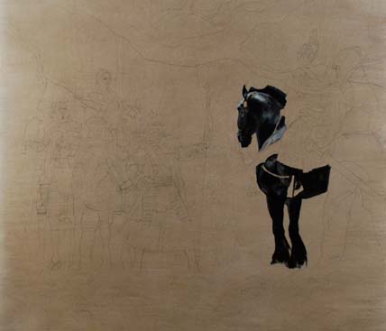
Greg: This method of painting has developed for me over the years of focusing to hit deadlines. As anyone can see, it’s based on extensive pre-planning. Before the first stroke hits the surface, I must be able to ‘see’ the entire piece completed in my mind. This helps me meet the deadline, because from that moment forward I put down what needs to be there. Period.
I knew the darks were going to be fairly heavy, so why not just put them in? I knew what value the whites had to be, so between the darks and the lights, I had my range to stay within.
This part is a joy. I slop paint on there in a deliberate manner, but I can be as loose or as focused as I choose. Here’s a little secret from the Golden Age Illustrators: They knew when to paint loosely and when to tighten up. It’s not all loose paint. And more can be said with a determined stroke than with a blended series of tickles.
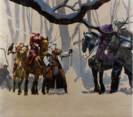
I saved most of the skin work for last. It has to fit with the color and values of the drapery. This allows for a balance of focus. Besides, it’s fun to watch the characters spring to life while I work. And then the whites….which are never pure white anyway. there’s always some color mixed in. And finally, adjusting the background values to reflect atmosphere, mood, and depth….brings it all together.
Amazing post! I feel like I should have to pay for something I learned so much from. I’m amazed at how spontaneous his work looks as it’s so carefully planned, which is exactly what I think good art is. And I’ve never seen his sketches before. They look like Renaissance cartoons! Amazing.Thanks for the great post.
Wow, thanks for sharing all the process stages. It’s an absolutely gorgeous painting. I really enjoyed seeing all the different sketches.
What a great post – fun to watch Greg work. Thanks for sharing.
Thank you for sharing this with us, it was a pleasure to watch and read… oh, how badly I want a copy of this book now!
I second what orchard (and everyone) says. Really interesting to see the stages n the decisions.
Personally as a reader / buyer i’d have been more likely to pick up the one with Lady Tam being led through dangerous territory – less static. But i understand the need to use a scene that’s pivotal within the story as well as just ‘photogenic’.
All the paintings and sketches here – and the photo ;0) – are a delight to the eye.
Thanks for the post Irene. It’s great to learn about the process as far as which sketch is chosen… and I always get a kick out of the photo shoots. I had the pleasure of working on one of Ken’s stories for “Realms of Fantasy” a few years back… fun stuff to work on.
Wow. What a fascinating process. Thanks for sharing it!
Really beautiful sketches up there. Greg’s draftsmanship is impeccable and lovely, as always. Thanks for sharing!
Wow. There’s nothing quite as educational as watching a master craftsman work. Kudos to Greg for another brilliant piece, but more importantly for having the good will to share with the rest of the acolytes!
Oh…and I consider getting to see him dressed up for martial arts, cattle herding and construction all at the same time a bonus.
What an incredible post here! It’s always a favorite of mine to see an artist like Greg’s process, it is so fascinating and exciting to see the finished piece and where it started from the ground up. I’m totally loving all the comments between each process piece, it’s so fun to read everyone’s thoughts on a particular moment in the constructing of this painting.
Irene- I was totally thinking the same thing about that painting once I opened this post! While I was at the Brandywine Museum earlier today I got worried because they moved it from the spot I saw it last at, thankfully they still have it out on display! That painting is simply perfect reference for a piece like that.
Greg- You must have a lot of restraint to do the skin work for last, I would be so antsy to get right into it :x The finish looks beautiful, thanks for all the WIP shots.
That’s beautiful work, Greg! I love how you punch those foreground characters in so confidently, build the rest of the painting around them, and still get all the other values so right. And this from a guy who never uses glazes! Masterful eye, brilliant work. I love it.
Makes me want to sing …
Thank you so much for posting this. I always like seeing someone’s process and getting to hear a bit about the dialogue between the three of you is wonderful.
Also, I’m even more excited to read Canticle now.
Thanks for the awesome share! Seeing Greg’s penciled roughs makes me salivate for a Manchess illustrated comic.
Thanks for the kind compliments everyone! I’m glad that it shows at least one way that these covers are created. It’s a team effort. Everyone has their own ideas and everyone has to evaluate what’s best for the book. I like that. It allows the process to help with creating it. It’s not always 100% and that can be scary. But when everyone comes from a real & honest concern, chances are the final will succeed.
The reference is just to get a sense of light direction and mass. So constructing this out of layers of clothing can look a little ridiculous! You should see my pirate farmer magician reference….
Such a great post, Irene!
I have to take responsibility for vetoing the great sketch of Lady Tam being led through the forest. Yes, it would have been a wonderful painting with a lot of movement.
But it presented Jin Li Tam as passive, a woman being led. And in Canticle, she is anything but passive. I wanted the cover to show her in strength, to be a pair with Rudolfo on the cover of Lamentation.
Thanks so much for posting this in such detail. I thoroughly enjoyed getting the perspectives of all three main players and what each is looking for. More posts like this would be a great addition to the Tor site!
Yep, I LOVE this cover. Big thanks to everyone — Greg, Irene, Beth, etc — who had a hand in it.
It is a great scene to capture with the three queens gathering to parley in the forest.
Greg, seeing your process is incredibly inspirational. Thank you for sharing your secrets with us. Your sketches are so beautiful and confident.
Irene, I’m so, so glad that you took the time to produce this post (with your wonderful collaborators I must add).
What a stunning explication of the the creative process, and a great way of literally illustrating how art is made. It really shows that the clockwork can be just as beautiful as the face.
Moreover, I think this isn’t just about book covers per se, but also the way people think about stories, represent stories, and render the symbols on a page into something both more corporeal and ‘real’, and yet also something eldritch and almost miraculous. Sorry, I’m raving, but this is an area of great interest to me, and this post struck a lot of chords.
Hands down, my favourite Tor post thus far. The enthusiasm and good-faith spirit you all clearly bring to this process is very inspiring, and makes me wonder why so many bad covers clog up the bookstore!
Really detailed process work. I love it!
Great process!
” I immediately went to Hamilton King Award-winning Greg Manchess.”
Um, Irene – you know that everyone else know’s that you and Greg are ‘a thing’. Right ?
While I appreciate the wish to feature female characters, from a composition standpoint, this image doesn’t bring the female characters to prominence over the male content of the image. The image is still very male-dominated, so if it was meant to feature the female characters, I think it fails.
A large part of this is because of the costuming and the contrast – the central figure holding the spear has both red and high-contrast white in his costume, plus his stance is broad, and he is both central and the largest human figure in view, based on canvas space. From looking at him, my eye went to the diamond of yellow on the forehead of the horse behind him, then to the glint of red in the hair of the woman on the horse, and then to the next figure back, with the eye-attracting tan and black contrast and the interesting sillouette of the bird on his arm. The two female figures have nothing visually interesting about them in terms of costuming (meaning contrast, distinct sillouettes, etc – the highest contrast point on the woman on the left is the highlight on her breasts, which doesn’t help, and I note that the hair and the hood on the woman on the right were both more interesting in the earlier sketches but are truly bland in the final picture), and they are completely bracketed by men, and inactive in the scene – simply sitting their horses while the man with the spear commands the action. Until I read the commentary I would not have guessed a goal of this image was “to show off the strong female characters of the series”.
@@@@@ 22 A thing not terribly unlike Patrick and Teresa Nielsen Hayden, Jim Frenkel and Joan Vinge, Harriet MacDougal and Robert Jordan, and many other things. It’s not something I have ever tried to hide from anyone that cares enough to follow my blog, Twitter, Facebook page, or talks to us at conventions and workshops. But just like our Joan Vinge books don’t say “edited by husband” I took the liberty here to treat us as professionals.
Fantastic process, and a fantastic painting. Greg is one of my favourite, contemporary ‘Golden Age Illustrators’!! Great to see the painting process from start to finish…makes me want to get my paints out!! (obviously, I’d have to practice for YEARS first!)
Can the next Tor.com meet-up be a costume party? Please?
This post is awesome. Art is such a wonderful mystery to me and I love the way artists talk about technique…it’s like listening to chefs talk about food, all I can do is nod excitedly and say “pretty!”
Thanks for the amazing description and explanation of the cover art for Lamentation. The excerpt of Lamentation is also great. I love how Tor and Macmillan are sharing literature and SciFi with readers via e-books and the web. I cannot wait to read this story.
Miriam – Librarians and audiobook fan
This is good step by step process sketch to final result from Greg Manchess, thank you very much for this inspiring post Irene.
@15 bam, I appreciate the desire not to show Lady Tam being led as in the earlier sketch, but her stance in the final version still looks completely passive to me. The woman whose face you can see is just sitting on her horse with a mild expression on her face (the one with her back to the viewer is even less active).
What was your reaction to the final design?
Great post! Really enjoyed the commentary and the artist’s work speaks for itself. Bravo!
Gotta love an artist process that includes pencil sketches.
Thank you. This was very generous to share this.
This is amazing! Beautiful, incredible, inspiring.
Beautiful and I am one of the lucky ones to have an early Manchess in my home from his Galena Illinois exhibit