


By popular demand, or, more accurately, by one request, here is a follow-up to our “H.M.S. Stubbington” post. This time we will show some of the early sketches for our official logo, Stubby, the Tor.com rocket.
Before we get to Stubbs, I feel like we should go further back in time. Tor.com was the brainchild of our publisher, Fritz Foy, but despite what the initial proposal said, we pretty much knew the site couldn’t be called “Fritz’s Fantasy.” Naming the site turned out to be the single most agonizing issue over that year.
We were the TheRange.com for a nanosecond.
Torus.com for a few heartbeats. (Get it!? Tor Us!) We were Torus.com long enough for me to threaten to make the logo an inner-tube sticking on top of a mountain, ring-toss style, which means we were Torus about forty-five seconds too long.
We were Lightspeed for a long while. I thought it was a bit generic but I didn’t have a good argument against it. And we had a cool tagline for it, “Science Fiction at 186,000 miles per second, give or take.” So, we started making masthead designs. Eventually, we decided that Lightspeed had too many other businesses and associations attached to it.
Suddenly: SciFiDiner! I don’t remember who came up with it, but I loved it. Our editorial director, Patrick Nielsen Hayden, hated it. In fact, everyone else hated it. I figured, in no time we’d simply be called “the diner” and diners are places were old friends get together to talk all night while eating fries. Not the worst association to have with a community site. But in case you missed it: everyone hated it, and all the “Blue Plate Special” jokes that were inevitable.
At the last minute, someone had the brilliant idea to call us Tor.com. After a year of fretting it was instantly clear that we should own up to our background, which we never intended to hide anyway, and take advantage of a three letter URL that was already a well known entity in the sf/f world. Truth be told, we spent the whole year continually coming back to Tor.com; it just took us a long while to realize that sometimes the obvious answer is the right answer.
These are just a few of the early masthead designs we had Drive Communications create for us:

The robot was super cute but, oddly, looked a bit like Boing Boing’s logo, even though the Boing Boing logo is not a robot.

This winged figure is very elegant, but a little more corporate then we wanted to be.

The second flying man was very enticing. I liked that it would bridge science fiction and fantasy. (It also reminds me of Brazil, and I never mind being reminded of Brazil.)

The Tor mountains did not have enough whimsy to it and would make the fact that we are not the official Tor Books website even more confusing. But, man, do I wish that was our logo for Tor Book’s. (Whoops. Did I just type that out loud?)

The retro rocket…Everyone loved the retro rocket. I loved it too, however, I did fear going full-on retro would make the site look like a smaller arena than we wanted it to. It also had the potential for looking dated quickly—which I know sounds odd given that “dated” is the point here, but, still, a balance needed to be made.
So, we decided to take the clean and elegant feel of the flying man, but add a different image. All we needed now was our very own rocket.
I asked Greg Manchess to do some drawings for us that were classic, yet modern! Whimsical, yet authoritative! Retro, yet timeless! All those contradictions that designers just love.
Greg Manchess: “Contradictions, alright. Not too modern, not too retro? Shoot me in the head! I grew up watching re-runs of Flash Gordon and reading the Flash Gordon Sunday comics whenever my grandmother would cut them out of the Chicago Tribune. So that’s where I started sketching: full-on retro and worked forward.”
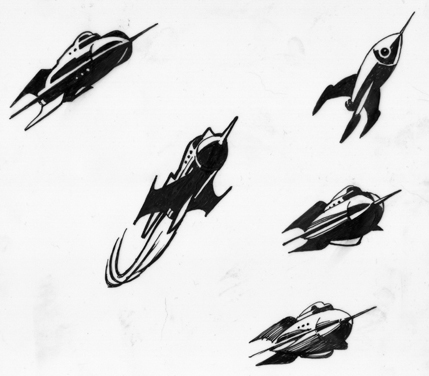
Irene: This was a first stab at developing shapes…
…and discovering how difficult it would be to stay clear of anything too phallic looking…
…and realizing how important it would be to simplify the shapes so that could read at a very small size.
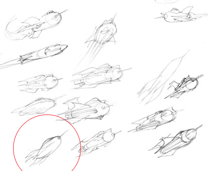
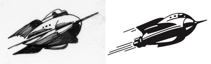
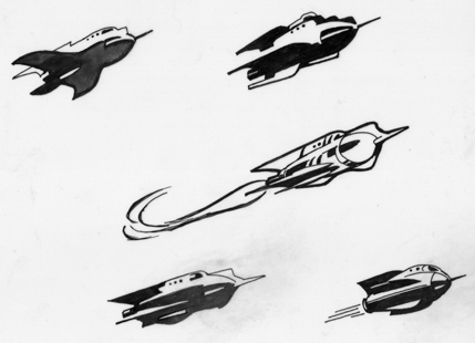
Another round of loose shape-finding sketches. I didn’t realize it at the time but it seems the highlighted one was the genesis for our Stubbs.
Irene: Here, I clearly remember pointing to the first red-circled rocket and saying,”Yeah, short and stubby, like that!” (Thereby condemning us to a lifetime with the name “Stubby.”) That bit of cartooning suddenly made the ship into a character rather than an inanimate object.
Greg: After Irene pointed to the first one, my eyes were crossing from looking at so many shapes. So I pushed the next sketch and thought to myself, “there, that’s fat.”
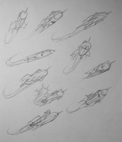
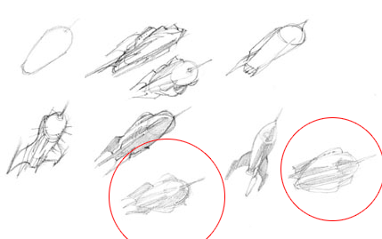
Irene: At this point we wanted to start seeing them as bolder shapes needed for a logo. Clearly the bottom two were further along in the right direction; still, we wanted to keep some other options around to see how they developed. (Secretly, I love the top right just because it looks like a flying fish head.)
Greg: There’s Stubby’s granddad on the lower right…
Irene: Here we simplified the shapes even more, trying to reduce it down to as few lines as possible. And there is our Stubby in the bottom corner, pretty much fully formed. It was hard to leave behind the top right rocket but unfortunately the Nemo-ness that made it so cool was what made it wrong for the site.
Greg on the top right ship: Remember the Proteus from Fantastic Voyage? Yeah, me, too. So cool. I need one of those.
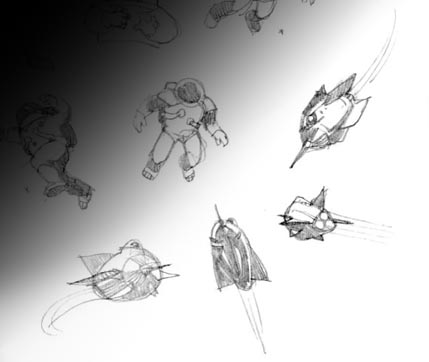
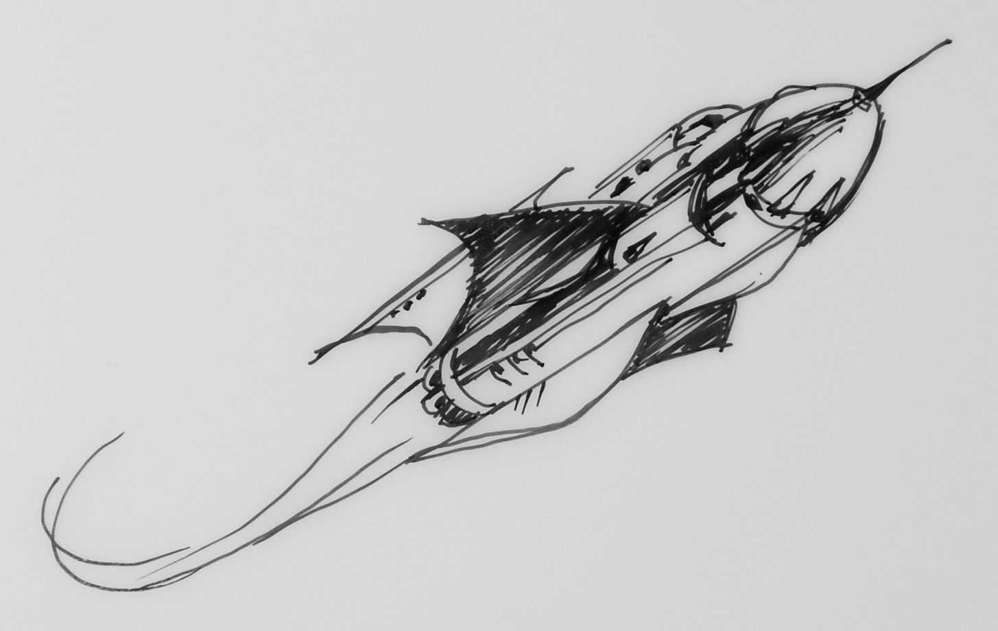
A few explorations of the ship at different angles. (And yes, a brief look as astronauts, as well as robots not seen here.)
![]()
Irene: Not much changed from the last version to this except the cockpit window reflections were reversed. This gave it a subtle “eye,” to add more personality.
Greg: As you can see, Stubby came out as a blend of these two more finished sketches. I like its forward motion, the movement it needed to project a sense of exploration and adventure.
![]()
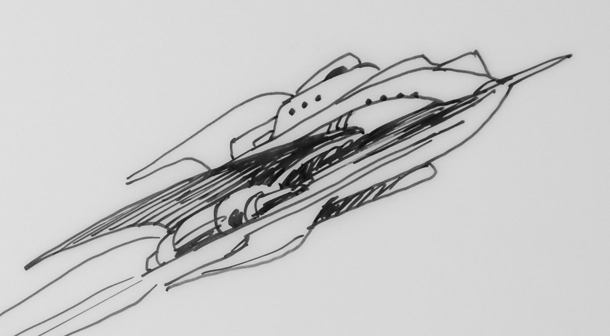
The final drawing.
And finally, sharpened up and logo-ized via Jamie Stafford-Hill’s Adobe Illustrator chops.
![]()
Irene Gallo is the art director for Tor, Forge, and Starscape Books and Tor.com.
I LOVE this post!
Beautiful logo.
3 Stubby, and love the “creative process posts” in general. And if its any consolation Irene, I thought the Diner was a nifty idea too.
Interesting insight into the process. Neat to see how it all developed. :) I dig the background on the second lightspeed banner. A larger verison would make swell desktop wallpaper.
(thats meant as a compliment by the way, just in case there was some doubt. Its a nice picture!).
I never had a problem with Tor.com, but now that I know it COULD have been SciFiDiner I’m disappointed.
What a great post! I love seeing the process. Count me in as a SciFiDiner voter too. Not that I don’t like tor.com or Stubby, but, a diner is always cool. All times, all places – the diner is where everyone goes if they can’t go home.
Great post. Now I’m all about the Tor.com pins with Stubby that were handed out at places like BEA, etc. But I’d love to see real metal or enamel pins in the shape of stubby. Those would be neat. I’m a sucker for a cool, sf-inspired pin for my jacket. Keep up the amazing work over there!
Thanks guys. There are things that you do and don’t do as you work on projects likes these just by feel. It’s an interesting process to have to articulate them much more succinctly. Whenever I do these posts there is one or two “Oh, _that’s_ why we did such and such” moments.
Mr. Henry Yee: from you, that is high praise.
(Everyone, Henry is one amazing book jacket designer. check out his website.)
Tor.com was definitely the right choice. You want people to remember it – and thereby you. It’s nice and short. 3 letters. That’s all you need.
And Stubby? He’s a nice looking rocket, but I’m not crazy for him as a logo. But logos are hard. Funny I never thought of him as phallic-looking, but now that Manchess said it, I always will.
Irene — this is awesome. Thanks for letting us behind the curtain.
Tor.com makes a lot more sense than the other choices, particularly for those of us who don’t care for the term “Sci Fi”. (Or, for that matter, “Syfy”!)
Stubby rocks, though, and the Steampunk variant from last month was fun too.
@10 – yeah, that was the real issue — we (or, at least Patrick) knew the term scifi would irk a whole lot of people and that is certainly no way to invite a community to over to come and play. We also discovered that Disney has an actual Scifi Diner, but the idea was fairly dead before then. And I’m glad for it. I am Tor, hear me roar. (Ouch…Sorry, that was bad.)
This was a lot of fun! I like the sneak-peak into Tor.com