


With The Eye of the World, the first Wheel of Time ebook cover, we wanted something that opened the series with a broad historical look. Book two, The Great Hunt, will release November 17th and now it’s time to dive in and the embrace the genre!
I had been noticing Kekai Kotaki’s work for a while and started working with him on a few other projects. I love his expressive, even explosive, brushwork and dramatic sense of light. He’s a lead video game concept artist for ArenaNet’s Guild Wars. (A company that consistently takes over awards for concept art.) Typically concept artists are so specialized that it’s tough to imagine them working on a narrative painting. Not true with Kekai. His work has epic scale, cool costuming, great anatomy, and is all about movement. And, it turns out, he’s a sweetheart to work with.
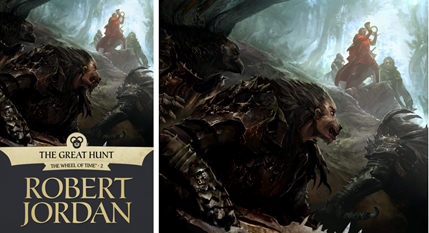
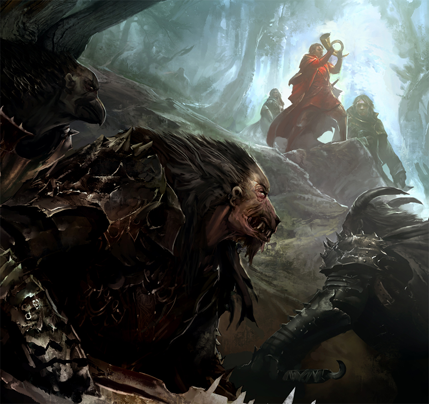
I mentioned to Harriet McDougal that Kekai is particularly good with depicting creatures so she suggested the cover be a recasting of the print edition of The Great Hunt cover. Trollocs, a wooded landscape, and Rand in full hero pose—you can’t beat that. When I called Kekai with the assignment I was thrilled to see that he was already familiar with the books: “I first started reading the Wheel of Time series in the 7th grade. I have been following ever since, and was saddened by the passing of Robert Jordan before he could finish his epic. I was both excited and nervous when I was contacted to be a part of this re-release project. I hope my art is able to stand up and be a part of this great fantasy series.”
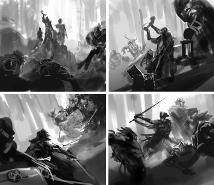
I asked Kekai to “Save As” often so he could share the progression of the painting with us.
These were the four sketches that were not chosen. As an art director, it’s almost hard to look at them now—they would all make great paintings and it’s impossible not to want to see all of them fleshed-out.
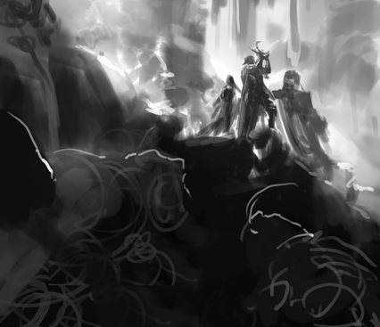
This sketch was the favorite pretty quickly. It has a bold diagonal composition rather than a more typical dead-center view and, while scale and detail favors the Trollocs, he manages to maintain attention on the heroes with his use of light and atmosphere. Most of all, I love that he has made the viewer part of the enemy patrol. We are stuck with conflicting feelings of awe and concern for the protagonists.
What follows are a series of shots of the painting in progress. I was excited to be getting these along the way, typically I am time-warped from the above sketch to something much more finalized.
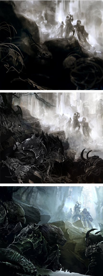
At one point I showed Jason Denzel, of Dragonmount, and Leigh Butler, of Tor.com’s Wheel of Time re-read. They were both excited by the image but reminded me that, if there is ever a problem with any of the depictions of Trollocs, it’s that they lose all of their humanity. When I showed Harriet a close-to-finish version, she said exactly the same thing. Clearly we had a small bit of tweaking to do. It didn’t take much—a faint adjustment to the eyes and forehead—and I think Kekai did a great job of it.
For more of Kekai Kotaki’s work, check out his website, blog, and Tor.com gallery.
Next up, Donato Giancola on The Dragon Reborn, December 15th.
Previously: The Eye of the World ebook cover by David Grove.
Irene Gallo is the art director of Tor, Forge, and Starscape books and Tor.com.
This is beautiful and it was great to see the different stages of the painting!
I cannot express how much I would love to own dead tree versions of the series with this new art work.
best looking trollocs ive ever seen!
Way cool!
Outstanding! Absolutely worthy of WoT. Keep them coming!
Shiny!
The trollocs look great, but to my recollection there isn’t actually a scene in the book that has Rand holding up the horn while trollocs skulk in the background.
Is there any chance that any of the future e-covers will actually depict a real scene from the books?
Artistic License Lives!
Down with the evil toryx. ;)
AIEE! Want Wallpaper! Want-want-want! PLEASE!
Hey all, Jason just posted a larger version on Dragonmount. (We are sadly confined to 429pixels.)
http://www.dragonmount.com/News/?p=1003
Wow. Those Trollocs are excellent. Probably the best I’ve ever seen.
Nice! Though I generally prefer traditional art over digital, I must say that Kotaki’s smooth lines appeal to me here better than Sweet’s work in recent years. I feel Sweet’s strokes have become too hairy and his figures unnatural.
Absolutely, especially for those of us that don’t own them all already. Very, very nice.
Our heroes look indistinct, and I’m not sure where this scene is, but I do like it.
Wow. These eBooks are really doing the WoT justice. Incredible.
This cover is much better than “Rand on a Stripper Pole” from the Eye of the World ebook.
This one is spectacular.
It’s always entertaining and enlightening to see the process of creating a book cover illustration. Thanks for sharing the story behind this book cover illustration with us.
–Duncan
=====================
Freelance illustrator for HarperCollins, PS Publishing, Pocket Books, Ballistic Media, American Media, Fort Ross, Asimov’s Science Fiction, and other publishers. See my book cover illustrations at: http://DuncanLong.com/art.html
There are no good WOT wallpapers.
It would make perfect sense to publish the walls in a nice resolution. I’m sure everyone here would be more than happy to be flaunting WOT on their screen real estate.
If this does happen, please, no obnoxious logos.
This is lovely. And such an improvement. Hopefully this is only the beginning of the long process of wiping all trace of any of Darrell K. Sweet’s non-art from fantasy publishing altogether.
@19 I can assure you, we have no intention of eradicating anyone’s career. To whatever degree this set of covers succeed or fail, they will do so on their own merits.
I have been looking for artists like these for years. Why dont they use him as the artist for the new books and scrap the silly artists for the older books
Isn’t this the scene where Serene asks Rand to show her the horn just after Rand and Loial steal it from Fain, whilst they were still being hunted by Fains Trollocs?
This is a different version of the current scene on the the paperback book I have – and MUCH better than the one on my book – but this scene doesnt even exist does it? I prefer scenes rather than what if pics. BUT that being said…nice artwork.
THIS is what a book cover is supposed to be like. Such an improvement from the previous uninspired covers. If I saw this cover in the store I would buy that book immediatly. :)