


That metal-slamming sound could be heard all over North Am in 4000 A.D. Equipped with red mini-jumpsuit, white go-go boots, and a Kung Fu grip, Magnus—Robot Fighter, was at it again, battling errant robots back to their nuts and bolts—even during dates with his smokin’ hot space vixen Leeja, the daughter of North Am’s Senator Clane.
Russ Manning’s creation of Magnus held my interest circa 1966 with his sharp focused, graphic ink strokes and deftly rendered metallic surfaces. He was a master of the comic world to me. I copied panels from his stories over and over again. I spent eighth grade dodging teachers while I sat in the back of the room copying Magnus and robots and trying to remember American history.
Manning’s stories fleshed out a science fiction world that captivated my young man’s ideal but it was his ink lines that solidified it all. Each panel was designed for maximum graphic effect. I started my intense study of composition through Manning’s panels: how to tell more with less.
From the tickle-rain take-over of North Am’s Weather Control to the “Weird World of Mogul Badur” where Magnus is kidnapped to an alternate dimension (replete with more evil robots that wait on apathetic obese people, pre-dating WALL-E), it read like an issue of National Geographic to me, reporting on what lies waiting for my adulthood in the future.
I can’t make it to 4000 A.D., but I’m excited to know that others want to go there still. Wednesday is the release date for the next generation of Magnus, from Dark Horse and I’m as excited as a shiny red Battle Rob. [Note from Tor.com: Expect a review in tomorrow’s “Wednesday Pull List” comics post!]
Will 1A return to protect Magnus and mankind? Slamming robots and karate-chopping metal heads that SQUEEEEE! is enough to make me get the ink pen back out.
![]()
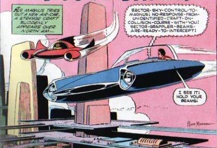
This is my idea of a spanking clean future world: soft-sculpted high-rises, pedestrian walkways the size of the promenade at Teotihuacan, and flying Buicks.
![]()
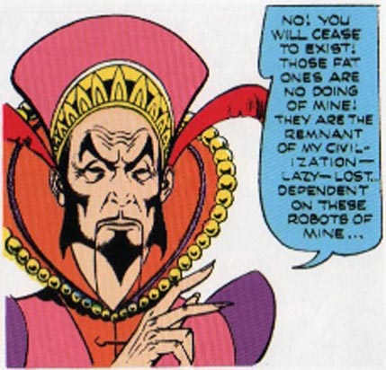
Notice how perfectly diametric Mogul’s features are: the exaggerated eyebrows balance the rich downward shapes of his beard. The shadows are formed with similar shading that all end in sharp points.
![]()
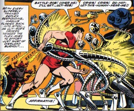
Check out this body posture. If this doesn’t send flutters through every wannabe action illustrator out there… Here’s Magnus in full, fighting form: the legs just pushing off; the torso in mid-twist; and a perfect head turn towards his next move—and the bad guys. All in understated anatomy, just the right amount of shadow, and none of it rendered in values. Perfection.
![]()
If you’re interested, these classic adventures are all currently available in three hardcover volumes from Dark Horse.
Greg Manchess is an illustrator working in New York and Portland. He is currently writing his first novel.
Nice article. I like the way you explain why the drawings are so good, but one question: What does “none of it rendered in values” mean?
I second the “rendered in values” question.
And why is Young Zapp Brannigan beating up Bender’s kin? (And I forgot Leeja totally.)
No, seriously, I liked these a lot as a teen, even if I couldn’t articulate exactly why. Except for the cars. I mutilated many convertible model cars and Hot Wheelses to be “flying Buicks”.
I’m another who remembers Magnus fondly, but of course I lost them all (and every other comic I’d accumulated in my youth). Thrown out by the ‘rent after I went off to college. How cliche is that?
This was amusing, not least because my wife and colleague Teresa Nielsen Hayden was for about a year the editor of MAGNUS, ROBOT FIGHTER during its mid-1990s run at second-string comics company Valiant. She brought Keith Giffen in to write it, and she still reminisces about the epic brainstorming sessions they had about possible futures for the storyline.
I don’t remember if it was Teresa or Keith who observed that when Magnus wakes up in the morning, he smashes an alarm clock just to get things started.
Manning was an incredible artist.
I fell in love with the Magnus series in particular when Jim Shooter started up Valiant. There was something about the future that was depicted that was just so fascinatingly retro. It really was quite brilliantly executed, at least up to the point where Shooter was ousted from his own company. Then I drifted away.
Notably, Jim Shooter is spearheading Dark Horse’s new Magnus, Robot Fighter series, as well as the other Gold Key character he (and the incomparable Barry Windsor-Smith) did an amazing job with back in the 90’s: Dr. Solar, Man of the Atom.
Now, if only they’d revive Archer & Armstrong, Harbinger, and Rai…
That’s a great question…I’m so glad you asked!
The older comic style used flat colors, with ink lines that gave the illusion of rendered shapes. This was a limitation of cheap printing at the time. That’s why Magnus’s skin is a flat flesh color and his suit is a flat red color. The black ink lines give the forms their shape.
Most comic books today try to get fancy with rendering images to make them look more dimensional. A product of the digital age. “If we can do it, why not do it everywhere” is the basic philosophy. Also, the producers believe that more people will be interested if it “looks more like a photo.”
Unfortunately, the result is an even greater departure from reality than the simpler approach. Our brains enjoy completing the necessary details. In fact, the comic covers today are less detailed than the inside images, and therefore stronger.
Comic covers are dramatically better today, and rely on less information to grab a reader’s attention than the inside page work. I love the covers now, but I’m so disappointed in the general pages as a result.
Russ Manning was able to use those earlier limitations to bring his fullest skill set to bear.
Take a look at Mike Mignola’s Hellboy, currently one place where flat color is used to it’s highest form. These stories are masterpieces of graphic perfection. Dave Stewart’s color matched with Mike’s black line is a tour de force.
Wow, that takes me back.
I remember his karate chops beheading robots, and the elevator tubes. That was what I was into at the time.
Thank you for your detailed reply on the rendered values: all very interesting!
Wonderful article — the first of many, I hope; and I hope they’ll be longer. While it can be misleading to be told about influences and then look for them, I must say that your own paintings do have a real Manning feeling — clean, vivid, beautifully composed. They don’t imitate anything specific about Manning, but they make it very evident what you responded to in his work.
As for coloring in today’s comics, agreed, it’s typically bombastic and overrendered, and it often makes the pages difficult to read, as well as fighting with the line art. But there are notable exceptions, such as Laura Martin, who sees herself as a cinematographer, not someone who has to plod through adding unnecessary detail. If she’s on her game you look at the quality of light in her skies and you know exactly where you are in the world.
I started to read comics again as an adult when I was living in Europe, as a way to learn languages. A lot of them were black and white reprints of American comics (Hellblazer, Swamp Thing, and so on). When I saw the colored originals it was usually a letdown; the coloring rarely added anything, and it usually got in the way. But you’d really miss the colors in Magnus if they weren’t there. They make the panels still more lucid and effective. It would be hard to see how the reds work here, for example, and not want to do it yourself.
Having read Magnus as a kid, I’m forever imprinted on Leeja. But who isn’t?
I couldn’t agree more about comics and the over rendered value today. Definitely the single most reason Ive abandoned them over the years. Funny you mentioned Mikes work too, I devour anything he puts out. His graphic simplistic use of shadows is just AWESOME! Im constantly looking at his work hoping to inform my own. If anyone knows of others with similar artistic sensibilities Id love to hear of them. Cool article! Thanks Greg.
On a Tor.com side note:
Is there anyway to subscribe to a comment thread via RSS/Email? If not does anyone have suggestions for following a conversation ones interested in? Too often I comment on something and would like to read additional remarks but they get lost either in the wilds of the internet or my failing memory. Apologies in advance if I am missing the obvious here.
SwashbuckleDom ,
Funny you should mention — it’s one of the things we want to address in the not-too-distant future. At the very least we’ll have RSS feeds but I’d also like and opt-in to follow conversation via email.
Currently – the best thing to do is check your user profile page. It will list new comments in any conversation you have taken part in.
Greg,
Great article expressing every feeling I have always had about Russ Manning’s Magnus Robot Fighter.
I too in Jr High was constantly drawing Russ Manning’s Robots. That must by why after 3 years of french class I knew a total of one word for each year of instruction. As an aspiring artist I started my own Magnus Robot Fighter comic. Unfortunatly I never made it past the first page, though I am very pleased with the results. (Page can bee seen at http://www.comicartfans.com/gallerypiece.asp?piece=609859&gsub=94661 as well as the original Russ Manning art I own).
I still feel Russ Manning’s skill has yet to be equaled.
Being a long time Magnus Robot Fighter collector ( and an owner of 5 original Russ Manning pages), I have to comment about Dark Horse’s adaptation of Magnus Robot Fighter.
I realize that this was a labor of love but in my opinion they have completely missed the mark on some very important points that made Magnus Robot Fighter stand above all comics and even outselling Superman at one point in time.. Please don’t think I’m being overly judgmental, NO ONE has managed to capture the magic that Russ Manning gave us. I am not talking only about the artwork, there are more fundamental issues in play.
First of all,the Russ Manning Magnus Robot Fighter was more of a Science Fiction graphic novel. 4000 AD was a believable optimistic future than seemed real. North-AM is open, bright and airy (except in the goph levels which was only explored once and not a main focus of the series.). Magnus and the North Am world exemplifies the purity and best human kind has to offer.
Every attempt after Russ Manning left has turned Magnus Robot Fighter into, dare I say it, merely a comic book. This was painfully obvious in Valiant’s version when they had a robot dressing as a human and the continuous use of slang terms such as “Meatbags”, “Milespire” etc.
Dark Horse’s variation has a Cyborg named “Big Guns” which is as comic bookish as you can get.
Robot’s conversing during confrontations, Magnus sleeping with another woman are more examples of how far they have deviated from the world created by Russ Manning.
The following excerpts are examples of the comic bookish dialog and slang that appears is aimed at the grade school reader and not adults. Russ Manning’s Magnus Robot Fighter never talked down to it’s readers.
“Q-ROBS”
“BLIP-OFF-ANY-INTERFERENCE”
“THE-OTHERS-HAVE-BEEN-BLIPPED”
“LET’S ZOOM”
“WHATTERYA HIS P.R. GUY? CLAMP IT.”
“I TOLD YOU HE’S THAT FREAK-STRONG ROBOT FIGHTER”
“HE MUST BE GEN ENHANCED TO THE MAX”
“THUG-ROBS”
“THE BOYS AT THE PENS WILL SQUEEZE WHAT SHE KNOWS OUTTA HER ZAP-QUICK”
“STUPID-FRAIL!”
“CHOOCH, BEEZER…GO WITH BOSS ZAPO.”
“SCRAPPERS SQUEEZER”
“SCRAM AND ZOOM”
As gifted as Bill Reinhold is, he has not captured the open clean look of Russ Manning’s North AM. Even the upper level scenes seem cluttered and crowded giving a completely different feel for North AM.
I do not expect anyone to be able to duplicate Russ Manning s North Am, but I was hoping for at least the flavor and mood to be captured.
In my opinion, Russ Manning’s Magnus Robot Fighter is still the greatest comic ever produced.
I am truly disappointed that once again Magnus Robot Fighter had emerged only to sink into oblivion and obscurity once again.
Gregg Hazen
Brunswick, Ohio
Well I brought the navigator home and I have been converted. I like many others vegged out on the infomercial. They make the vacuum sound like it’s going to save the world from dust and dirt. They also focus on how they were able to copy the features of the Dyson for less money. I felt if they had to copy a vacuum you might as well get the original.
For more details visit us :
Vacuum Cleaner