


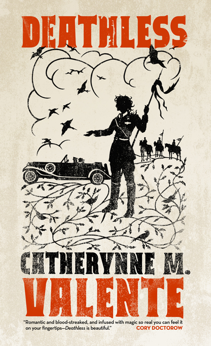
Behold! The cover to, Deathless, an upcoming novel by Cat Valente, due out in March from Tor Books. Artwork by Beth White, design by Peter Lutjen.
In a way this was a tough one—if only because all the cool-kids of Tor kept telling me how much they loved the book. The pressure was on.
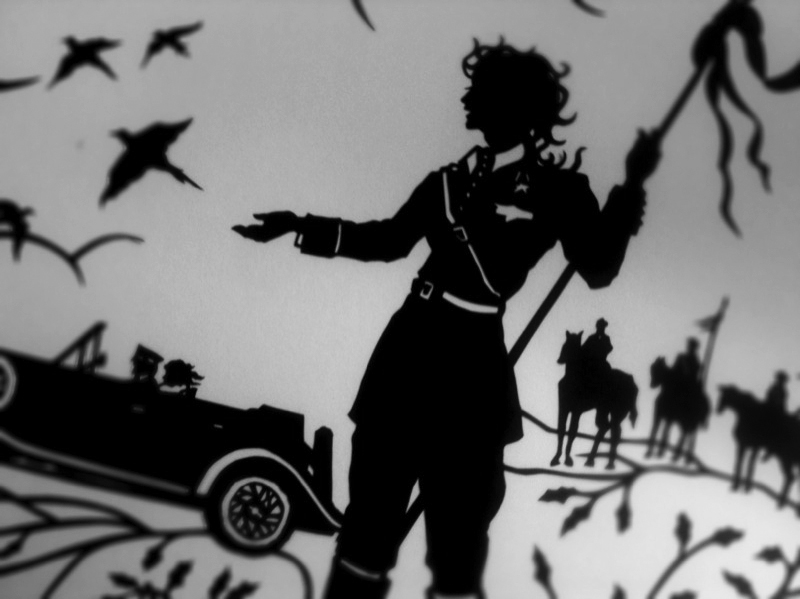
The story is a reimagining of the Russian folk-tale of Koschei, the Deathless, set in Stalinist Russia. I remembered seeing (and being jealous of) Beth White’s cover for The Evolution of Calpurnia Tate for our sister company, Henry Holt. I thought the story-book quality of Beth’s artwork and the bold use of graphic shapes would due well to set Deathless apart in our catalog and in the stores.
When the sketch came in, I remember thinking, “I love it but, how the hell are we going to put type on this?” Then I remember thinking, “Eh, Peter, our senior designer, is brilliant.” And he was. He didn’t just come up with something, he came up with several somethings.
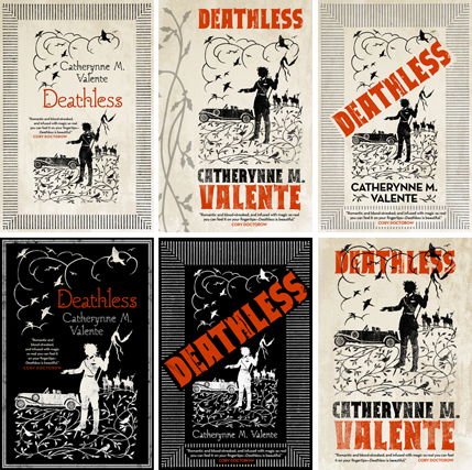
It was hard to chose but in the end we really enjoyed the strong block printing and posterized look of the final, bridging the folk-tale with graphics of the 30s and 40s.
 Most surprising, I had no idea that the piece would be a real paper cut-out until Beth asked for my mailing address. In this digital age, being able to hold a cover and see its edges got a few extra squees out of the editor, art director, and all the cool-kids silently threatening me to “get it right.”
Irene Gallo is the art director for Tor Books and creative director of Tor.com.
Wow, I think it is *exactly* right, and I’m a long-time Valente fan seriously looking forward to this book!
I’d have to agree: the poster-like quality of the final is a really excellent choice. The inverted ones feel a little forced, and the diagonal text, while active, don’t feel as period to me. Though for all I know, that was common in propaganda art during the Stalinist era.
Some very nice cutting from Beth White, and the “worn” overlay you gave it really brings the feeling of aged, wall-plastered poster to the book cover.
Great work. Looking forward to one of many Valente books next year.
Very nice! ~ and while I like seeing the alternate designs, there isn’t one I like better than the final.
Oh, that’s lovely.
Very striking!
Lovely. Though I do think you picked the best one.