


Pastiche? Mash-up? The best form of flattery? Whatever you want to call it, artists have enjoyed riffing on historical paintings for ages. For some, it’s a fun way to learn and explore issues of color, composition, and application of paint by intimately copying from a master. For others, it’s a means to tap into the feelings and emotions already assoctiated with the original image, (for humour or drama.) Seeing John Mattos’ great modernist takes on Star Wars made me want to seek out other views of science fiction via the classics. Here’s what I found….
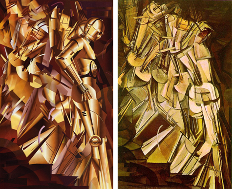
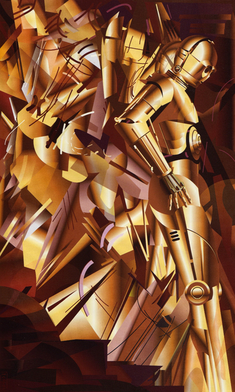
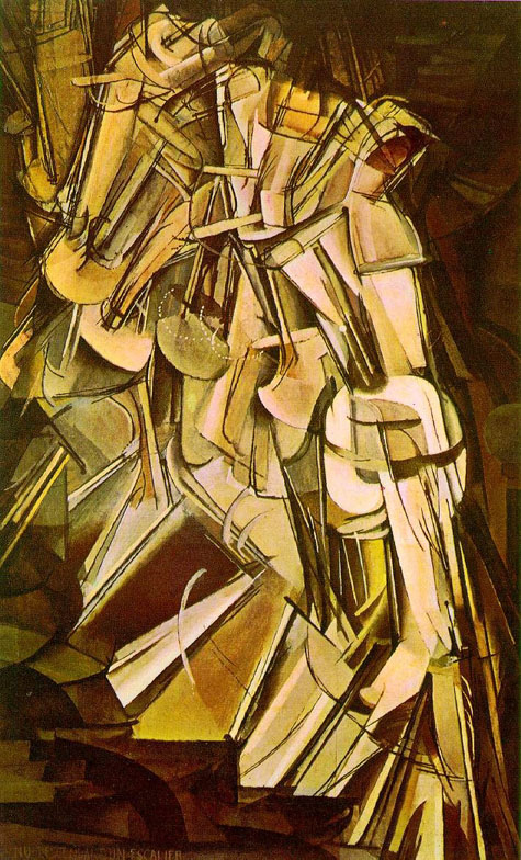
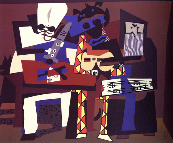
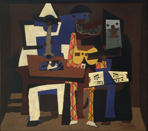
John Mattos took on Marcel Duchamp’s mechanically abstracted Nude Descending a Staircase and brilliantly reset it with C3PO. Then took Pablo Picasso’s Three Musicians to the Star Wars’ Cantina.
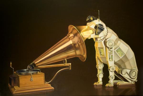
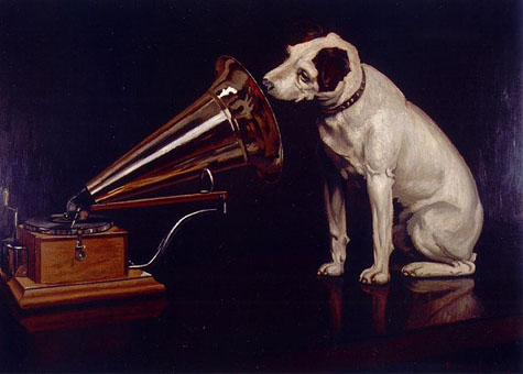
Tim O’Brien hears his master’s robotic voice.
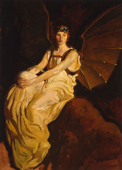
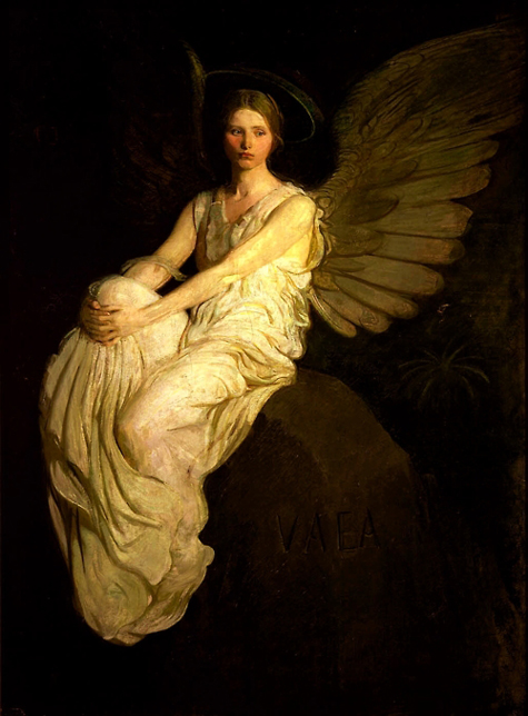
Abbott Handerson Thayer, often noted as a painter of angels, punked up a bit by Greg Manchess. Unrelated but interesting, Thayer invented camouflage. (Greg’s version is available as a desktop wallpaper.)
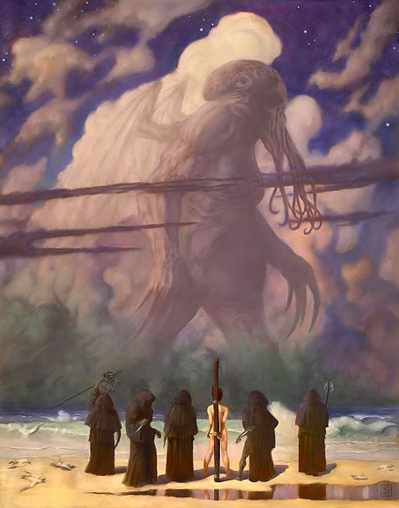
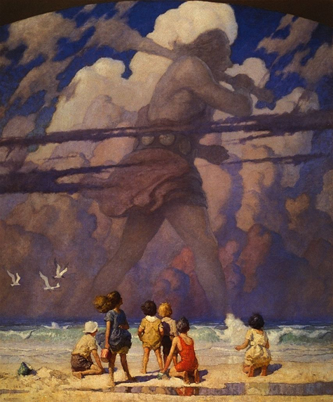
Cyril van der Haegen inserts unspeakable evil into N. C. Wyeth’s “The Giant.”
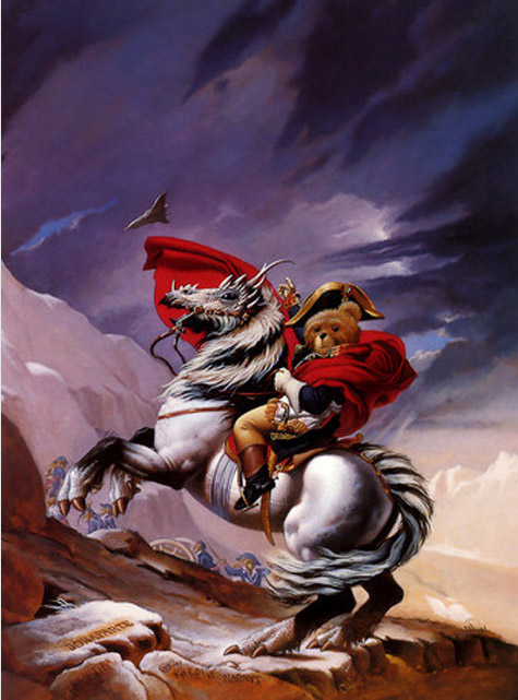
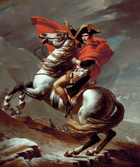
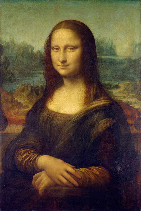
It’s a tough race to see what has been parodied more: the Mona Lisa, American Gothic, or Napoleon Crossing the Alps. Here is Michael Whelan’s extra charming take on the David classic for Poul Anderson and Gordon R. Dickson’s novel Hoka.
Tristan Elwell invokes Leonardo da Vinci’s Mona Lisa for the cover to Jo Walton’s novel Tooth and Claw.
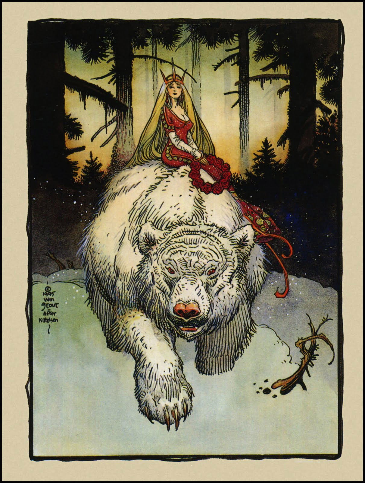
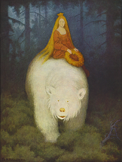
Thanks to Zelda Devon for pointing me to this William Stout, an homage to Norwegian artist Theodor Kittelsen’s “The White Bear King.”
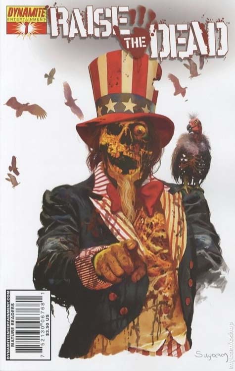
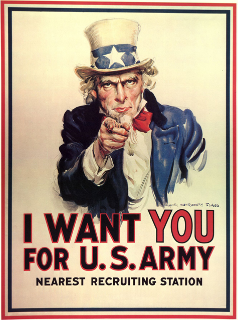
Arthur Suydam’s “Uncle Sam,” originated by James Montgomery Flagg.
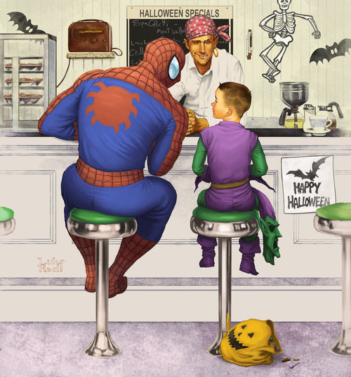
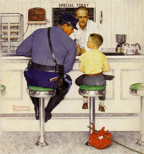
A super-sweet Halloween recasting of Norman Rockwell’s “The Runaway” by Luke Radi.
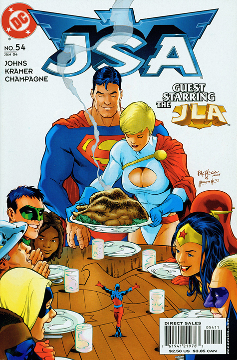
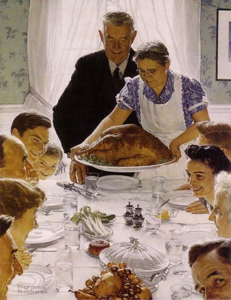
There are numberous renditions of Rockwell’s “Freedom from Want,” part of his series based on Roosevelt’s “Four Freedoms.” I couldn’t pass up this one from Carlos Pacheco, utilizing the most wholesome, all-American superheroes for this all-American scene.
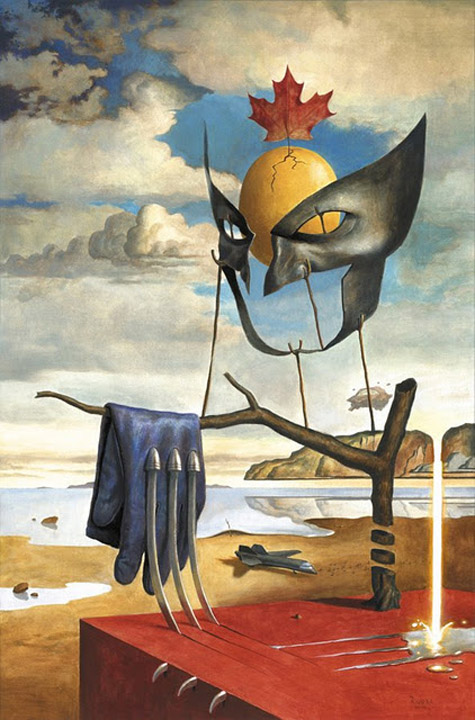
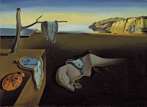
Marvel did a marvelous (sorry) series of Wolverine paintings done in various styles. You should check them all out. This one by Paolo Rivera after Salvador Dali’s famous “The Persistence of Memory” (better known as That-Melting-Clock-Painting.)
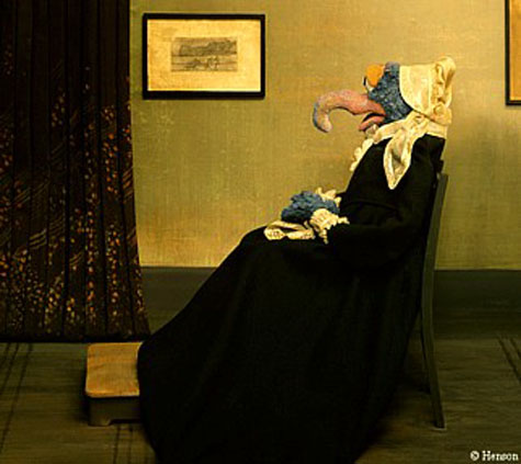
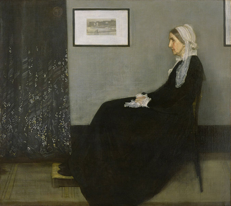
The Muppets released a number of art history parody calendars. This one showing (the space alien) Gonzo as “Whistler’s Mother,” more formally known as “An Arrangment in Grey and Black.”
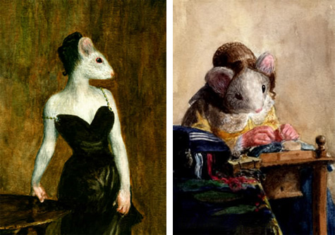
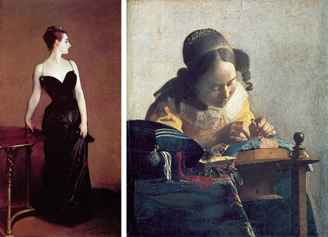
Alan Beck has been charming con-goers for a long while with his Mouseopolitan Museum of Art — American, European, and pre-historic art, as well as movie classics, are all subject to Alan’s mouse-ification. Here we see John Singer Sargent’s scandalous (at the time) Madame X and Johannes Vermeer’s Lacemaker.
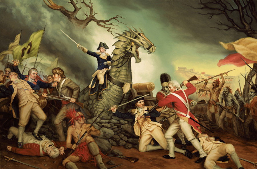
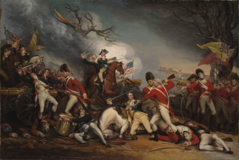
Ryan Pancoast recreated John Trumbull’s “Death of General Mercer at the Battle of Princeton” (with Zombies) for Michael Stackpole’s At the Queens Command.
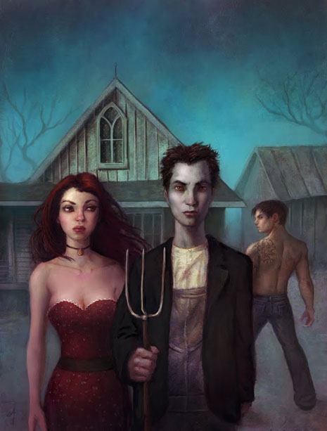
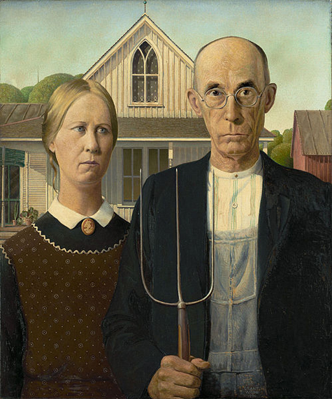
Scott Altmann does all kinds of mash-ups here — Twilight meets Grant Woods’s American Gothic for Night Shade Books’s Garrison Keillor pastiche, The Twilight of Lake Woebegotten.
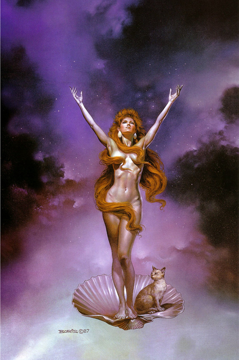
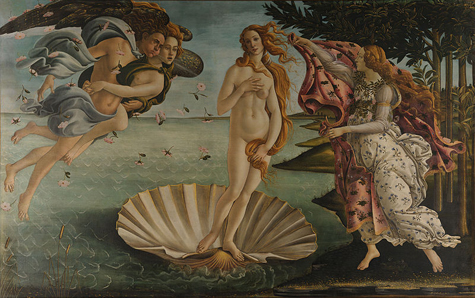
Boris Vallejo taking on Boticelli’s Birth of Venus, AKA Venus on the Half Shell, in service of Robert A. Heinlein’s “To Sail Beyond the Sunset”.
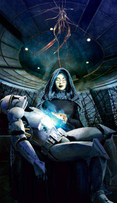
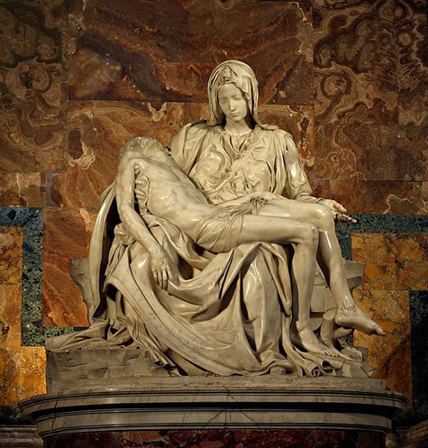
Dave Seeley invokes Michelangelo’s Pietá in this Star Wars book cover.
Irene Gallo is the art director of Tor Books.
I love these so much.
I’ll have to remember which Frazetta it is that quotes Poussin’s Rape of the Sabine Women.
The Boris painting, riffing off Botticelli, is not a Kilgore Trout book… it’s for Robert A. Heinlein’s “To Sail Beyond the Sunset”, his last novel. (That’s Pixel, the cat that walks through walls, sitting on the shell)
Thanks! I was flipping through too many screens. I will fix now.
Ryan Pancoast’s painting looks like it was inspired by Trumbull’s “Death of General Mercer at the Battle of Princeton” instead of General Warren.
…and, thank you Cliff. Fixed.
(Our readers are teh smarts!)
That Dali Wolverine is terrific.
The Boticelli painting is discussed in the text of Venus on the Half Shell, and so there is nothing subtle about placing a “swipe” of it on the cover. There is a site devoted to covers of the book.
I wish I knew which artist painted the Dell edition, which, as I recall, carried the blurb “NOW AVAILABLE FOR THE FIRST TIME WITHOUT LURID COVERS!”
Oh, wow, I’d never seen the C3PO Descending a Staircase before. That’s amazing, on so many levels.
You missed one. Paul Kidby’s cover for Terry Pratchett’s Night Watch is a Discworldified version of the Rembrandt painting sometimes known by that name, with Sam Vimes in the front.
Lovely collection – thank you so much for gathering them together.
Here’s another – a Norman Rockwell done for a sf themed contest on cgtalk.com. I don’t know my Norman Rockwell enough to know if this is a copy of a specific painting, but the style is indisputable:
http://forums.cgsociety.org/showthread.php?f=137&t=672574
Thanks for the links, guys. I’m sure there are houndreds of others. Keep listing them if you know of any.
The cover for Paladin of Souls is based on a Renaissance painting of one of the saints; unfortunately, I don’t remember the title and Google wasn’t being helpful this morning.
Great stuff, hope to see more!
@Del beat me to it! Paul Kidby’s riff on Night Watch by Rembrandt for Night Watch by Terry Pratchett was terrific. I liked how Nobby Nobbs replaced the golden girl in the original. :))
Beautiful collection. I hate to admit it, but I’d seen a couple of the
sci-fi versions before without realizing they’d been modeled off the
originals. In the case of Boris Vallejo’s “To Sail Beyond the Sunset,”
I think he outdid the original in terms of beauty. — Duncan Long, Science Fiction Illustrator for Asimov’s SF, Harper Collins, etc., etc.
What great fun. Thanks, Irene, for tracking it all down for us.
Makes me wish I could afford to buy some paintings!
Baen Books (notorious, I’ve been told, for horrible covers) selected a bunch of old masters to be retouched as new covers for the “ring of Fire/1632” series. The cover of 1634: The Ram Rebellion is Liberty Leading the People. Grantville Gazette #4 is Rembrandt’s The Night Watch. There are others.
Not sci-fi, but one I did
Extremely creative! Studied the originals often. Surprise!
Hans Holbein’s “Sir Thomas More”

and
Alana Bograd’s “Power Puncher”
http://alanabograd.com/zoom/984×588/287503.html
The Pieta shows up a lot in comics, most prominently Superman holding Supergirl in the Crisis on Infinite Earths comics. Most subsequent appearances are homaging that cover at least as much as they are homaging the original.
Though not as close as the Sunset cover, the cover for Heinlein’s I Will Fear No Evil also cites Botticelli:
https://www.google.com/search?pq=heinlein+i+will+have+no+fear&hl=en&tok=jtVxxuQV0lzuzVMxZjlI-w&cp=16&gs_id=g6&xhr=t&q=heinlein+i+will+fear+no+evil&safe=active&client=firefox-a&hs=pvU&rls=org.mozilla:en-US:official&gs_upl=&bav=on.2,or.r_gc.r_pw.r_cp.r_qf.,cf.osb&biw=1086&bih=708&um=1&ie=UTF-8&tbm=isch&source=og&sa=N&tab=wi&ei=zyMwT46eJaixsAKc9PmfDg
There are two particular examples missing from the list that should be noted: Paul Kidby’s take on Rembrandt’s “Night Watch” for the Sir Terry Pratchett novel of the same name and his spoof of Joseph Wright’s “An Experiment on a Bird in the Air Pump” for the cover of “The Science of Discworld.”
DarthCavert. You reminded me that Experiment on a Bird was also used by Stephen Youll for a World Con cover.
At the risk of being terribly pedantic, why are the parody images first and then the originals second? This seems totally backward to me. I would much rather see the original first (while scrolling down the page) and have the reveal of what direction the other artist took for any given image. I’d be surprised if I was the only person who felt this way.
Regardless, lots of neat images; thanks for posting them.
the one of the runaway child talking to the police man sends a much differend messege than the parody version. In short, Spidy looks like a pedo… and the cop looks like he wants to help. I suppose it’s just the outfit.
The cathulu one is priceless too.
Cyril van der Haegen‘s unspeakable evil seems to be ctulhu
@29 Duder,
Hmmm…I think you are right that the narrative chnages a bit, but, to put a better spin on it:
The halloween bag takes ayway any hint of the boy being a runaway. To me it becomes more a father/son moment.
The “Nude Descending A Staircase” homage would have made much more sense (and been less cheesy) if the ‘bot were the Maria-bot from Fritz Lang’s “Metropolis.”
vs
I’m suprised theres no mention of James Hance and his work on here.
He has done some great scifi/classic art mashups. Such as:
I have a few of my own. :)
http://society6.com/KarenHallion/La-Dauphine-Aux-Alderaan_Print
http://society6.com/KarenHallion/Bride-0zh_Print
http://society6.com/KarenHallion/Rise-of-the-Purebloods-v2_Print
http://society6.com/KarenHallion/Mucha-Pin-Up-Girl_Print
http://society6.com/KarenHallion/Theatre-de-la-Labyrinth_Print
Here’s a version I did of Napoleon Crossing the Alps:
http://www.avikatz.net/sf/napalien.htm
It was made as a poster for Tel Aviv’s “ICon” and there was a contest to see who could name the source of the most names scratched in the rock… I trasure a copy signed by Orson Scott Card
Which was the classic painting that inspired the original 1977 poster of Star Wars?? Would appreciate if someone could post the answer.
Amazing………….!!!
Very great and creative works. I’m really impressed with those creations. You just prove that art has no limitation and you have an unexceptional talents.
Here’s a long webpage filled with dozens of reworkings of La Ravissement de Psyche, by Bouguereau. Some excellent, some not-so-excellent, some just plain weird. (A My Little Pony version?)
Oddly, they missed the best reworking I’ve seen, here. This was a submission to a Photoshop contest on Worth1000, but I’ve always thought it would make a great book cover someday.
Jean Jackson has some great MST3K-themed pastices at http://stores.ebay.com/mst3kprints. My favorite is her “Cezanntillite of Love”, which inserts a certain spacecraft into Paul Cezanne’s “Gulf at L’Estaque”. There’s a copy hanging in our living room.
The mark of a brilliant parody/homage is that it is more than just a simple copy of the work being homaged, with a few bits transformed. The best of them incorporate key elements from a variety of related works.
The Paolo Rivera Wolverine piece is a standout–it combines a great many of Dali’s trademarks to make a piece that is clearly new. While the forked stick and the overall composition are clearly from “Persistence”, the overall effect draws deeply on “Atavistic Vestiges after the Rain”, “Apparition”, and other landmark works.
This is so cool!
Borris Vallejo is amazing!
The website for Boris Vallejos’ work has been changed from http://imaginistix.com to http://borisjulie.com
@47 – I updated the link, thanks!