


“Legend fades to myth, and even myth is long forgotten . . .”
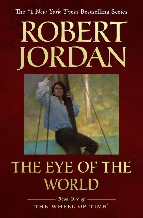
In honor of the Year of the Dragon, Tor Books is excited to announce that the first three novels in Robert Jordan’s beloved internationally bestselling The Wheel of Time® fantasy series will be published for the first time in trade paperback with sensational new cover art. The Eye of the World is scheduled for May 2012, The Great Hunt for June 2012, and The Dragon Reborn for July 2012.
As Harriet MacDougal and Brandon Sanderson work to complete A Memory of Light, the final volume in the series, the timing is perfect for millions of Wheel of Time fans to go back to the very beginning, when five kids from Emond’s Field had little idea of what lay ahead. Whether you’ve read the series once, a dozen times, lapsed after book eight, or are just coming to it fresh for the first time, these new editions are a perfect jumping off point for a fresh readthrough.
Check out the new artwork below, which originally debuted with the e-book editions of all three titles, but will grace bookstores for the first time in spring and summer 2012.

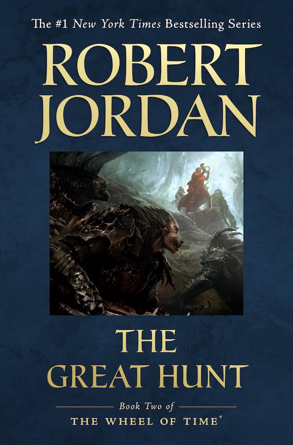
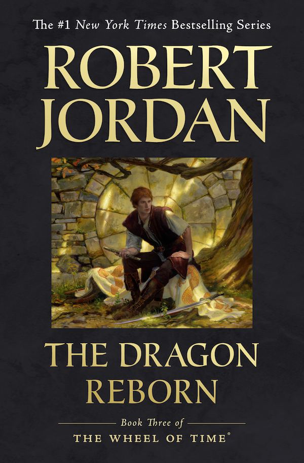
You can see larger versions of the art for these covers in the Wheel of Time Master Index.
The eBook covers and the new art is amazing, and I loved them. These covers… not so much. :(
There’s far too much ’empty’ space, and the artwork gets such short shrift compared to the eBooks. Also, Trade Paperbacks are terrible, terrible things.
Agreed, I don’t understand why the art doesn’t take up the whole cover.
Or if not the whole cover, at least a “widescreen” image that leaves the solid color at the top and the bottom, but wraps around the whole cover/spin/back. Its not like the books need a bunch of blurbs on the back. Overall, it’s kind of blah.
Its ok, though, these are just new trade PBs, so I’m not likely to be buying them anyway. I’m assuming that at some point after AMoL, Tor will release a new edition, ridiculously expensive hardcover collectors set. That’s something I would buy. I’ve already told my wife should such a thing occur, be prepared for me to drop $250.
I actually quite like them. For instance, I think the grey background on TDR sets off the brilliance of the predominantly yellow painting. To me, they almost look like little windows into the book, and I like the look. Besides, you’re going to need that much space when you get to the later books and have to print “Robert Jordan & Brandon Sanderson” in the author block.
That said, if any marketing folks are reading this, I won’t be purchasing the books. I have all of them in hardcover and ebook versions, and I don’t care to collect something as flimsy as a paperback. But, like @Anthony Pero, I would drop my savings in a heartbeak, should these become available in hardcover.
(Though now I’m wondering if the spines and back covers are going to be solid with just text.)
Feels like a constricted view. The images are way too small. Though, i do like the art for 2 and 3, i think the art for book 1 is kind of pointless. Overall, i prefer the originals.
Yeah, the artwork is given too small a space. I can’t help but think “thumbnail” when I see that.
One thing I would like is the ability to buy dustjackets for my existing hardcover books. I know that probably won’t happen since Tor wants people to buy the entire book, but it would be nice and probably cheap to do–plus it would get a lot more people who won’t rebuy the series but do want to get rid of their Sweet covers. RIP, but damn his WOT art was terribad.
These books were already published in trade paperback. That is how I bought The Great Hunt in 1991. Or is “will be published for the first time in trade paperback with sensational new cover art” the complete claim (implying that the old cover art was no sensational)?
Am I the only one who thinks that EoTW and TDR are weak? I like how EoTW catches the Thomas Cole-esque Voyage of Life beginning feel, but otherwise feels un-Epic. TGH is basically a HUGELY improved version of DKS’s work. And TDR? guh…. emo flute boy vs. DKS’s awesome (if filled with inaccuracies) seize the sword.
Some of the later new covers are awesome (WH, KoD), but these are bleh.
thay are way to Bland for me
The art is brilliant but the layout should be changed. I hope they plan to rerelease hardcover editions with the ebook art covering the entire cover. That would be BRILLIANT.
I hate these. Make the art full-cover and I’d consider buying them, but these bland bricks with tiny eBook cover art bug me.
Generally speaking I like the ebook art better than the original art (sorry DKS), even though these three aren’t the best examples of that. Like several others have said here, it’s also a bit annoying that the art doesn’t take up more, if not all, of the covers for these versions.
Personally, while I find the ebook Eye of the World cover a little bit bland, I think it’s a good fit for the book overall. It reminds me of the innocence of Rand and the other main characters in the first book, before all the craziness of the later books turned them into such powerful figures (both in terms of their own abilities and their political power) that have had to deal with so much sh*t.
I agree with Ghenjei about Great Hunt- much improved over the DKS version. I’m also glad they stuck with this scene because it’s one of the cooler scenes in the book, and that it too has Rand on the cover.
I’m not so happy that Rand is on the cover of Dragon Reborn. Even though he IS the Dragon Reborn… He’s in the book for like ten-twenty pages. Shouldn’t Perrin, Egwene, or Nynaeve, who got the most POVs and attention in that book, be on the cover? The later ebook covers got this right- Mat being on Shadow Rising, for example, was perfect, because that was when he really got a chance to shine. It’s a shame they couldn’t make this happen more consistently.
I like the Tower of The Ghenji in the background of the first one.
I also like the minimalist feel to it, even though most people seem to disagree with me on that. But to be quite honest, I think it’s portraying them as romance novels almost. Those pictures just don’t make me think “badass fantasy series” they make me like “fantasy romance”…which WoT is not.
The art for The Eye of the World depicts such an unimportant event that I didn’t even remember it. I had to look on the wiki to see when Rand was on a ship during the book. Oh yeah, while traveling from Shadar Logoth to Whitebridge. Ummm…. k. Not gonna depict Shadar Logoth or The Eye of the World or the Two Rivers or any of the settings that are central to the book’s plot? Kind of odd.
i love the ebook cover art and have been waiting for when they were going to put it on physical books, but i agree that the art is too small in relation to the cover.
even so, i’ll probably be getting these new copies. i prefer to read paperbacks (especially with books as long as these, since in hardcover they’re prohibitively heavy for hauling everywhere) and i also really like books to match, which i have about half paperbacks and half hardcovers, so i’ve been meaning to replace some of my copies anyway.
Make the art bigger, the rest is fine
While I agree that the art work should be more pronounced, I will still buy them, just so I can read them in public without having to block out the cover in some way.
Echoing the sentiment of wanting to see the actual art expanded. It feels too constricted! Why not just duplicate how it was done for the Ebooks? They were perfect. :)
Do we know what size “trade” paperback these will be? The hardcover/galley size? 6×9? Some other non-standard size? Are they using the plates from previous hardcover printings, or will another round of corrections be made?
I like trade paperbacks. I’m more concerned about what this announcement means for the final book cover. I was still holding out hope that we would get Mr. Sweet’s unfinished cover for the final installment.
Also, site technicians… It says underneath each picture “click to enlarge.” Traditionally, that means the picture will be bigger when you click on it… not smaller. ;)
Agree with everyone above that the thumbnail-like images are too small.
Why not just use the ebook covers? :/
I agree with many of the comments here, that this is a bit of a lackluster event considering it’s the Year of the Dragon and all. It seems like Tor is putting small thumbnails on paperbacks and asking us to shell out more money, and just for the first 3? There is no word if they are rereleasing all of the books in paperback with the amazing eBook covers. I remember tons of people at Tor.com saying they would shell out their money for an eBook cover art calendar or dustjackets. If we had a calendar then we would be able to see the details of the artwork much better. Why does there have to be such a vast border around the small thumbnail pictures? The art should take up the whole cover. I really wish Irene at Tor would tweet me back, she never does, but I am curious about Tor’s decision regarding the DKS cover for AMOL. Now THAT would be some real news. Fans already have to deal with now waiting until perhaps NOVEMBER for the final book when we’ve waited long enough (20+ years!) just because it makes more marketing sense to Tor? Tor could definitely get us the book, which is completed, by summer. I don’t mean to complain, but when I saw this news about new covers, I jumped out of my seat with excitement and then when I saw the covers I was very underwhelmed. Tor should be providing us with some real perks as we approach the end, not books we already have multiple copies of with small thumbnail eBook artwork.
@Anthony Pero @21
it enlarges but only if your browser is full screen and at a 1080p resolution or higher.
Ah, I see, the lightbox is set for 80% screen height. Some JavaScript applications have a button you can click in the corner to maximize the image size. When i right click and select “View Image” it does get larger. Still, almost all users will see a smaller image when clicking the image.
I am going to say that I appreciate the effort. The new cover art is beautiful and deserves to be seen in more than just ebook form.
Trade paperback may not be the most optimal showcase but it is nice that the new work is getting out there on the shelves. A lot of hard work and effort went into those paintings and the artists can benifit from being seen a bit more.
Mr. Sweet’s wrap around covers are, in there own way, synonamous with The Wheel of Time series for those of us who have been reading it over these past 20 or so years. Love them or hate them they are part of the Wheel.
These new covers on trade paperback is a nice way to rebuild the series for a contemporary audience who may enjoy the ebooks and want a physical copy. It is also nice for the new reader who does not have an e-reader and may want something better than a pocket book of 800 pages (making it not so pocketable).
I support the new trade paperbacks. They may not be perfect but it is a very nice start in recognizing the new artists beyond the ebook limits.
Hi folks. I posted this on Dragonmount, but I thought I’d share it here:
I don’t know for certain, but I suspect that Tor had a meeting that went something like this:
1. DKS has passed away and his in-progress book cover cannot be used. What do we do?
2. Answer: Let’s make fresh covers
3. But a new cover won’t match the old ones
4. So let’s make new covers
5. But we don’t have time (or budget) to make 13 new paitnings
6. Let’s use the overall excellent eBook covers and come out with the 2nd editions we’ve been talking about for a long time
7. Great idea! Also, it will encourage people to pick up the series again, or invite new readers
Some of you have commented that these new covers don’t feature the ENTIRE ebook artwork. Well, that may be true, but overall these new covers represent a very modern look for trade paperbacks.
In fact, one of the complaints about the original covers is that they scream “GEEK FANTASY!” rather than “Mainstream epic saga”. These new covers are far more likely IMO to be interesting to a casual reader or somebody who has not heard of WoT.
Why not use the exact ebook covers rather than these clipped images? If you’re going to re-release the books for the sake of the new artwork, you should feature that artwork, not put it in a tiny window.
@Blackajah,
I’m afraid there are just too many pieces still up in the air to give anything like a solid deadline for Memory of Light cover. I can tell you that we will show it off as soon as we can, but I’m not comfortable giving you (or even my boss!) a solid deadline on that yet.
I was really saddened to hear that we could not finish the series with Darrell. (I don’t imagine Robert Jordan, himself, saw it any other way.) I’m confident we’ll end it well but speaking from the heart, I have to admit I wish it was otherwise.
@Jason,
Sorta kinda. ;-)
We had been planning on trade paperback editions for quite some time, wether it was this or some other deisgn. Darrell’s passing was not part of the equation. We would have had an ebook edition of Memory Of Light regardless of the print edition.
But you are absolutely correct in that we want these to invite new readers to series. (As well as give fans more options.) We’d love to introduce the Wheel of Time to those scores of people that like to wait until a series is over before jumping in.
@benjicat.
I wont defend the asethic to anyone that doesn’t care for it. I’ll just state that an ebook cover and print cover have very similar-but-slightly -different roles to play. We tried to accommodate room for more copy, in case we need to add quotes and taglines that can live on the a web-page for the ebook edition. I also think that the larger image space works really well on the smaller sizes that ebooks are displayed at, but, can look a bit horsey on a physical book.
Another excuse to buy more WoT books – yay! ^_^
I agree with those saying that the art should dominate the cover a little more. I also agree with those who would rather hardbacks (I have a complete DKS set), but honestly I have been thinking about building a trade paperback collection recently, and I’ve been looking ALL OVER for DKS covers to match my first three trades (I have the rest in MMPB), but all I could find was UK editions (boring). I might reinvest in 1-3 to build this collection, though. I use paperbacks for lending (which I do a LOT for these books), and trades are much easier to handle than MMPBs.
I am agreeing with the majorty here. The Images look too small? Is this 100% set in stone? Can we try them with larger images? or a bit of a different layout?
I loved the ebook covers and have been wishing they were available in book form. I own the hard backs, but I read the MMPB and underline, and write in the margins, and make a right old mess of them. That said, I would prefer a new hardback set with the ebook covers, but will probably settle for the trade paperback.
I echo the sentiment that the DKS covers are embarrassing to carry around. And I agree that the new covers are much more modern, and will attract a wider audience than just us geeks. Epic fantasy is finally getting “hot” on TV and film, and the DKS covers were very old school. Anything that helps mainstream the genre is fine with me.
Putting my (former) graphic designer hat on, I like these new covers! The ebook artwork is far superior, and although I think the art could be a tad bigger, I like the “frame” of the color around the image. Think of it as a mat around a painting. I’m just not a full-bleed kind of gal.
Thank you Tor.
btw….we could still use calendars and new HC dust jackets….I’m just saying…..
I’m sorry, but these covers are really disappointing. Surely the art is more important than quotes and taglines? I was looking forward to repurchasing the series with the beautiful ebook cover art, but it feels like a waste of money to spend hundreds of dollars on such a small piece of the art. Here’s hoping that TOR will pay attention to how many fans are not happy with these covers and replace the design with one that better showcases the art.
@27 jwdenzel has it right I think. The books with the current cover art look a bit much for some people. I know people that ordered the UK versions so they wouldn’t look so obvious on the train. Of course, I’m buying ebooks almost exclusively at this point, so it is a moot point for me and many others.
I would like to see a leather bound copy of the whole series at some point. It would look better on my bookshelves than my current hardcovers and paperbacks (Yes I have both).
I’m going to admit that I’m a new WOT reader, so new that I’ve bought all the MMPB versions but haven’t started reading them yet. Ever since my early teens (we’re talking mid-90s) I was always been drawn to the artwork of DKS on the covers and wanted to read the series, but no money or having saved for something else always prevented me.
While I don’t want to take away from the artists who created the ebook versions that will now adorn the trade paperbacks, but if those would have been used originally then I wouldn’t have been drawn towards the books. The DKS covers just seemed cool and screamed out, “READ ME,” and frankly I won’t care what other people would think of seeing me reading the DKS artcover versions. The ebook artwork just doesn’t have that “cool” factor and just says “meh” to me.
Personally that’s just my take on it. And I hope DKS’ art is used for AMOL (or at least DKS-inspired art) because to me that is part of the whole WOT experience.
P.S.- I’ll be starting EoTW as soon as I finish the current book I’m reading, which I’m about 65% through, then alternating between other books on the “To Read” pile and WOT. Can’t wait!
@36: That’s exactly what we are hoping for — that some readers will enjoy the Sweet covers on the mass market books, while others are attracted to the new ones. We will certainly continue to publish the mass/Sweet editions.
Skip@35
Tor prints 100 leather bound editions of each book. They are numbered and really expensive.
I’d re-buy a complete leather set with the new covers – especially if it was the later printings with the errors corrected. Can’t say as I’d pay a kings ransom – but I’d definitely pay a premium.
PLEASE PLEASE PLEASE TOR!!!!!!!!
Don’t be scared to use the incomplete DKS cover on AMOL! It’s poetic! Makes a real statement. A Memory of Light, A Memory of Color…can be construed as the same thing! Someone else mentioned this, so I guess I’m just echoing the sentiment, but RJ didn’t live to see this complete, DKS didn’t either…maybe we all should be able to SEE how something is complete when we behold the cover. Comes full circle, sort of like a wheel. Makes the last book seem more foreboding too, seeing it all black and white. Sort of like, a yin and yang…
The problem for me is that the the FIRST book, TEOTW. The starting point for the series, makes it look like a Pirate book. I mean come on. The first cover should explode with the greatness that this series is.
Rand on a boat does nothing to show this. Werent there any other awesome scenes to convey?
Shadar Logoth? The Myddraal on the road to Bel Tine? Fighting Trollocs at Rands house or the Two Rivers? Mat clutching the dagger? whitebridge? The Blight? Fal Dara?
Arguably the best DKS cover in the original series is TEOTW. Why make it look like a pirate adventure when there are so many awesome scenes that could be depicted?
Doesn’t anyone else feel like this is an inaccurate depiction to this great epic fantasy adventure?
If I were a first time buyer, I would say “Hmmmmmm? Pirate story” and, just pass it by.
On a second note.
I would love to see a leather bound SINGLE volume of the entire work all in one book.
Every book in one tomb.
It could be 14 inches thick, weigh 100 pounds and cost 400 dollars.
I would buy it.
I really like the new E-Book covers. Nearly all of them. The exceptions are: A Crown of Swords, The Dragon Reborn, to a lesser degree The Gathering Storm and espeacially The Eye of the World. Just as Shawnchan said @41: The Eye of the World cover gives a completely wrong impression of the book. I know this is a scene out of the book and I guess the artist thought, that this would express the feeling of a young man going to see the world, which would be really fitting to the book, but for someone who has not read it, that just wont work. Maybe a picture of Rand and Mat on their way to Caemlyn would have been better…
On the whole, re-releasing the books with new covers is a necessary step – the DKS Covers are just too far away from the “state of the art” (and pretty terrible in my opinion).
Well I have been dieing for new wot covers for a long time now. So on that note, yay! But the art for TEOTW is the most under whelming of all the ebook covers, and now that the art is just a thumbnail. If tor wants to release all of the books again that’s fine, but they dropped the ball here IMO, for some of the ebook covers this layout will work fine (tDR for example) but it wont work for some of the other one’s (LoC). Also why only release the first 3, in the summer, tor should be releasing all of these books in a span of a couple months. Now I am gonna be stuck with 3 trades on my shelf, and no good place to even put them. Year of the Dragon my but, more like Year of the underwhelming ad campaign.
Yeah, I look at the first cover and I see:
The #1 New York Times Best Seller
Mark Twain
[Picture of Rand on the ships mast]
The Adventures of Tom Sawyer
———- Book One of ———–
Tom Sawyer’s Travelouge
Double Post… the WYSIWYG is acting wonky. At least it give me an excuse to type “wonky”.
I’m in the minority, but for the most part I thought the e-book covers were weak, being better suited as interior illustrations. The covers for EotW and DR do nothing for me whatsoever, especially since I recall being drawn in as a wee lad by both of those particular DKS covers when they were first released, but hey, maybe they’ll catch someone’s eye on the shelf.
So glad, the original artwork always bothered me…the people were always weirdly proportioned and “looked” nothing like the characters.
@38. anthonypero – I know, but I really want a set, not just each book. Like @39. forkroot said, I’d like them to be the revised printings. And I’ll go one step further to say that I’d like them all in the same typeface. On good paper the books actually will be substantially thinner. I’d be willing to pay for it, I know the cost to print such a small batch on good paper and binding isn’t a very economical enterprise. Not so willing that I’d sell my signed first editions to buy them, but still.
I definitely won’t be buying these – I agree with everyone saying the art is way too small. I also despise the trade paperback format – you lose the good features of a paperback (cheap, lightweight, and portable) without gaining any of the good features of a hardcover (durability and quality).
No disrespect to the artist, but personally, the only cover of these new books I liked was for The Great Hunt. It had immediacy and an implication of action and danger, it didn’t really look like an interior art layout as the others did. I need to re read WoT but, I don’t remember alot of it taking place on sailing ships.
It looks like Rand is sailing and probably be better used on a cover of a Fantasy where sailing is more intergal to the plot. No disrespect also but I grew up, like many others, with the Darrel K Sweet covers of the originals. I only hope this new artist gets more experience and can someday be as experienced and revered as Mr Sweet was.
While I didn’t care for the original’s lack of consistency with the book – I can say that I originally picked up EOTW because Lan looked so cool and Moraine so cute.
These are just lame.
But, I am not the biggest fan of Sanderson’s re-characterizations – so they kind of fit with my general disappointment. If only Brent Weeks had been next door neighbors with Jordan…
I don’t like these at all – I prefer to imagine what characters look like in my own head, I didn’t like the original set of “pictures” and I don’t like these either as they don’t conform to what I think Rand looks like. I prefer the proper paperback and hardback set with the different coloured pictures of the Wheel of Time, its far more appropriate for the series and far less divisive. This new artwork seems completely pointless, none of us who already own the books are going to buy them and, if I were a new reader, I would be more drawn to the clean lines of the WoT symbol, which doesn’t tell me how I should think the characters would appear like. The best thing I can say is that the artwork is better than the original set, and that isn’t saying a lot as that was universally dreadful!
I always think character appearance should be mostly left to the reader’s imagination – see Janny Wurts Wars of Light and Shadow series or Steven Erikson’s Tales of the Malazan Book of the Fallen for great book covers that still leave plenty to the imagination ;o)
I am chuckling to myself. Why? I did cover designs 30 years ago so simlar that I did a double take when I saw them. But then I was a typographer in those days and font selection and size was just as important to my sence of good design as pictures. Sorry that so many of you don’t like them; as a professional I give them the thumbs up.
I like the fact that Rand actually looks like a kid. Because he is one.
Not I’m gonna have to buy them aaaaalllll over again!!! :) Not that I mind, of course!!!
WOW- Let me re-type this, as apparently it was deleted for speaking the truth?
PLEASE do NOT release the new cover art! It is very, very lacking!
—-
Let me explain: People DO judge books by their covers!
A little over 20 years ago, while working graveyard shift at a local gas station, a young man who loved stories, but hated to read anything that was not comics or role-playing books, discovered this book on the magazine stand at work. The cover was cool. It was attractive and very, very eye catching. It was next to several blah, solid covered books that had a small image surrounded by book titles and authors names, and those books were boring. The Eye of the World? Hmmm…
So I opened it. And have been addicted ever since! I now have THOUSANDS of books in my personal library. I read various books at once, and even write on the side. I am an independent film maker, and am working on a new series. I would love to turn the WoT series into a TV series!!! Saying that Robert Jordan changed my life is beyond true – It is like part of my DNA!
The point is this: Looking at the new cover I get bored. I think of Mark Twain and a million pirate books for teens out there. I am NOT attracted to this cover. If this cover had been originally released, I would not have ever cracked open the EotW. My life could still be dull, and lacking.
The new covers do not display the wonders of the story inside, and do a great disservice to Robert Jordan and Brandon Sanderson – two men who have brought TOR million$!
So00- my recommendation: Release a collectors edition or two. Offer a challenge to fans to create the covers and use social media to have us judge them, selecting the winner. Create a series of covers, that when put side-by-side on a shelf all make up a bigger picture (the Wheel, Serpent, Spear and Sword perhaps). I would SOOOO buy that!
At any rate, listen to the fans- we are after all, the people who buy the books…
Just my 2 cents…
The first fantasy book that I have read.. The wheel of time is my favourite fantasy story and I read the first book “The eye of the world” in 1997.
I can’t wait for the last book to come out this year…
To wait for the last book in 2012, I’m currently rereading all the books of The Wheel of Time. I’m now in book 9 and hopefully when I complete until book 12, I will get my hands on book 13!
Its amazing to see the different cover of the first three books as I still having the original cover when the books came out in Malaysia…
The new covers are barely ok- at least the author and title are clearly legible. The original artwork was much better though, very rich and vibrant. Why bother with new very wimpy cover art? Don’t want to fork over extra money to Darrel Sweet’s estate??
I just hope you make the new books so the covers actually stay on the book this time so the whole thing doesn’t fall apart again. The last books were very poorly made especially for the price we paid for them.
I think Art is subjective, for me these covers are very dynamic and engaging..much more than the Hardcover art from previous..I look forward to seeing the entire set when it comes out..
Has it been confirmed that these will be released for the rest of the books in the series? Read through the entire series 2 years back, and loved it, but didn’t really want to invest in my own set… But saw these for the first time in person, and really wanted them. But before I start the grand spending… Are we actually going to get the whole series?
Mmmm, i dont like this at all!! I’ve been busting my ass to find the ORIGINAL Tor publishings, these latest releases, along with the artless paperback issues, terrible. To the people that say “The old ones scream geek fantasy, not mainstream blah blah blah”… who cares? If you dont want to read a book because you feel the need to label it into “geek fantasy”, you can go find 50 Shades and gently place it into your rectum. You’re not changing the text in the books, so dont change the original art!!! Boo!!
I don’t like this at all. I probably would not have gotten into the wheel of time if it hadn’t been for the amazing cover art on the first book, and the second book had the best cover art I have ever seen on anything. And they are replacing it with generic looking covers that look like all the other fantasy books. The old cover art really made these books stand out. Definitely not getting the new covers.
Hi, I have a question if someone from Tor could please answer it, will they release a new hardcover edition with these covers?
I really like the new covers, I do prefer the ebook versions but in hardback the art would be bigger so that wouldn’t bother me. Contrary to what lots of people are saying, I like the Eye of the World cover, I prefer having a poetic image from the book to a depiction of one of the exciting moments. I hated that they put the climactic moment of the TDR right on the cover, it gave away the ENTIRE plot, and we could all safely assume that Rand would indeed get the sword at the end of the book.