


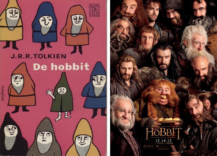
We were tickled by this BRIGHT PINK cover from the 1960 edition of The Hobbit from Netherlands publisher Prisma Boeken, not only because of the grade school art of Bilbo and the dwarves, but because of the striking and massive accumulation of detail in the 52 years between the book and the posters for the forthcoming film adaptation of The Hobbit. (How far we’ve come?) Click the image to enlarge.
I love how cute and vaguely pschadelic the 1960s hobbits are. That little guy waving, really could be hiding a joint or something under that cloak.
___
Speculators Club
http://www.speculatorsclub.com
Where Serious Sci-Fi & Fantasy Fans Hang Their Pointy Little Hats
Must be one of the ugliest covers ever!
I usually hate it when they change covers. It’s one reason why I don’t want to read translated to Dutch books. Because they want to use other homemade covers, they change the size from pocket to big-sized books…..somehow probably thinking people take the book more seriously or something. But bigger size means taking up more space, I’ll take pocket-size anytime. Translations usually suck bigtime….for example Discworld by Terry Pratchett…who in their right mind wants to read that in Dutch?
And by using other cover artists, publishing bigger sized books and using translators the prices are way up compared to the original. On top of that, if published at all, you have to hope a series will be published in its entirity…and months (years?) after the original release.
So adding it all up, I’m glad I can read English and am not doomed to sucky translations and bad covers that hurt the eyes even more due to their size for which I have to pay more too.
Don’t even try reading Douglas Adams in any other language than English. I once flipped through a Dutch translation of The Hitchhiker’s Guide in the local library and I immediately put it back…yugh! I’m glad most Dutch like me are fairly adequate in the English language so an original English version isn’t hard to find here usually. That cover isn’t even cute…