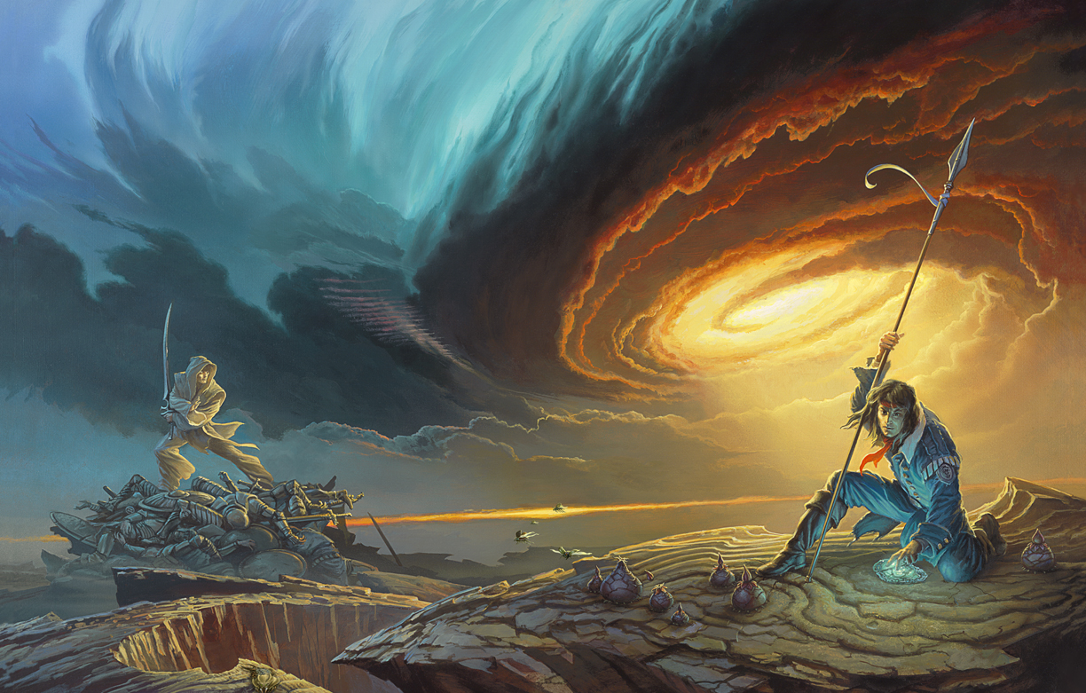
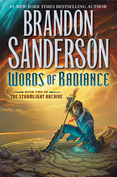
Tor Books is proud to reveal the cover for Brandon Sanderson’s upcoming Words of Radiance, sequel to the New York Times bestselling The Way of Kings! Below the cut, artist Michael Whelan shares his thoughts on the process of designing the cover, including several preliminary sketches for alternate images.
As with any Brandon Sanderson book, there’s just too much content to try to distill such a complex tapestry into one image, alas. Having such a rich world of possibilities is overwhelming: a well delineated but diverse cast of characters, strange yet compellingly natural flora and fauna, multiple story threads weaving from page to page…how does one choose what to present? It seems as if any choice will be wrong, for having to leave something else out that calls to be presented to a potential reader. Nonetheless, a choice must be made.
I was aided in this part by Irene Gallo and the editorial staff at Tor Books. After conferring with Brandon Sanderson they agreed on a short list of key scenes for me to consider. Irene sent me these possible scenes in an email accompanied by copious notes about characters, dress, and other necessary details.
I chewed over these potential scenes, read what I could of the actual text, and let everything simmer in my head while I completed other tasks. But even with the limited scope of the scenes that were selected for me, possibilities abounded in such profusion that I began to feel paralyzed with indecision. All directions looked equally tantalizing.
With such a bewildering array of opportunities before me I fell back on a formula that I’ve employed regularly through my career: set out to establish the value relationships of the image first and save the issue of color for the last step before beginning work on the actual painting. Once I get started, ideas start popping up in my head even while I’m doing something else; in such cases I’ll do a sketch on whatever is handy. Many of these quick loose sketches or “thumbnails” are done on sheets of old manuscript paper [from books I was commissioned to do in the pre-digital days]. One can tell I used that stuff because the lines of type on the reverse side almost always show through the image if I choose to scan it for something like a blog post. ;-)
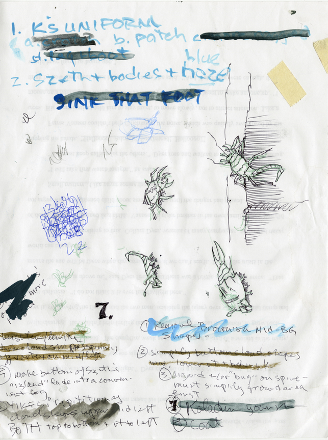
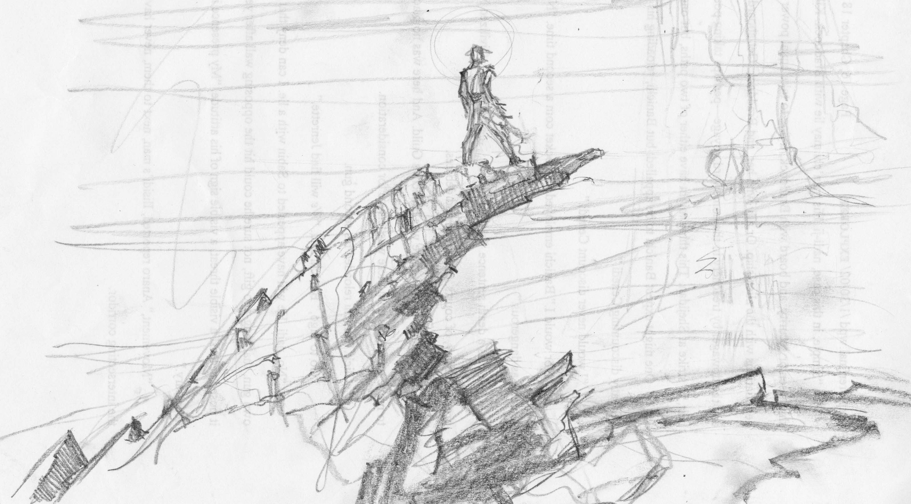
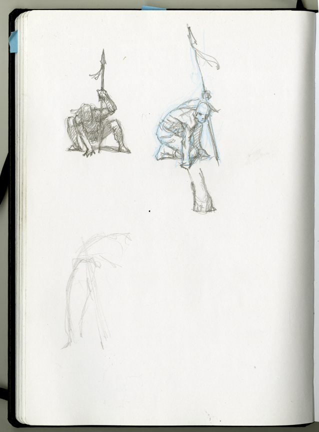
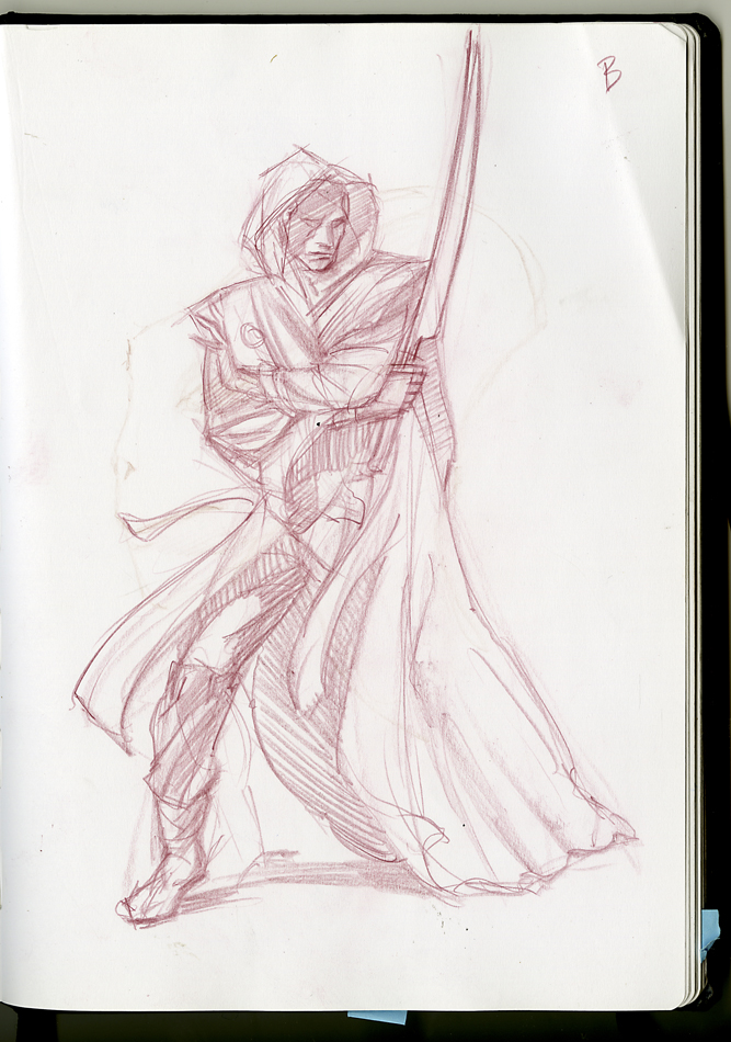
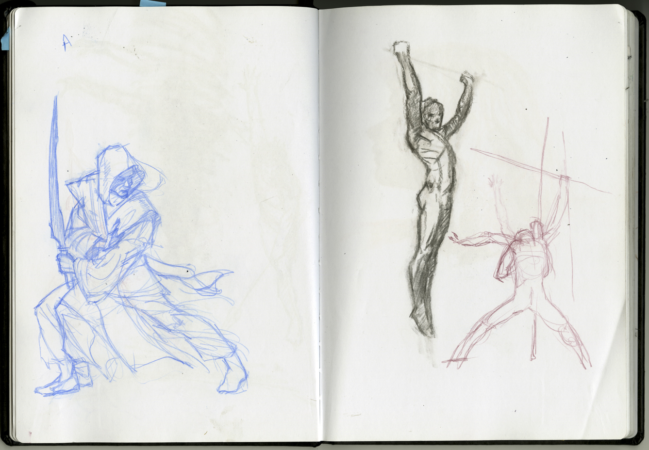
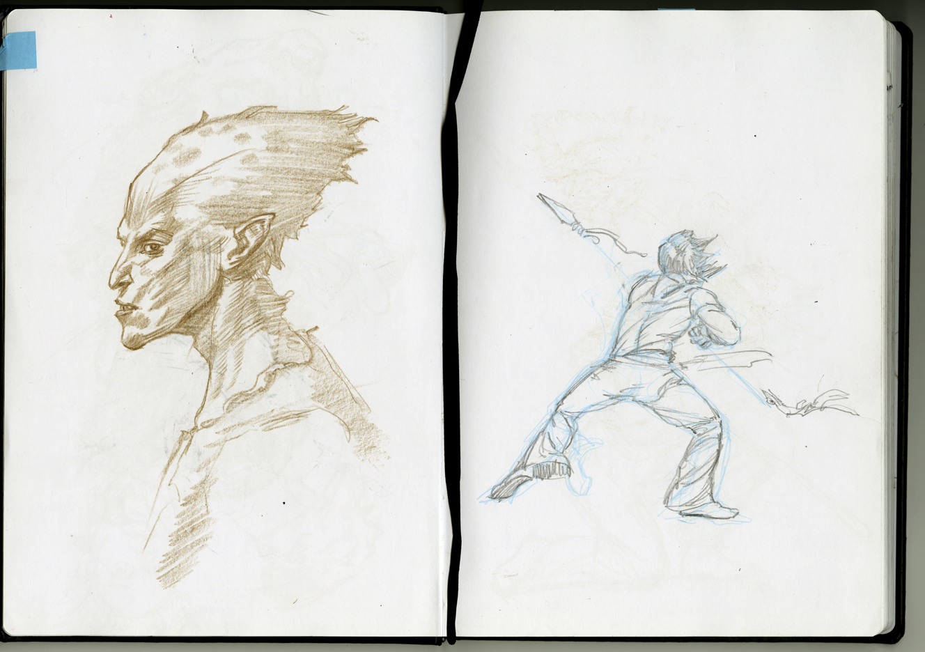
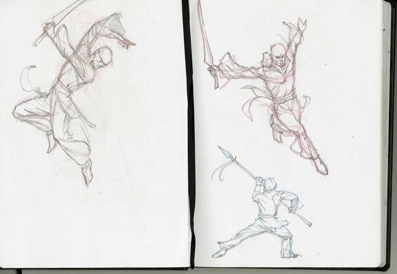
Most of my prelim sketches, however, were done in my studio—in sketchbooks…
…or painted directly on scraps of watercolor board.
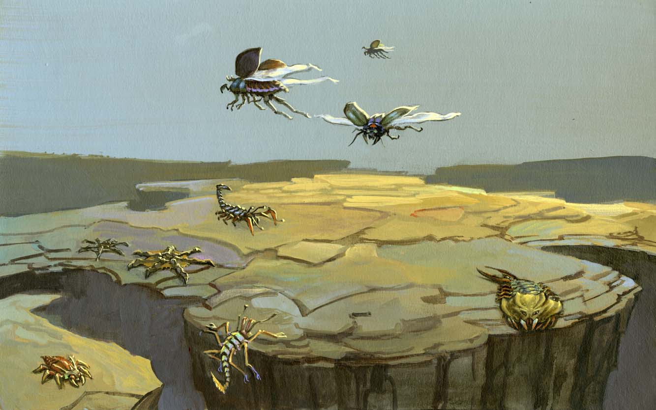
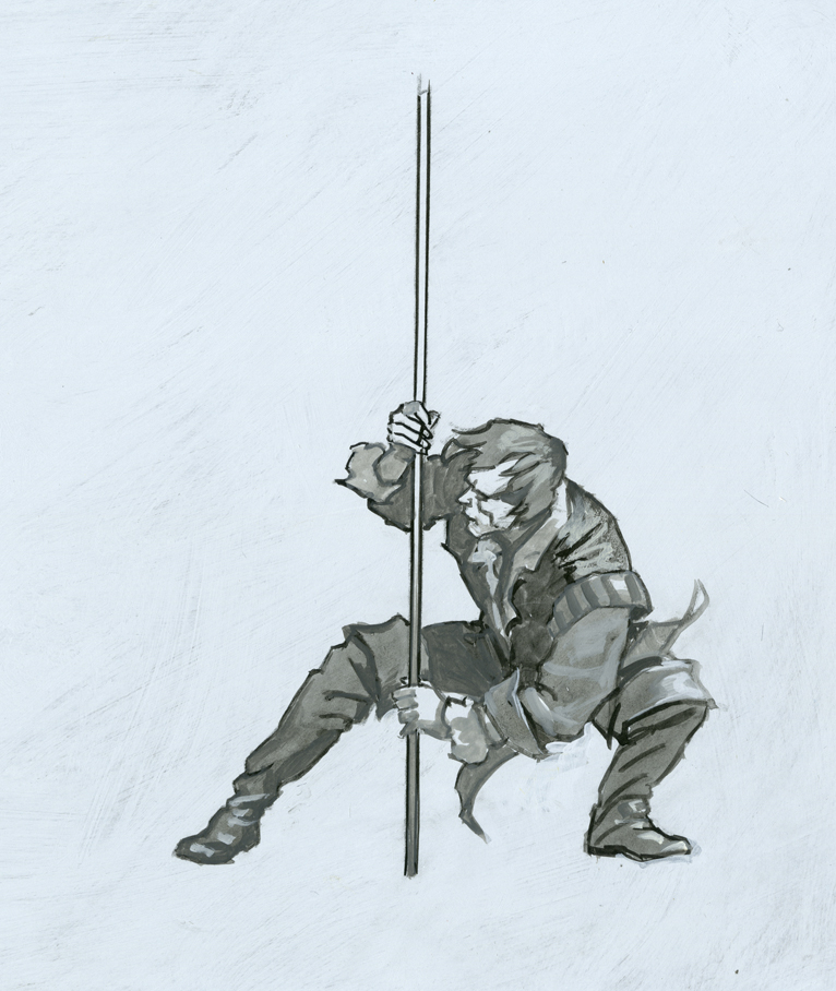
Unfortunately, I wasted some time drawing out some concepts that were based on a mistaken notion of who was where in the picture I was thinking of painting, and so I had to scrap those approaches. Nevertheless, it helped get me into the right mindset for taking things further.
Eventually, things started to gel for me. As I have done on my past several projects, I separated out the background from the foreground and worked on them independently, at least at the beginning. I’m not convinced it is a good way to go ordinarily, but for the Stormlight Archives books I think it’s called for, due to the key importance of the weather in these stories. it seemed appropriate to me to “build the storm first” and construct the scene within it, rather than the other way around.
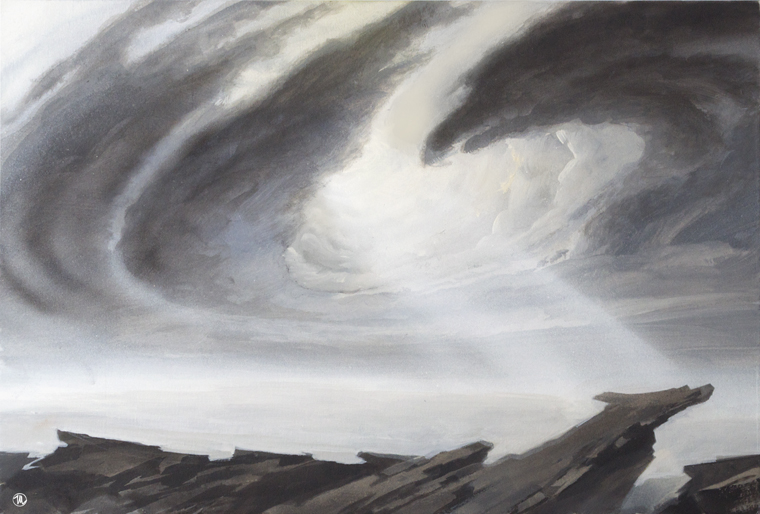
As I felt my way into Roshar territory I alternated between coming up with ideas for light effects/storm systems for the background and doing sketches exploring figure poses. My thought was that I could work both ends of the problem at the same time and after a while an intersecting idea would come to me in which all the elements worked together.
Riffling through my preliminary sketches, I scanned a bunch of the most likely candidates into the computer and tried assembling them via Photoshop. I came up with all sorts of variations, most of which were too crappy to show here. But Irene found one she liked well enough to give me the green light on, and after some discussion we went with this concept. She was kind enough to send me a provisional type layout which was extremely helpful in that it showed me where to alter the composition to make things fit in the open areas.
But before I could start I needed to 1) get a color scheme together and 2) give myself some reference photos to go by as I worked. The color scheme I did in my usual fashion—small and loose— painted on a scrap of canvas at roughly 3 x 5 inches.
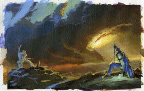
(As I got going on the painting, however, I lost confidence in the tiny color sketch and made a sloppy but larger version, which is visible in the studio photo below.) For the reference photos I posed myself in front of a Flip Video cam on a tripod in my studio. I took several screen snaps off the video and dumped them into my studio laptop. The resolution was low but good enough for my purposes. No one photo was quite right, but between the different shots running in an iPhoto slideshow, I had enough visual info to do the job.
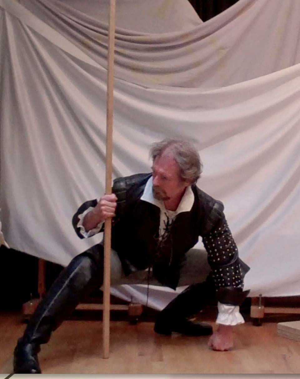
Just to be sure, however, I did a painted study of the two main figures to use as my “models” while I painted.
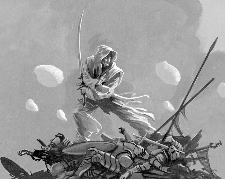
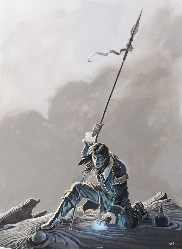
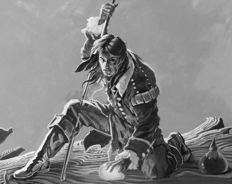
From that point it was just a matter of painting the painting. I used acrylics on a 24×36” Gessobord, going from background to foreground as per my usual practice. My laptop was next to me the whole time, running a slideshow of my reference photos and sketches.
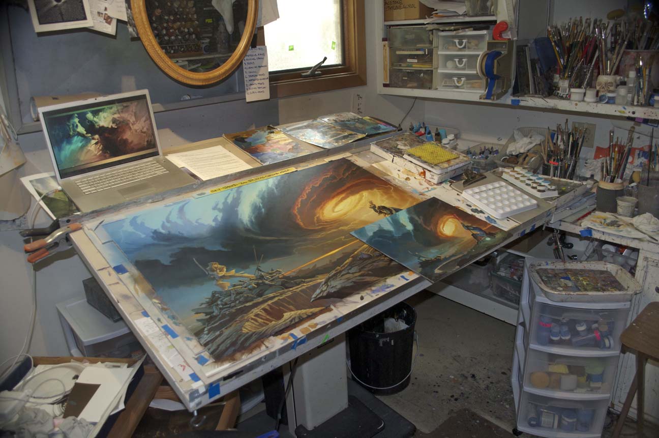
Unlike my painting for The Way of Kings, I went right into it without doing a pastel underdrawing of the cloud structure first. Later I wished that I had not skipped that step, because I changed my mind a few times about the look of the clouds and sky on the left half of the panel—meaning a lot of time spent in overpainting, which I could ill afford as I was already behind deadline. (My summer’s work has been deeply affected by a severe back injury at the beginning of June, which made it almost impossible for me to focus on what I had to do for weeks afterwards.) Fortunately, the folks at Tor granted me an amazing amount of slack as I worked my way through this process, and for that I am extremely grateful.
Thanks to Brandon Sanderson for writing such an inspiring book, and thanks to Tor for allowing me once again be part of what will surely be called the high water mark of fantasy in our time.






The cover is beautiful. I enjoy your art. Thank you. And I’m so looking forward to reading this book!
AWWWWWWWWW YEAAAAAAAHHHHH
Kaladin vs Szeth…*twitch*
Beautiful art Mr Whelan.
It looks like Szeth on the back cover. The sword is wrong (Szeth’s blade is double-edged), but otherwise appears to be Szeth. Looks like we do indeed get a fight between Kaladin and Szeth in WoR.
Beautiful. I can’t stop looking at it
Ahhh.. Yeah! Kaladin vs. Szeth. Bring it on!!!
The painting is beautiful. I love the colors and really enjoyed reading about Michael’s process and seeing his prep work!
@3
That’s what I was thinking. Can’t wait!
Sweet! This is now my new desktop background so I can bask in it’s beauty.
I want to know what the blue shinning thing Kaladin is touching is. Something that holds stormlight?
The final image is – for me, at least – literally breathtaking. Thank you for the gorgeous painting, and for the look behind the scenes. Beautiful.
(And yes – I actually forgot to breathe when it filled my screen.)
Very beautiful!
This looks great! Just going off the first image of the front cover, I didn’t really get why this was considered a scene of importance or relevance initially. But after seeing the full layout (and the final, finished image), I am truly appreciative of Mr. Whelan, Irene, Brandon and the rest of the Stormlight Archive team for the selection and final image!
This is truly awesome! I was already looking forward to the release of Words of Radiance, and with the (apparent) confirmation that Szeth will face Kaladin in this book, I can hardly wait for it to come out!
Thanks guys!
Ohhh my god. So hype. Kal vs. Szeth. Beautiful as always Michael Whelan.
I love this! It’s gorgeous and I’m really excited to see Szeth.
This is awesome, great imagery.
Shardlet @@.-@ – If you zoom in on the picture, Szeth’s sword appears to be double-edged, despite the slight curve.
scio @9 – On a guess, I’d say it’s something he has infused with Stormlight for some purpose we’ll find out when we read this scene.
My first thought when I saw the front cover was, “This is Shallan’s book! Why is Kaladin on the cover?” Then I saw the final, where it’s clearly Szeth vs. Kaladin, and thought, “Oooohh!” We’ve anticipated this event since we read Szeth’s last chapter in WoK (or before), and now we know we don’t have to wait two or three books to see it. Sweet.
Anticipation did not exceed reality. Wonderful work.
Michael, you must know how appreciated is your dedication to story fidelity. It is clear from your commentary how much you engaged in the story in order to determine an appropriate composition, and this reader is extremely grateful.
Others have noted the obvious Kaladin v Szeth confrontation here, but is it really? Szeth stands atop several fallen warriors, and there appears to be at least three sets of Plate there. Not going to venture into theorizing in this post, but…
Wet – I had the same response: “I thought this was Shallan’s book.” But…I guess Szeth v Kal trumps it.
Nice piece of work, Michael, in any event.
First off – :::squee stormlight stuff::: and can’t wait to read Kaladin vs. Szeth.
Secondly, maybe I’m being overly critical, but especially closeup where you can’t see the spear tip Kaladin looks like Steven Tyler with his headband and mic stand. Also, the pile of dead bodies all in one place with Szeth on top just looks ridiculous to me.
Oh holy crap it’s Kaladin v. Szeth. I’m DYING to read this fight. I also may have shortcircuited my laptop with the drool.
Amazing work, Mr. Whelan.
Nice! Wouldn’t mind having a full size print to match with my print of the cover to A Memory of Light!
Freelancer @17 – Well, clearly they haven’t actually started fighting one another yet, but they’re in the same scene, so something has to resolve here. Either Szeth abandons his orders, the orders are changed, Kaladin fails to protect Dalinar, or… they’re about to have a confrontation. I’m sure there are a few other permutations possible, but those are the obvious ones. In any case, it’s a cover-worthy scene, which generally means that not only is it something that can be depicted in a still painting, but it is significant to the story as well.
Also, there are a lot of bodies, and clearly some are wearing armor, but is it merely plate, or is it Plate? Am I missing something that indicates he has defeated multiple Shardbearers?
My first thought was “Why isn’t it Shallon?” too, but then I remembered that Dalinar is on the cover of Kaladin’s book. So there is no reason to expect the flashback character to be featured on the cover.
Great piece! And, sorry about your back (as I can relate). I hope you are doing much better.
Bring on the storm!
Another beautiful work of art, Michael! I love to hear about your process.
I hope your back returns to pre-injury form. It’s amazing how pain can take over, eh? Glad you are better.
Your beautiful book I got at JordanCon continues to bring hours of pleasure….and starts many conversations!
Thank you!
Please make this into a wall paper like you guys did with the last cover!!! So excited about this book!
This is definately drool worthy! Such beautiful art that really invokes the feeling of the world of the Stormlight Archives.
One thing to notice is that Kaladin is not looking at Szeth – which could just be artistic license or it could be that Kaladin hasn’t noticed Szeth yet – OR its also possible that Kaladin doesn’t consider Szeth a threat for one reason or another.
I love it!
Thanks Michael, that’s really gorgeous! Sorry to hear about your back :( – I hope it’s healing well.
Spearman = Kaladin. And he’s grabbing Stormlight. From the sketches, those acrobatics look like Surge Binding to me. Szeth was told to kill Dalinar, and Kaladin is guarding him now. The battle was foretold!
Okay, why did I choose to look at this when the book release is so far away. WHYYYYYYYYYYYYYYY?!!!!???!!!!!
Kaladin vs Szeth! ZOMG OMGOMGOMGOMGOMG! I. Cannot. Wait.
Just one question –
Is Kaladin planning an assault on precinct 13 or is he maybe about to punch Blackadder in the face and steal his girl WOOF!
My guess is that Kaladin is holding a recently harvested gemheart from a chasmfiend. What’s better than Kal and Szeth fighting each other? Kal and Szeth fighting each other while dodging/killing a chasmfiend or two.
Oh, and amazing work on the painting!
Incredible artwork. Just amazing. I can only imagine the level of talent and effort it takes to paint something like this (I can’t even draw good looking stick figures), but I can certainly appreciate it. Very well done.
Normally love Whelan’s stuff, and I’m not typically someone to be critical, but this leaves me wanting more. The full image at the end of the article is nice, but the way the piece is framed on the cover is very displeasing. What I would consider the worst part of the painting, the awkward pose and facial expression on Kaladin, is front and center, while the redeeming effect of the light from the heavens is obscured by the text in the top half of the image. I’m just glad this isn’t the cover of the first book of the series, and therefore isn’t so critical to the book’s success.
Szeth’s blade is just fine. He based it on the canonized design as seen in the novel and the concept art.
You know what would be awesome? If we could buy art prints signed by both you and brandon.
Thank you, Ben!
Question…
Where’s Syl?
If Kaladin stretched his left arm out as far as he could, and slightly back, he’d almost be able to reach her. ;)
Wetlandernw @22
Oh, there’s little doubt that the two must face off, the foreshadowing cannot be denied. Much of the previous theorizing about this is that Kaladin would somehow prevent Szeth from completing his mission. This view brings a big question mark to that thinking. As to the armor, in the pencil drawing of the scene, at least three sets of armor strongly suggest ShardPlate. Whether that is the intent or the final execution of the art, and whether the art is true to the text, remains to be seen.
Either way, most intriguing.
Ah. Yes, I missed what could easily be seen as “overlapping, interlocking plates” the way Shardplate is described. As you say, the detail remains to be seen, but it is definitely most intriguing!
Hyperventilating with excitement!
Podsixia @31
If that is a gemheart, perhaps it’s filled with a vast amount of stormlight energy for Kaladin to draw upon?
This is a beautiful cover, I love the colors
@Quethas: I agree with you a bit. Once again Whelan paints the most beautiful storm system, and they cover it with words!
The type treatment really dominates the cover. If Brandon gets any more popular (big authors = big type), we might have a wraparound cover with all the action on the back!
re: Shallan not being featured…perhaps you haven’t seen everything yet. Book 1 was heavy on illos, right? It’s not unheard of for MW to do interior work. He’s done some pretty amazing stuff on the Dark Tower book interiors for example. Maybe Shallan fans shouldn’t give up hope.
re: reproductions…I believe we’re looking at later in the year for the release of a print on Michael’s website. It should be something along the lines of WOK and AMOL in terms of size and quality although I’m not sure about the author sig.
I’ll check with Audrey and see what she’s planning. I know she just sold through on the special edition of the AMOL prints that were signed by Brandon and Harriet as well as Michael. Plenty left signed by just the artist though.
Preliminary concepts should be in the shop for the holidays along with a few other little doo-dads. We’re working on metal etched bookmarks of Michael’s art from WOT and Stormlight. I have a couple featuring AMOL and they look fantastic.
@17 just because there is armour does not mean that it is Shardplate. If it was that would possibly mean that Renarin, Dalinar, Adolin, Elhokar, Sadeas and mabey even Amaram. Any of them could be dead and more that I cannot think of right now. That would be a disaster IMO
PLEASE… how does one get on the PRC list… I have chocolate.
http://www.edparton.com/blog/words-of-radiance/ would a post on ANTICIPATION do any good???
Okay, will have to buy the harback book now. For WoK, I only have an ebook version.
The parallel to the storm of the first cover is too perfect.
I was with others who asked why Shallan wasn’t featured, but as @45 MRJackson said, we shouldn’t give up hope yet. Guessing there will be lots of her drawings on the inside.
And the Parshendi do look a little “skinny Ironman” for me, but I had not spent much time visualizing them. (Really like the drawing with the swept back skull.) Guessing that’s a pile of Parshendi Szeth is standing on.
Great Job Mr. Whelan!!!
Hope your back issues continue to improve.
shardbearer @47 – This is Sanderson. You don’t eliminate a possibility just because it would, apparently, be a disaster. :) We don’t know for sure yet, and we won’t until we read the scene, but Freelancer correctly points out that the pictures seem to reflect the way Shardplate is described in the text, as opposed to regular armor.
Braid_Tug @50 – Interesting idea, that the bodies around Szeth might be Parshendi. Again, we can’t really tell for sure, but it would explain why there appears to be a Parshendi sketch in the preliminary works.
This just gets better and better. The anticipation builds… ::cue music::
Just thought it was worth pointing out: it was strongly implied at the end of WoK that Dalinar was giving his Plate to Renarin, and I would expect that by the time Szeth gets to Shattered Plains from Kharbranth, the transfer would already have taken place. If the bodies Szeth is standing on are indeed wearing Plate, I would argue it’s less likely to be Dalinar dead than it would be someone else. Certainly could be a disaster nonetheless, but I wouldn’t count our favorite Highprince out of things just yet.
@35, John –
A little songling tells me that you will be able to bid on a print of the WoK cover art signed by Brandon and Whelan at the JordanCon 2014 charity auction. :-)
For the sake of my own sanity, I’m just going to assume the bodies are metaphorical, representing all the people Szeth has killed in the past years rather than in the past 5 minutes.
Clearly Szeth has already broken Kaladin’s neck. Would a “spoiler alert” have killed anybody?
Kaladins face in the black and white picture looks way better than the color version on the cover, in my opinion. His face on the cover is distracting, and takes away from the overall impact of the cover. Besides that, I love the cover. The colors are great, everything is great except his face.
Wow! This painting is fantastic. I really like the circular gestures in the clouds as it centers in on the light, they remind me of Starry Night, which is one of my favorite paintings.
As always, a truly stunning cover by Mr. Whelan. I’m in awe!
Kurkistan @54,
I somewhat like the metaphorical approach to all the bodies at Szeth’s feet. It would be difficult to imagine him as ready to keep fighting after defeating so many, including at least two in Plate (I still think it looks like three sets of Plate in that pile, but it’s hard to tell). With Szeth’s methods, I can imagine that many of the bodies would be down the chasm, or thrown about by various Lashings. But as cover art, the visual must be engaging in limited space, so there you are.
FYI, the final image shown above isn’t simply a thumbnail, but a shrunken full-resolution pic. Save it and view it full sized for all the amazing details.
hearmonicaroar@56, why? What’s wrong with his face?
@56, Totaly agree. While I love the painting as a whole, on the cover Kaladins’ face is what draws the eyes and it’s weird because, in my opinion, that red bandana around his forehead makes him look like he should be in an eighties hair metal band. I think my problem might also stem from me having a very different image of Kaladin in my head than what is presented on the cover. Love the full painting though.
No Kal Vs Seth. Kal’s doesn’t seem like he is fighting. Otherwise this is so cool
“SINK THAT FOOT”
Lol, sorry, I just find this note funny :D
Also, love the cover! Great art!
We learned this week that the cover art that’s been revealed isn’t actually quite the final version. Kaladin looks a bit different in the current version, and the gemheart is no longer in the picture. However, we aren’t likely to see the “current version” because Mr. Whelan keeps improving on it. :) He’s also doing (of his own volition) some endpapers! Woot woot!
@60. PeterAhlstrom I’m sorry, I didn’t mean to ignore your question, I just didn’t see you had responded! In the black and white version Kaladin appears to be looking up which seems more natural to me. In the final color version presented here he appears to be looking in a different direction and it almost makes him appear to be crosseyed. I guess I like the other direction he’s gazing better.
This is probably too late a response, but there you go!
The color of the painting is truly beautiful, but I can’t get over the look on Kaladin’s face. He looks like he is lovestruck and daydreaming about his new found love while going crosseyed.
I’m so glad this wasn’t the final art. I don’t find this or the final particularly dramatic, but at least the final doesn’t look so utterly forced as this does.
Well played Mr. Whelan.