


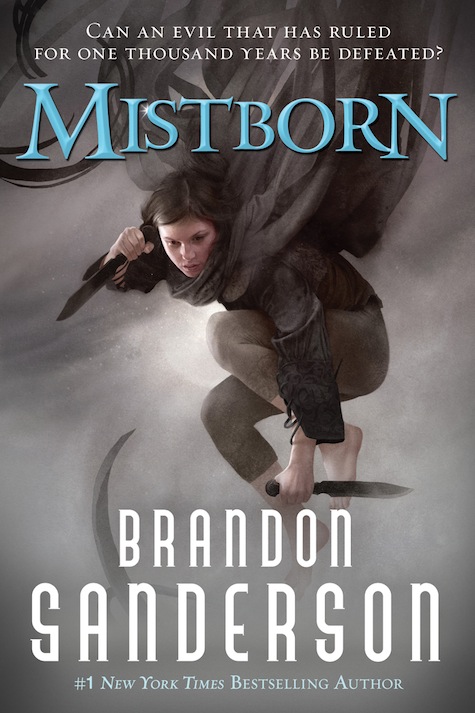
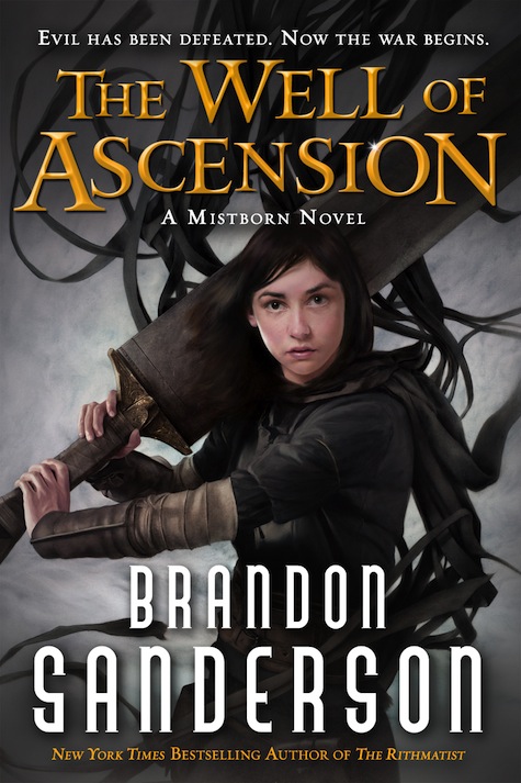
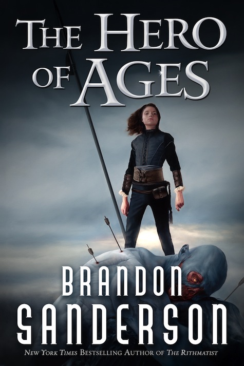
Brandon Sanderson’s wildly popular Mistborn trilogy is being reissued for the Young Adult market, and to celebrate the occasion artist Sam Weber has created three all-new covers.
Check out his vision of Vin, the reluctant protagonist of the fantasy trilogy, in the new covers for Mistborn, The Well of Ascension, and The Hero of Ages. Weber captures the sense of motion that permeates these high-flying adventures, and brings Vin to life again.
Gonna be honest, not my favorite at all.
Like the second one a lot. First one’s ok. Not a huge fan of the third (No Mistcloak?)
Not a fan of those headers. The covers would be stronger without them. The second is nice. The first seems to be a rehash of every Final Empire cover. Not a fan of the third mostly for the lack of the mistcloak – the depiction of the koloss is pretty great though.
Vin looks 14 in these illustrations, not 19-20.
I am more curious about this marketing strategy. Why is this relaunch necessary? Are the stores really going to put these in the YA aisle instead of with all the other Sanderson stuff in the SF&F aisle? Are there really a large body of readers that will read YA fantasy, but not cross over to the SF&F aisle?
Ehh… I like the originals and the international ones better (especially the triptych of Kelsier, Vin, and Elend). Not sure why this is necessary, but I guess the attempt to appeal to a different market is unsurprising. Not bad, nothing amazing.
Also, Vin’s sword on the Well of Ascension cover looks like Cloud’s Buster Sword from Final Fantasy VII… Just saying.
My original covers are better.
Vin mostly stopped wearing the mistcloak in the end, because the mist seemed to be avoiding her and it made more noise than not, so it makes sense to depict her without it. My issue is just that it looks like 3 different girls not Vin in the process of growing up.
#5 spot on.
I didn’t realize Gaia was part of the Cosmere and that somewhere between books one and two Vin world-hopped over to Midgar to pick up Cloud’s leftovers.
@MDNY
…you did some of the covers for Mistborn? Which ones? Original hardcover or original softcover? Or were you just saying that the original hardcovers were better? I agree, though, the art on the hardcovers is unparalleled by any of the other designs that have come.
Is that a Shardblade? Not at all how I picture Vin in my head. Too young looking. Great Books, Bad covers all the way around.
@9 LOL I meant the ones I own, no real drawing talent here.
@10 I believe it’s a koloss blade, they’re supposed to be as tall as Vin herself.
Vin looks pretty close to right, I think, but she also looks like she had a gun airbrushed out of her hand in the third picture.
I really like the way her facial expression grows up through the pictures. In the first one, she looks unsure of herself, there’s more confidence in the second, and pure determination in the third.
@@.-@ Walker
It is done to many books over the years. Trying to figure out what is and what isn’t apropriate for readers at certain ages can be difficult. Many people who would at least question a book for their kids found in one area would not think twice about it in YA.
Mystborn is also a gate way series. A relatively easy Epic Fantasy. Who knows how many will read it because it is now on a store room shelf next to Hunger Games and Twilight, while being 10 times the series.
I have to chuckle at the reference on the bottom: “New York Times Bestsellling Author of The Rithmatist”. Rithmatist definitely was a fun book, but are they really going to not even mention The Stormlight Archive, Elantris, or you-know-what? It’s like calling GRRM “Author of Tuf Voyaging” or RJ “Author of The Fallon Blood” or “Writer of a bunch of Conan books”.
@14
Rithmitist is his only other Tor-published YA book.
Cool! Wonder when the new editions will come out
Love the new cover for Mistborn. tWoA looks great too in terms of composition and the contrast of the title against the black. Her expression however…The lack of mist cloak on tHoA makes sense but it makes the cover look empty. Vin still looks a bit too young in all 3.
Much better! Not that I didn’t like the others but the cleaner look is nicer and these are easier to see parts of the story. Awesome job!
I have to join the chorus of disapproval on these. They’re visually drab, and yes, Min looks much too young.
Cool! The first one looks familiar – the ebook, maybe? – so I’m not overly excited about it (though I do love it) but the second one is awesome!! Always great to get a new look on those amazing books! :)
Speaking as a bookseller, I can answer the questions that a couple of people had: yes, we will shelve the YA targeted editions in the YA section and yes, people who might otherwise not have known about this series will be exposed to it.
Why does Vin have nightblood? Nonetheless they look phenomenal, especially the first two.
I admit that I have not read these books, though I am a Brian Sanderson fan and hope to pick them up. I am not a fan of these covers though and would not pick the books up for these. The sword on the second cover is impossibly large. In the third book, while maybe well deserved, the character appears almost cruel in victory. I think the first cover has the most appeal. These covers make it obvious that they are SF&F books…which does not prohibit them from being YA as well.
Brand new covers, eh? Strange how similar the first one looks to Sam Weber’s Mistborn cover from three years ago, then . . .
http://www.tor.com/blogs/2011/01/sam-weber-on-the-ebook-cover-for-brandon-sandersons-mistborn-trilogy
(also, it’s interesting how different the comments are from then to now; folk are funny)